« For God, Country, and... Starbucks? | Main | Again With That Word, "Design" »
February 01, 2004
Designing for People - Chapter 7: The Telephone
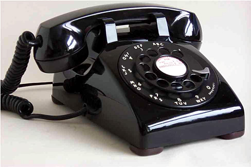
Henry Dreyfuss' widest-spread and most lasting design contribution was his work with Bell Telephone, and particularly his work on the 500 Series.

(Taken from here)
There are a few lessons from this chapter. The first is: don't enter beauty contests. When Dreyfuss is first approached by Bell Laboratories about redesigning the telephone, it was as part of a program for artists to conceive the future of the telephone. Dreyfuss declined, insisting that the "appearance should developed from the inside out." Bell at first disagreed, only to return months later with the news that while the other artists offered original designs, they were all impractical.
Such began a remarkably fruitful partnership. Bell Telephone, while perhaps an evil regulated monopoly, deserves some props for their appreciation of good design. They had the insight to hire Saul Bass to redesign their logo in 1969, and to work with Dreyfuss.
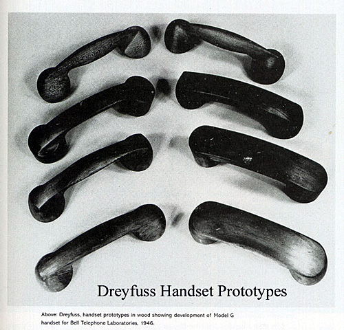
Anyway, Dreyfuss presents all the factors that went into the phone design: ergonomics, maintenance, aesthetics. You can read more about it at the National Design Museum's site on "Documenting the Process". And it's worth viewing the evolution of the shape of the handset.

(Taken from here)
The ubiquity of the telephone means that we tend to forget what an amazing design artifact it is. What Dreyfuss could have never guessed was just how wildly popular this design would be -- I can't find the page now, but I came across a statistic of something on the order of 90,000,000 such phones produced. And, as a sign of the design's brilliance, when Ma Bell released a touch-tone phone, the basic shape of the 500 series remained intact.
It's worth going a step back, and thinking about the design of telephone calls. Using a telephone is so simple, we forget how remarkably complicated the process actually is. The genius of Alexander Graham Bell, and the phone system in general, is that they placed all the complexity on the other end of the phone -- at phone switches and the like. The user interface to the phone was made intentionally basic... From party lines (pick up the phone and just talk) to operator assisted calls (pick up the phone and tell the nice lady what you want) to telephone dialing that allowed instant access to pretty much anywhere in the world.
I still use a Bell touch-tone phone. It's got meaningful heft, is easy to handle, and easy to use. The handset evolution photo demonstrates the care that went into the planning. And because it was in Ma Bell's interest that customers never need to replace the phone (since the phone was 'free' with your service), they were designed to pretty much last forever. Compare that to the shoddiness of contemporary phone design -- I've got a Toshiba cordless that pretty much became gummed up in its keypad within just a couple of years.
After the stagnation and then worsening of the landline phone experience, for a brief period, mobile phones served as exemplars of evolving utility -- screens that allowed you to see the number you punched in (helping avoid misdials), address books, microphones that didn't need to be directly in front of your mouth, etc. But, sadly, phone manufacturers have decided that people don't want to make a call on their phone any more, and the resulting interface designs have grown remarkably unwieldy.
Posted by peterme at February 1, 2004 12:52 PM
Trackback Pings
TrackBack URL for this entry:
http://www.peterme.com/mt/mt-tb.cgi/272
Listed below are links to weblogs that reference Designing for People - Chapter 7: The Telephone:
» Phone design from JD on MX
Phone design: Peter Merholz writes of how phone design has changed over the years... from a new type of device which was designed both to advance the technology and to be sturdy, to a replacement for known technology which does... [Read More]
Tracked on February 2, 2004 01:23 PM
» phone design from JerryKindall.com
Henry Dreifuss designed the AT&T Model 500 telephone for Bell Labs, and documented the design process for posterity.... [Read More]
Tracked on February 8, 2004 01:29 AM
Comments
A professor of mine, Bonnie John, once told me that, while she was working at Bell Labs, they had a design principle that anything large enough to sit on should be built to withstand use as a stool, and anything smaller than that should be able to be a hammer.
The old Bell phones, compared with today's phones, are excellent examples. Then again, when they followed those ideals, Bell owned all the phones, and customers rented them, so Bell had incentive to make them durable. Nowadays, phone manufacturers have incentive to make phones breakable, or rather, replacable.
Posted by: Kevin Fox at February 1, 2004 10:50 PM
Speaking of designing telephone calls, I'm reminded of Ladislav Sutnar. He was a brilliant information designer, and his work with Bell Labs produced a new telephone directory and number system, including the bracketing of area codes. See examples of his work at http://www.sutnar.com
Posted by: jz at February 2, 2004 10:17 PM
i hope i'm not going on a tangent here but i also wanted to add that this phone does serve a function in our modern age. having lived in earthquake prone southern california for some time, my family insisted that i get a phone that plugged straight into my phone jack for emergency calls in case my electricity failed. i ended up scouring our back alleys finding over 12 of these phones in minty fresh colors over four years. i never paid for my collection and i discovered that every phone i found thrown out, was in good working order! i never lived through an earthquake so i never had to use my phone(s).
then i moved to new york and having loved the 500 and touch tone series' design, i brought one with me. and what do you know? during 9-11 and last summer's blackout, i was one of few people who had a working telephone! my friends and neighbors came over to call their loved ones to tell them that they were OK because they couldn't do it from their cell and cordless phones. there is always a time and place for good form and function.
Posted by: souris at February 9, 2004 02:31 PM
stasio mysli, ze smierdzicie
Posted by: stasio at October 26, 2004 03:56 AM
stasio mysli, ze smierdzicie
Posted by: stasio at October 26, 2004 05:31 AM
Własnie wruciłem z premiery "one Last Dance" i muszę stwierdzić że wilm jest kiepski a Swayze się zestarzał i ma strasznie przepity głos.....
Posted by: 5t453k at October 26, 2004 08:21 AM