« Wherever you search, there you are | Main | Headin' Back To Hong Kong »
February 17, 2005
Google Maps UI - Some thoughts
My last post served as something of a paean to the new Google Maps. While that hadn't been my original intent, it is the way my writing went.
This post will be more critical of the application, particularly of its interface.
One of the biggest challenges Google Maps faces is introducing a radical departure to how people interact with online maps. Such innovations are a huge interface design problem -- how do you provide people with cues, so they know what to do, but enable new, more powerful means? People use best what they use most -- which can mean that user-centered design, when taken to some extremes, inevitably stagnates. This is particularly problematic with the Web, because people develop assumptions on how the web works from *all* the web sites they use -- they don't do a lot to distinguish one site from another, they pretty much expect them to all behave the same.
So how does Google Maps do?
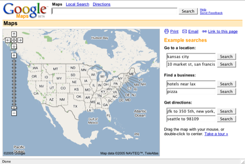
Google Maps biggest weakness is, unfortunately, it's home page. The place where they most need to orient people to their new way of interacting with maps is overloaded with search input boxes. And the layout of the search input boxes down the right hand side is misleading -- it suggests that each box is tied to a different search -- that if you want to search for directions, you use the 5th (or 6th?) box. It's not clear that these are all simply examples of the same search -- no matter which you use, it all gets sent to the same place. I know I'm not the only person to have been confused by this.
I only JUST NOW saw the words "Example Searches" -- and I've looked at this page many times. Instead of having them in search input boxes, I think it would have been better to just show them in the body of the page, and cue people to use the widget across the top. The current set up draws your eye right to those 6 boxes, so you don't see the interface at the top straight away, nor does the design suggest these are examples.
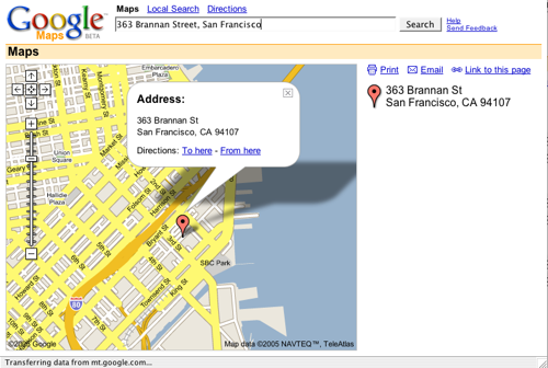
The address search, the simplest for a map application, works very well. Freely type in an address (no need to specify what is the street address, city, state, zip, etc.) and there you are. The map is big and attractive. The address is boldly called out with both a red balloon and a word balloon. I love that Google Maps uses the word balloon to draw attention to details of particular locations.
I also love that they've embedded, in the map, where your attention is, the links to whether or not you want directions to or from this place. You don't have to click some "driving directions" tab, or some link off on the side somewhere. It's right there, in the middle.
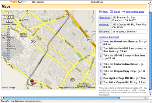
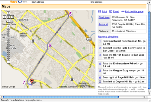
I love that you can click the numbers on the right-hand side to highlight those turns...
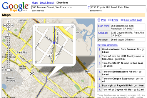
And that it uses a word balloon as a magnifying glass. That it allows you to see the detail *in the context* of the whole.
I do think they missed an opportunity to bring the numbers of the turns into the map... something like what I've mocked up below...
In terms of getting people to adopt unconventional interface elements, Google Maps does a bang up job by offering multiple means to the same goal. The most obvious is with panning. The arrows in the upper left-hand corner provide the "typical" way of doing it, and they work fine. Even better, of course, is the ability to click-and-drag on the map, which responds pretty speedily. They've also enabled the arrow keys (and even the page up, page down, home, and end keys) so that your fingers never have to leave the keyboard.
(Too bad you can't type numbers for the different turn markers in the directions...)
One place where there is a HUGE opportunity is with what gets printed. Currently, you pretty much just get a print out of what's on the screen. And there's a bug, where if you are printing driving directions, the directions line doesn't print.
Enabling better print outs could be a killer feature for an online map -- it's probably the one kind of thing I print out more than any other. You always need a print out to take with you in the car. It would be great if you could get some power for the online print out -- like, you could print a map at a significant level of detail over a number of pages (so that you're not confined to whatever is visible on your screen). Or that you could have it print out the magnifications for every turn (the trickiest part of following directions).
I don't know if I addressed what I had originally set out, but I wanted to get some of these thoughts out there. Google Maps is, clearly, impressive. And there's a lot to learn. I think there's a lot its designers could learn from observing and analyzing how people use maps in the real world -- such as how to really extend the experience to what happens after you've left the computer and you're taking your map with you.
Posted by peterme at February 17, 2005 12:24 AM
Comments
You can also use the +/- keys to zoom in and out.
Posted by: Daniel J. Wilson at February 16, 2005 01:43 PM
Daniel's comment reminded me of something I wanted to say, but forgot in the original post. There's a lot of "hidden" functionality, particularly with the keyboard commands.
And the only way to find out about them (besides banging around like a monkey) is through help. And it's often believed that "help doesn't."
But you know what? It does. It very much does, in this instance. When I realized that this app had more power than most, I gladly clicked the help link to see what all could be done here. And, for me, help... helped! It's clear, concise, and addresses the primary issues.
Posted by: peterme at February 16, 2005 03:48 PM
Another problem with the homepage and the clutter of search options is that people are so often used to filling out forms with addresses on separate lines that the close proximity of the search boxes could easily confuse users who don't realize that each one is a separate entity.
I saw someone (who uses computers daily but is not a "power user") use the interface and end up putting the address she was searching for on two lines, so that when she pressed the "search" button it only looked for half of her query.
Posted by: CA McGee at February 16, 2005 10:45 PM
Wouldn't it be great if you could export a search to Powerpoint or Keynote? For example, above you can click on a "turn" or intersection and it shows you a close up. Well, what if the export showed the over all view of your trip, then all of the turns in order. So, say your driving along I-40 then you notice a road change. All you have to do is hit down on your keyboard and the next slide is like the 4th image above - a close up of the turn. And so on and so forth until you get where you're going! It makes sense in my head anyway.
Posted by: tyler newberry at February 17, 2005 10:15 AM
Most of these features are available through Microsoft Streets & Trips. It's a worthwhile investment, particularly if you have a laptop (although Google Maps closes the gap a tiny bit).
Posted by: Peter at February 17, 2005 11:51 AM
Google Maps seem good enough for finding a location and shopping its environs; about like Yahuu Maps but maybe a little prettier. But Google Maps is almost useless in planning a trip. Like Yahuu Maps, it shows you how to get from here to there in one drive; no stops, no lay-overs. When I take a trip, however, I usually go from here to there and there and there, etc. Only Microsoft Streets & Trips can route me from home to my Lost Hills gas-up, and then give me alternate routes and drive times to Casa de Fruta, Gilroy, Mitchell's Ice Cream store and North Beach in time for an afternoon coffee and cigar.
The print-outs are also exceptional, easily comparable to AAA Trip Tix.
Google is great for information, not interaction.
PS. I am mispelling the "Y" word because peterme's spam filter won't accept this post otherwise.
Posted by: BJMe at February 17, 2005 12:36 PM
I've done some UI work on web mapping/web-based GIS products in the recent past, and I'm surprised that Google didn't include some type of basic 'zoom to extent' functionality in their UI.
Zooming to an extent is one of the better ways to explore areas of a map, especially if you're searching in a visual or spatial manner - ie - you want to zoom from a North American extent to an extent covering just Southern Ontario. It's a simple 'click, drag, release'. Dragging to select is something that many users will be familiar with and it's easy to use the new extent to set an appropriate level of depth or 'zoom'.
The panning effect is cool, but panning to a location at a high level and then having to move your cursor to the slider bar to go down a few levels is not a great way to move spatially, especially when you end up repeating the pan-zoom sequence a number of times to get to the specific location and level you want. The more exact the area you want to view, the more iterations you're going to need.
Zoom to extent on the other hand reduces iterations. If you want a close-in look at a specific area you just define a smaller rectangle around that area. Doing this, I can zoom to the Toronto area in one action. Pan and zoom with the slider will take me many more actions.
Seeing that Google's Local Search in Google Maps defaults the search area to 'the map area below', getting to the desired search area should be as easy as possible. Sure, we can do this by typing 'Toronto' in the Search field, but if I already know where Toronto is, why not leverage that?
Anyway it's still an early beta, so hopefully we'll see some improvements to the spatial navigation fucntionality before too long. I'd love to see some type of spatial bookmarking system and the ability to set a users starting extent/focus based on their ip and/or their last viewed extent.
Posted by: Matthew Milan at February 20, 2005 11:22 AM
Plenty of other people found the search examples confusing - and thankfully this has now been changed. They are now simple links, not looking like the search box at all.
Posted by: zmarties at March 5, 2005 01:12 AM
