« Enterprise Search Report Review | Main | Not All Problem Solving Involves Design »
March 27, 2005
Genres Hamper Mobile Internet
A Reuters article made the rounds 10 days ago -- "Web pioneer: Design hampers mobile internet." In it, Tim Berners-Lee decries, "Everyone was supposed to be browsing the Web with their mobile phone, but the problem is that it has not happened."
I've long been frustrated by how people seem to think that content is this formless mass that you can pour into different devices, like water into different glasses. And my thinking around document genres lead me to begin articulating a framework for thinking about content in different devices, as a way to better understand why we're not "browsing the Web with [our] mobile phone[s]."
Document genres are about how form and content come together to address a purpose. In doing so, the rely on our expectations for how that genres is designed in order to facilitate its use. When I open the envelope with my credit card bill, I don't expect a comma-delimited list of purchases in alphabetical order. I expect a tabular list of purchases, in date order. I expect that the first page will summarize my purchases for the period, and provide a space for me to write in how much I plan to pay.
As credit card bills move to the Web, it's important to recognize that, while serving a similar purpose, and having similar content, the fact that it is on the Web means it's a materially different (though related) genre. I bring different expectations to how I utilize a credit card bill on the web, such as: you don't flip through pages finding certain information, you utilize links which allow access to information chunks; the ability to call up payment history from before the period in question; etc.
In the same way that paper-based document genres evolve when they're brought to the web, digital document genres rely on the various devices within which they're viewed. And you can't just take any web page, and expect it to work within any device (remember WAP?).
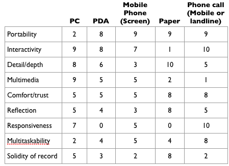
So, I've started thinking about understanding what genres work best in what devices, and why. It begins by thinking about content-related attributes of different devices.

Some terminology clarification:
Portability - the ability to carry it around
Interactivity - the ability for the device to provide instant feedback to a user's action
Detail/depth - the amount of resolution and detail the device provides
Multimedia - the ability to utilize more than one medium at a time
Comfort/trust - generally, how comfortable and trustworthy people find a device
Reflection - the degree to which a device engenders a user to reflect on the content within. A distinction borrowed from Ellen Lupton in her essay, "The Birth of the User."
Responsiveness - the ability, for when something goes wrong, to get an immediate response that can address the situation.
Multitaskability - the ability to do other things while engaging with the device
Solidity of record -- the degree to which you can rely on the device to maintain a record of action
I graded each device on a scale of 1-10, 10 being best/highest.
When thinking about genres, the concept of "purpose" gets foregrounded. And when thinking of purpose, of the task at hand that someone is trying to accomplish, we realize that purposes/tasks require an appropriate degree of these attributes.
Let's take the long and involved process of buying a house. Looking at some steps along the way, we can get a sense of what tasks require what attributes... And what that says about where document genres are best suited.
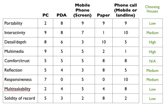
So, when you're choosing houses to check out, that task has certain attribute requirements.

You don't want to waste your time visiting a house that's not suited to you, so what's most important is to get a lot of information, and information that *shows* you the house -- photos, videos, QuickTime VR. As you rank the importance of each attribute for the task, and then look across the table, you realize that PCs are exceedingly well-suited to helping people choose houses. It shows why we've gone so quickly from super-brief classified ads to media-rich web pages in a very short time.
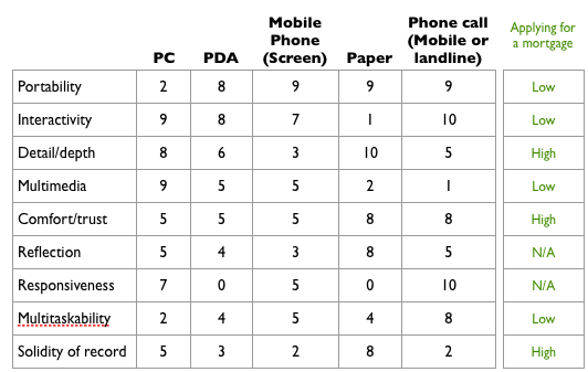
How about much later in the process, when you're applying for a mortgage?

The chart suggests why applying for mortgages is still largely rooted in the world of paper -- the crucial elements of comfort/trust and solidity of record. But those are cultural attributes... and you can see that PCs are not all that far behind, and those numbers will doubtless rise over time.
That's enough of this for now. In time I'd love to figure out a way to make this more rigorous, and come up with some methods for taking advantage of this.
Posted by peterme at March 27, 2005 12:13 PM
Comments
This is great, it greatly extends the elements I have been working on for a 3D representation for the variations of devices across only 3 planes (portability, access to info, and personal/external information organization). I have not been happy dealing with just the 3 dimensions and this helps me realize I had a good reason to be frustrated with that representation, as it was not rich enough.
Peter I think you are missing one element, which relates to the situational relevance of the information. Such as when looking for houses you may start the process at a PC, but having access to some of that information on the go would be extremely helpful. Marking the housing information on a PC and having access to that personally filtered list from a mobile device would be insanely helpful. The completing a mortgage document from a mobile would be a huge pain, but having access to all the information needed and in a format that would work well for dumping into a mortgage document would be insanely helpful.
Situational context I think would be very helpful for this matrix and would help working through scenarios. This situational context is central to working with the Personal InfoCloud framework. Your genres fit well win the perceptual receptors for in the Model of Attraction and both have been integral to my developing across platforms with relative ease. This is central to building a proper persona that includes this framework so to properly think about and plan for use by a real person across devices and situations. It is nice to work with a model and framework that actually allows us to get to this end. Repeating the success I have had with this has been relatively effortless compared to previous options.
We have spent so long working in frameworks and metaphors that stop us from developing for the person and their real problems. We spend time just trying to get information in front of the user and not really thinking how they use and reuse the information. Add situational interaction to your list and you may finally see through as well.
Posted by: vanderwal at March 27, 2005 06:54 PM
Yep, this one's good. Perhaps it just appeals to me as a software designer, because it's complex enough to apply to real situations.
One suggestion I have is based on the guideline of stripping out any additional complexity beyond that which you need. I think you'll have a more flexible and useful model if the "task" values are just binary, instead of high/medium/low/NA as you've provided.
For example, "Applying for a mortgage" could just be a column of checkboxes -- or more simply put, the set {"Detail/depth", "Comfort/trust", "Solidity of record"} .
I'm not saying it's always black and white. Certainly there are cases where a fuzzy set (what you've made by using high/low/etc) are more appropriate, and certainly the math exists to handle the fuzzy values. But I look at your model as the basis for good analysis -- and in the cases where simple checkboxes are okay, there's more room to layer stuff on top of it. The answer: allow both types of "task" values.
Posted by: Travis Wilson at March 28, 2005 11:59 AM
Bld dgqw as buy hydrocodone online here.
Posted by: Dominic at April 3, 2006 12:59 AM
Hello and congratulations! cheap valium
Posted by: jenny at April 3, 2006 09:40 AM
Hi there! Your site is cool! online pharmacy tramadol
Posted by: kori at April 4, 2006 01:01 AM
bauy buy ambien here.
Posted by: Diesel at April 4, 2006 07:50 PM