« Urban walking - musin' on cruisin' | Main | Heading to North and South Carolina »
December 13, 2005
Notes from User Interfaces for Physical Spaces
Yesterday I attended User Interfaces for Physical Spaces, a one-day workshop and field trip co-produced by MAYA Design and the IA Institute. The day was essentially an extended case study of the work MAYA did with the Carnegie Library of Pittsburgh (the public library system, CLP), applying methods of user-centered design and information architecture to the design of physical spaces.
The story of how the project landed at MAYA was illuminating. The CLP planned for major architectural renovations to their main library and branches. They sent out an RFP to a number of architecture firms. They awarded the project to EDGE design, because their proposal included their stories of trying to *use* the library (and struggling). EDGE developed a vision for a modern library, including information displays and kiosks. MAYA was originally brought in to help with the interactive portions of the system, but when they asked EDGE and the CLP what went on the kiosks, no one had a good answer. MAYA realized they needed to step back and truly appreciate the space.
In MAYA's Office
The bulk of the workshop took place in MAYA's offices, where we walked through the development of their designs. MAYA's first project was a 6-week-long intervention, with discussions with key CLP staff, guerrilla on-site research, development of key personas of library users, scenarios of use, and the development of a framework for understanding the entire system of use.With their scenarios, they identified four components in this process: Users (1) go through Organizers (2) to get Materials/Activities (3) in order to Use/Participate (4).
This is a pretty standard process for smart user-centered design, but there was a key point of differentiation from screen-based work. It comes with what MAYA calls Organizers. MAYA identified three classes of organizers -- Library Staff, the Physical Space, and the Categorizations in the catalog system.
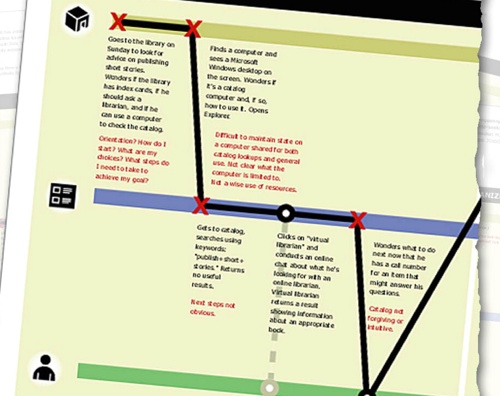
MAYA developed scenarios of use for their four key personas, and through that identified breakpoints -- moments where a person's attempt at getting something done is stopped by some problem they run into.

Initial attempts at diagramming the scenarios linearly went nowhere, but thinking through the problem, they realized the breakpoints mapped to the organizers -- things broke down when switching from people to categorizations, or from the categorizations to the space.
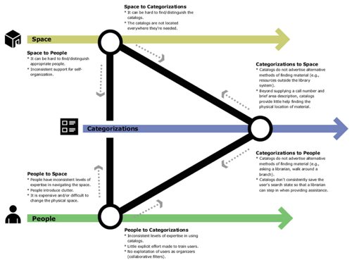
The A-ha! moment for them came in this distinguishing these organizers, because it led to the development of a framework that allowed them to get their head around the problem. The realized that the primary problems people had in using the library occurred when people switched from organizer to organizer -- from using the online catalog to engaging with the space, or from talking to a librarian to using the catalog.
This also served as an A-ha! For the CLP. Up to this point, MAYA was essentially telling them what they already knew -- there was a myriad of problems people face when using the libraries. The framework allowed the CLP to better understand the problem space.
So, unlike screen-based work, where we tend to get caught up in breakpoints with a single "organizer" -- the software -- MAYA had to grapple with three potential points of failure. This is orders of magnitude more complex.
This triangle shows what needs to be considered when handing off from organizer to organizer before the breakpoints occur -- and to smooth those handoffs by being aware of the issues that arise when making those leaps.
The 6 week project ended with "Tiger Teams" of 4 or 5 folks -- designers and CLP staff -- rapidly prototyping solutions to accommodate this new understanding. These blue sky propositions were meant to encapsulate the research in an explicit fashion -- not just giving the CLP a bunch of documents with models on them, but ideas for the implications of these findings on design.
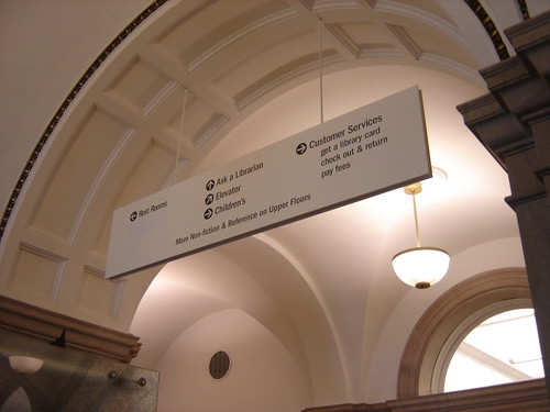
After the 6 week project ended, the CLP asked MAYA to help develop an actual solution for the library. This involved, essentially, in developing an information architecture that tied together the three organizers. They overlaid this information architecture on the physical architecture, by annotating actual building blueprints. They spent a lot of time refining nomenclature for wayfinding (thus arriving at "Ask A Librarian" instead of "Reference Desk" or "Customer Services" instead of "Circulation Desk"), and they worked closely with Landesberg Design to develop a signage system that communicated this information architecture clearly.
Field Trip!
After walking through MAYA's process, we then boarded a chartered school bus (really! yellow on the outside! green canvas seats!), and headed to some renovated libraries. The first library was the Squirrel Hill branch.
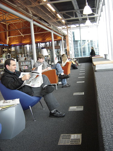
Squirrel Hill residents, though, know just how difficult the old library was, and dearly love their new space. It's clearly become a true community center -- people hanging out, reading, surfing the internet (free wi-fi!), and connecting with one another.

Photo by James Melzer
The second library we visited was the Main Library. This library has a host of complications, the biggest of which is that it's in an 1895 building on the register of historic places. This meant that it's boxy, room-to-room-to-room layout couldn't be changed.
Still, the Main library had some important successes. The Cafe is extremely popular, and its yellow floor has become a point of reference for wayfinding.

They've also been able to incorporate much of the signage and language that worked so well in Squirrel Hill.
The Main Library also demonstrates what happens when there is too much architect-intervention. Each library is modified by a different architect. At Squirrel Hill, the architect was content to pretty much follow the plan, and create an inviting, open space that just worked. At the Main, the architect did very well to open up and brighten the space, but often missed the point when it came to wayfinding.

Whereas the wayfinding system designed for the libraries involved white type on black, at the Main, they used the more traditional black type on white. Unfortunately, white is everywhere (all walls were wisely painted white to improve the lighting), and that means the signs get lost in the sea of white.
Also, the architects seemed to have a fetish for glass panels. Glass walls are everywhere in the new library, whether it makes sense or not. Perhaps the most egregious case is above the librarian desk near the entrance. While you can see the "ask a librarian" sign if you're staring at it straight on:

...when you shift your angle, it pretty much disappears:

It's fascinating to me the way that designers simply won't leave well enough alone. Actually, well make well enough worse by fiddling with it.
Well, this was a great event, and a huge thanks to MAYA for opening their doors, and the work, up to others.
Posted by peterme at December 13, 2005 10:40 PM
Trackback Pings
TrackBack URL for this entry:
http://www.peterme.com/mt/mt-tb.cgi/379
Comments
You mention ptototyping at end of 6 week "immersion". Was there any reference to prototyping the signs?... if not, could this be the reason for signage not being as good as they could be. In "Serious Play" (Michael Schrage's fascinating book) Michael talks of "Behaviour around Prototypes as a measure of innovativeness and getting it right. Could it be that protyping and stakeholder feedback died as the project moved into a more conventional detail design phase on the assumption all inputs had been achieved?
Posted by: Jim Rait at December 14, 2005 01:11 AM
Your pictures of the library suggest a solution to another "problem" I've been musing about: cafes as public workspaces.
I've always liked to read and write in cafes, but since they've been adding free wifi it's been harder and harder to find a chair in the kind of cafe in which I can linger. Clearly other people, like me, like working in the ambiance of other people and espresso machines (the reasons for which are worth a separate discussion). But how do cafes make a profit with all those people staying for hours over a single coffee? And how do we provide more space to meet the demand so that I can go work in a cafe when I want to?
As a former librarian, I'm embarrassed to admit that it was only when I saw your pictures that I realized that the solution is public libraries: making them more like cafes.
Posted by: Nancy at December 14, 2005 08:13 AM
Apparently, you can take the coffee anywhere in the library now. The reasoning (apparently) is that people take the books home and spill coffee on them there. Why not risk it in the controlled environment of the library? This is surprisingly pragmatic reasoning, and shows a deep concern for the user experience. Bravo.
Posted by: James Melzer at December 14, 2005 05:09 PM
The organizers approach reminds me of actor-network theory and Bruno Latour ... a network can be composed of non-humans that play a role in how something gets done. Flattening this view allows us to analyze their role in a process.
I think that in software design, there probably are multiple actants or organizers, too -- when people are trying to get something done, it's not just the website or mobile interface that they interact with. It's their kids yelling in the backseat of the car, the demands their bosses place on them at work, the cat. (Nothing you don't know, but I wanted to point that out since you said that in software, we tend to think of just one interface.)
Posted by: molly at December 18, 2005 12:20 PM
Thank you again for initiating this workshop, it really was a good case study and one with broad appeal. It was a jam-packed day and did not disappoint.
Maya is a very interesting, long-established design group and it was a privilege to get a glimpse inside.
Re Jim Rait's comment about prototyping signs: there was indeed extensive user testing of signs, both form and content. However I'm not sure this is uniformly true of all signs, and the usability may be somewhat affected once a sign is in situ.
For instance they noted that the scale of rooms is much larger in the main library than in the branches, with the result that what worked well in the branches needed to be scaled up in the main. This is the sort of thing that can be missed when testing can't be done in situ.
Posted by: Nathan at December 19, 2005 07:45 AM
I'm wondering why there isn't mentioned anywhere the notion of cultural change. When I look at this, I see a typically west coast design logic applied to an east coast facility.
It's likely common discussion about the new library that it is 'west coast' or at least 'mall style' or 'disneyfication', similar to the redone bits of new york. Why can't designers just talk about it in comparison to the design schools from which this comes from?
[personal story]
Here in vancouver, the new library had a real social uprising when it was revealed. "A giant colleseum?" People were shocked.
We had left behind the semi bauhaus model, which was a bit stuffy, but you know, glass and marble, and gone completely bonkers with an ancient rome approach. People thought it was a bit too much. But, low and behold, the 'cafe' model works well.
[/personal story]
Nonetheless, it seems that most people I chatted with when I was on the east coast were very vocal and aware that this was west coast style architecture, whether it was appreciated or not.
I don't see what the big dillema is really. I think it's likely new style dutch architecture at it's roots, but it's definately more predominant on the west coast. Why can't we, as designers, just talk about the effect and cause in the same language as the visitors?
It's a west coast library on the east coast, what's the big deal? They've got them all over europe now, like I said it might be dutch. From the images I've seen it's got some of the more traditional european forms still there, arches, balconies, etc, but it's fine to just say that west coast architecture has its rewards, especially when its done well.
I'll be the first to admit there is a lot of cheap west coast planning, but it still retains the typical designs of the west coast.
I'll also be the first to say that human centered design is west coast, or perhaps dutch by nature, and that IA or ID stem out of this insane belief that people's ease of living is a basic right, including ease of use and ease of play.
Now, my appologies for getting all long winded on this, but it's really silly how people ignore the basic cultural implications and focus on the exact person to reiterate them. I think Maya did a grand job, as likely did the edge. I just want to thank them for not doing it cheaply, and, of course, for 'asking around' first.
Thanks
CD Evans
Posted by: CD Evans at December 23, 2005 03:02 PM

