January 31, 2004
Designing for People - Chapter 5: Through the Back Door, Chapter 6: Rise in the Level of Public Taste
For the sake of completeness, I'm addressing these two chapters, but not in as much depth as the others. This is where Dreyfuss is weakest, and exposes a certain time-boundedness. Chapter 5 attempts to boil down art and design history in three pages -- but it's so cursory that I suspect the veracity of his history. He puts forth that industrial designers weren't able to bring their new, functionalist aesthetic in through the front door, because it conflicted too much with contemporary styles, but it worked through the back door, because in the kitchen, bathroom, and laundry, "utility transcended tradition."
Chapter 6 defends the aesthetic taste of Americans. Dreyfuss puts forth a populist notion of the masses now able to appreciate good design thanks to modern production and design. He also (unwisely) goes on and on about how American people have awakened to fine art, classical music (as evidenced by the success of symphonies on television!), and theater. What Dreyfuss couldn't have known in 1955 (or could he?) is that while television may have seemed a cultural panacea in 1955, it wouldn't take long for its higher aspirations to be dashed on the rocks of a more crass commercialism and appeal.
Where this chapter succeeds is in pointing out how designers draw from a variety of sources to inform their approaches, aesthetics, and ideas. Historic forms demonstrate that which has survived through the ages, and probably with good reason. The experimentation of avant-garde creators "gives us courage to try new forms, techniques, and materials."
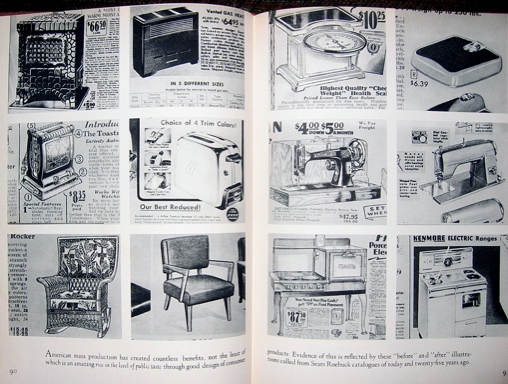
Dreyfuss relates an experience he had, presenting to Dutch product manufacturers how to appeal to American tastes. Cognizant of the language barrier, Dreyfuss found a visual solution: he juxtaposed images of products from a Sears Roebuck catalog, contrasting 25 years prior with the contemporary designs.
This exercise encourages me to consider "before" and "after" designs of website home pages. While hardly the best measure of the evolution of design approaches and tastes, it would provide a glimpse. At some point, I'll main the Wayback machine. But to continue...
While it took Don Norman about 15 years from the publishing of The Design of Everyday Things to acknowledge the importance of aesthetics and emotional appeal in design, Dreyfuss understood the impact of appearance:
...I am convinced that a well-set dinner table will aid the flow of gastric juices; that a well-lighted and planned classroom is conducive to study; that carefull selected colors chosen with an eye to psychological influence will develop better and more lucrative work habits for the man at the machine....I believe that man achieves his tallest measure of serenity when surrounded by beauty...
January 29, 2004
Designing for People - Chapter 4: The Importance of Testing
This is the one chapter which will likely induce the most forehead-slapping for any practicing user-centered designer. Because it points out that, 'lo those many years ago, Henry Dreyfuss practiced a form of usability testing in order to understand how well his designs were performing. Those of us who have had to fight to get things tested will wonder how on earth such a situation can still exist, considering leading designers were testing half a century ago.
One of the crucial elements of Dreyfuss' testing is that, while rigorous in set-up, it was also informal in its practice. He didn't get hung up on some desire for scientific accuracy in his testing -- he just wanted to see people use his designs, understand what worked, what didn't, and be able to revise accordingly. It's something of a shame that the human factors world has so promoted a "right" way of doing usability that it has lead many people to feel that such testing can only be done by a Ph.D. In my experience, such folks often don't get the true value of testing in a design process, which is simply as a reality and sanity check, not as some attempt to capture 95% of all errors.
Dreyfuss recognizes that simply asking preferences from people can be misleading (hello, focus groups!), as they'll tell you what they think you want to hear. You've got to try to get them to *behave* as naturally as possible. He also highlights that other common pitfall -- the client claiming to do research, or to understand the customer, when, in fact, well, they don't.
Dreyfuss encourages as much _in situ_ observation as possible. That can be hard for us who work with computer interfaces -- there's not a lot of opportunity to watch people use them, and even when there is, say at a laptop-filled coffeehouse, folks aren't really appreciative of you staring over their shoulders. That said, I always find it fascinating to watch my parents at the machine, or my girlfriend as she surfs the Web. It reminds you just how different people can approach this similar box in different ways.
Dreyfuss details ambitious testing environments: a to-scale set of completely furnished rooms for an ocean liner, built in an old stable; or an interior mock-up or an airliner, complete with staff. In the latter they had "passengers" in the mockup for ten hours (the time of a transoceanic flight in those days).
The chapter ends with some amusing tales of perceived affordances in early airplane experiences:
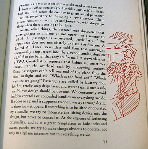
I'll reiterate his final sentence:
At the expense of forfeiting originality, and it is a great temptation to hide locks and access panels, we try to make things obvious to operate, not only in airplane interiors, but in everything we do.
And he's talking about physical objects with inherently more obvious affordances! It still mystifies me, how many "designers" seek to obscure interactive elements to serve some aesthetic desire (and they often proclaim the value of "discovery" in the experience. Feh.)
January 28, 2004
Four Corners Then and Now
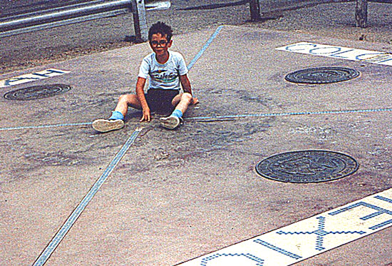
Back on our southwest road trip, we stopped at the Navajo Fry Bread National Monument.

Actually, it's the Four Corners National Monument, which is on Navajo land, and at which we spent more time waiting for and eating fry bread than we did viewing the monument.
Anyway, my parents dug up a picture of me at the same site 23 years earlier.
Designing for People - Chapter 3: How The Designer Works
In this chapter, Dreyfuss lays out his process for designing products. What's most intriguing is how what he writes is pretty much a summary of the two-day workshop my company teaches on design methodology. Everything old is new again.
The best overview is this photo spread showing how they addressed the design of a new vacuum cleaner for Hoover.
He discusses the need to meet with stakeholders, to conduct a competitive analysis, to understand the capabilities of the equipment, and to begin with sketches and then iterate the design in increasing levels of fidelity.
He stresses developing a close co-operation with the engineers, and how they're able to utilize the same common denominator -- Joe and Josephine. What was that about how personas can help an entire team rally behind a design goal?
Dreyfuss designs for the complete customer experience:
If the product is to be packaged, we design the conatiner, carton, and price tag. Occasionally we have designed the truck that delivers it. We interest ourselves in these matters because they complement the product. In certain merchandise they create the invaluable first impression in the mind of the customer which leads to ultimate purchase.
Dreyfuss points out that in the early days of industrial design, engineers regarded designers as "intruder[s] who [were] after their jobs." I can say that, without reservation, the same is true in the early days of information architecture and user experience design.
He also allows himself to grouses about the term "industrial design."
The word "design" is certainly not the exclusive property of the industrial designer. Its dictionary meaning, "to contrive for a purpose," makes it equally the property of engineers, architects, advertising men, artists, and dressmakers. The qualifying word "industrial" doesn't pin it down precisely either. But it's too late to try to coin a substitute..
As someone who has watched his profession generate a lot of heat, and little light, around terminologies and definitions, I think we ought to follow Dreyfuss' lead, and just accept it and move on.
There are two points he addresses that I think user experience folk would do well to heed. The first is the tight co-operation between designers and engineers. In my experience, this pretty much doesn't occur. Design and engineering is mediated by product management, who hand the specifications developed by designers to the engineers, and that's pretty much that. Back in the olden days, when I was a wee web developer, I made sure to work closely with designers so that they knew the capabilities of the web medium -- it's limitations and its opportunities. This collaboration lead to innovative solutions that truly took advantage of the medium. It's sad this this approach seems to have, by and large, fallen by the wayside, as companies wall-off their various disciplines.
The second point he addresses is for the designer to develop ever-more-high-fidelity models. In my experience, this, too, doesn't happen. Interaction designers come up with wireframes. Visual designers create final "looking" designs. But these are all static creations.
We get closer when we prototype in HTML, and perhaps even closer when we use JavaScript to 'fake' server-side interactivity. But we really ought to strive for prototype environments that are fed real-live actual data, but which still maintain the flexibility and iteratibility of HTML markup.
January 27, 2004
IS212: Information in Society Reading List
A course I'm planning on auditing this semester (schedule willing) is Prof van House's class on Information in Society. And my desire to sit in was bolstered by looking over her reading list, which includes direct links to the material (as opposed to just pointers to books you can buy).
January 22, 2004
Designing for People, Chapter 2: Joe and Josephine
Don Norman deservedly gets a lot of credit for making people aware of the need for user-centered design with his seminal book "The Design of Everyday Things," published in 1988. But 33 years before then, Henry Dreyfuss was talking up this philosophy, and his devotion to it is made clear when he devotes his second chapter to Joe and Josephine -- the archetypal people for whom Dreyfuss creates all his designs.

Josephine and Joe, Jr. Click image to enlarge.
(These creations were given their own book, The Measure of Man and Woman: Human Factors in Design)
The product of extensive research with human physiology, these personas helped Dreyfuss and his team design products that respond to actual physical form. Such data aided in the design of everything from a steam iron to a tank.
And the research isn't limited just to physical motor capabilities. All the senses are considered, particularly vision. And vision isn't just about how we see (or don't see, as with color-blindness), but the cognitive and emotional effect that what we see can have on us.
Where Dreyfuss falls short, and where Don picked up, is understanding the cognitive processes that allow us to make sense of the world. Still, this work in early human factors was ground-breaking, and if designers today paid more attention to this decades-old understanding, we users of products would be a lot less frustrated.
Oh, and I just love this little illustration from page 31.

One annoying-though-at-times-endearing thing about a book written in 1955 by a man who design products for a consumer audience is how it unabashedly uses gender stereotypes, particularly with women, who are depicted cleaning, ironing, being a telephone operator, etc.
January 19, 2004
Designing for People - Chapter 1. The Early Days
...it is better to be right than to be originalDreyfuss recounts his early days in practice, and addresses how the discipline has evolved, and his philosophy towards work. His first industrial design job offer was to improve merchandise at Macy's -- find items that lacked appeal and sketch out improvements. He declined the work because second-guessing the work of the manufacturers is unfair. He states, "An honest job of design should flow from the inside out, not from the outside in."
And he's adamant that a designer must appreciate all aspects of the business.
He does more than merely design things. He is a businessman as well as a person who makes drawings and models. He is a keen observer of public taste and he has painstakingly cultivated his own taste. He has an understanding of merchandising, how things are made, packed, distributed, and displayed. He accepts the responsibility of his position as liaison linking management, engineering, and the consumer and co-operates with all three.
And when it comes to the work of design:
The industrial designer began by eliminating excess decoration, but his real job began when he insisted on dissecting the product, seeing what made it tick, and devising means of making it tick better -- then making it look better. He never forgets the beauty is only skin-deep...He brings to this task a detached, analytical point of view. He consults closely with the manufacturer, the manufacturer's engineers, production men, and sales staff... He will compromise up to a point, but he refuses to budge on design principles he knows to be sound...I don't know about you. I find that inspiring.
He wraps up the chapter with a drawing that illustrates his perhaps-not-politically-correct sentence:"He must be part engineer, part businessman, part salesman, part public-relationsman, artist, and, almost, it seems at times, Indian chief."

Reading this first chapter really wins me over to Dreyfuss' point of view. A clear-headed marriage of pragmatism and enthusiasm, he aligns the realities of the business context in which design occurs with the creative delight that sparks us all. It saddens me to see how the word "designer" continues to be distorted, construed to simply mean "form-maker" and, typically "pretty-maker", and that when non-designers speak of the "design" of something, it's almost always about appearance. (Designers, graphic designers in particular, share a lot of the blame for this pejoration.)
January 18, 2004
Designing for People - Introduction and Initial Thoughts
My corporate-sponsored New Years resolution is to rekindle my passion for user experience work. A key aspect of that plan is to reread works that have fired me up in the past. As I do so, I'll transcribe passages and write up thoughts.
The first book I am dipping back into is Henry Dreyfuss' Designing for People. Henry Dreyfuss is probably the premier American industrial designer of the 20th century, working on projects ranging from commercial to governmental to military. Personal favorite designs include the Bell telephone and the Big Ben alarm clock (featured on the cover of his biography). His design firm lives on (though, sadly, they seem to think that an "under construction" notice suffices. Though, Google pointed me to the old pages that are still live, just not linked to.)
Written in 1955, Designing for People captures Dreyfuss' thoughts, philosophies, and processes as an industrial designer. I first stumbled across this at the San Francisco Public Library, and then spent a few years tracking down an affordable used copy. Nearly 50 years old, it's an eye-opening work -- the leading practitioner of industrial design is essentially writing a how-to on business-savvy user-centered design. And does so in plain-talking, buzzword-free style that communicates simply.
In future posts I'll be exploring the content chapter by chapter, but here I want to address the book's design. It's gorgeous. Stately typography and layout. Two-color printing to emphasize key aspects. Marginalia that illustrates concepts from the text. Pseudo-hypertextuality with call-outs to pages elsewhere in the book. Again, it's 50 years old, but feels remarkably modern.
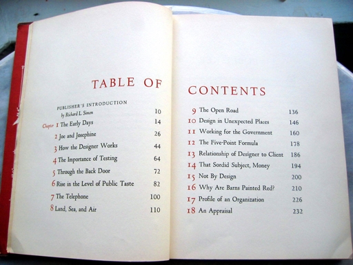
The Table of Contents sets the typographic tone. Click image to enlarge.
When I first planned this series of write-ups, it was under the assumption that you wouldn't be able to read the book yourself -- it had been out of print for years, and available only through second-hand stores (and often at a high price). That changed late last year when Allworth Press re-released it in paperback. I haven't seen this new printing, so I don't know how true it remains to the design details of the original, but I'm sure it's worth picking up.
I'll leave you with the title page, and a transcription of it's text:
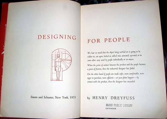
Click image to enlarge.
We bear in mind that the object being worked on is going to be ridden in, sat upon, looked at, talked into, activated, operated, or in some other way used by people individually or en masse.When the point of contact between the product and the people becomes a point of friction, then the industrial designer has failed.
On the other hand if people are made safer, nore comfortable, more eager to purchase, more efficient--or just plain happier--by contact with the product, then the designer has succeeded.
January 04, 2004
Your Tax Dollars Delivering Good Design
When one thinks of good graphic design, one pretty much never thinks about the work of the federal government. American graphic designers have long bemoaned the government's lack of interest in supporting good design (and always always always hold up the Netherlands as the ideal).
I spent 10 days over the holidays on a road trip throughout the American Southwest, with the chief destinations being national parks -- Death Valley, Grand Canyon, Mesa Verde, Canyon de Chelly, and Petrified Forest. Perhaps in another post, I'll discuss the travels. Here, I'm focusing on something else.
Upon entry of each park, you receive a park brochure. Overtime, you realize there's a pattern to the brochures -- black band across the top with white type, and lush imagery to draw your attention.
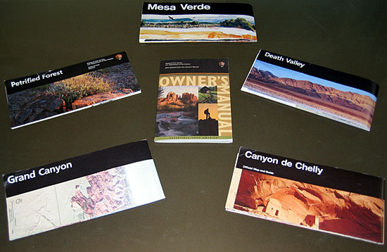
So, already, we're seeing the development of a smart graphic system -- bold, striking, clear, and engaging. There's not a visitor to a national park who doesn't want to immediately open the brochure to see what goodies await them, and the brochures rarely fail to deliver.
The Mesa Verde brochure serves as something of a standard bearer for publication design, so we'll focus on that. When you first open the brochure, the imagery continues, depicting life when Mesa Verde was inhabited (this is a departure from the other brochures, that utilize photographs):
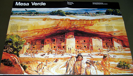
As you continue to open it fully you are given textual information explaining the park.
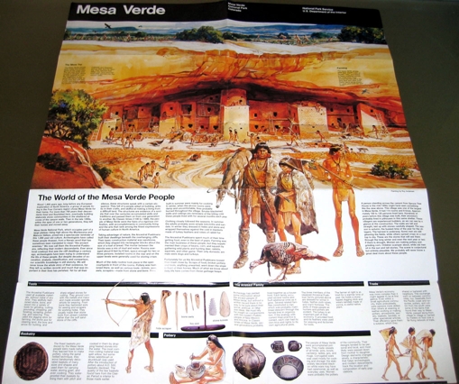
(Click the image for an enlarged view)
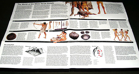
Stacy was the Keeper of the Brochures (I tended to be the driver), and what she noticed pretty soon is how the information on the brochure is aligned with the large page's folds. So, if you can't have the whole thing open in front of you, you could choose to expose the text:
And the same goes for the back side. You can see where the fold separates the text from the map:
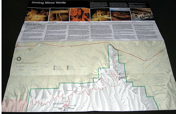
Obviously, this isn't happenstance. It's a precise plan, and a remarkably aware one. While I was pleased to see a government agency capitalize on graphic identity standards such as the black bar and the imagery, I was surprised to realize that a government agency used a design system that afforded greater utility.
It turns out there's a very good reason for this, which a wee bit of web digging unearthed.
The National Park Service's Department of Publications has their shit together. As someone who labors to get clients to understand the value of smart, consistent design, I was delighted to click around the Publications mini-site, and see how they communicate their mission and operations.
If you click into the brochures section you see a link to "The Unigrid System", created by Massimo Vignelli back in 1979, and still used to support good design.
I also love the section on the process by which publications are developed.
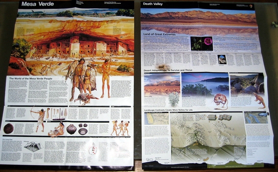
If you look at a variety of brochures, you realize that just because they're based on the same grid system (and have other requirements for color, typography, and imagery) that it doesn't mean a designer's creativity is impinged. Look at the Mesa Verde and Death Valley brochures side-by-side:
The Death Valley brochure is newer, utlizing color photographs as screened-out backgrounds, and playing with the grid a bit to provide a different experience. But it still basically works along the folds, and it's clear that it's a cousin to the Mesa Verde display.
The National Park Service faces a monumental task. How do they keep their hundreds of sites in line when it comes to a standard look and feel? Their website shows you how they attempt to manage it. The results are not perfect -- across brochures you'll see inconsistent typography, or just plain mediocre design (I'm looking at you, Grand Canyon) -- but considering the scope of the problem, they perform more than admirably.
And it's clear that they're willing to have some fun. Typically, at the bottom of a brochure is a black bar. For Death Valley, they let the designers play with that element to communicate some valuable information:
Kudos to the National Park Service for providing us an example of a government agency that isn't afraid of innovative design.
