June 30, 2004
I Read DUNE While Traveling In Europe.
If you're around my age, when you think of Dune, an image like this comes to mind:

And you just know of it as David Lynch's film that failed massively, was supposedly incomprehensible, and features Sting in leather. Which means you can't really take it seriously.
Well, I hadn't given Dune much thought until two recent occurrences:
- Living with a woman who went very far out of her way to find the fifth Dune book, because she loves the series so much
- The Believer Issue June 2003 featured an essay which not only took the series seriously, but felt it illuminated some aspects of contemporary life.
So, I found a used copy, and read it on the trip.
It's pretty good. It's most impressive as a history -- the world that Herbert creates is remarkably rich and textured. It has a real presence. It's less impressive as a narrative/story -- the plot is pretty hackneyed (Christ figure story, very melodramatic good vs evil, some awkward devices to keep the story moving). But those shortcomings didn't prevent me from enjoying the book. And recommending it to you, dear reader.
Rick and Ilsa Can Keep Paris
On our trip, we visited three cities -- Amsterdam, Paris, and Barcelona.
Of the three, Paris is the best known, the most lauded as a "world-class" city.
Visiting there, I couldn't help but have the impression that people "love" Paris because it's "Paris". Of the cities we went to, it resonated least with me. It's the least beautiful, charming, engaging. It's crowded, and filled with people, mostly tourists. I mean, it's not a bad place, but, really, it's not "all that."
We spent a few days there. Some photos:
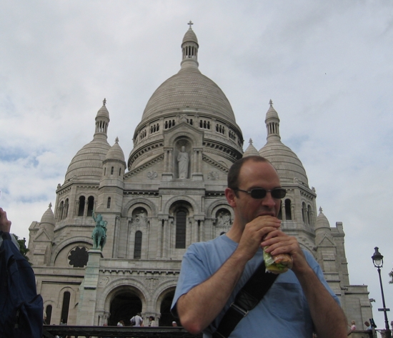
10 years ago, a I took a picture of myself eating a baguette in front of Sacre Coeur. So, I thought I'd do it again on this trip.
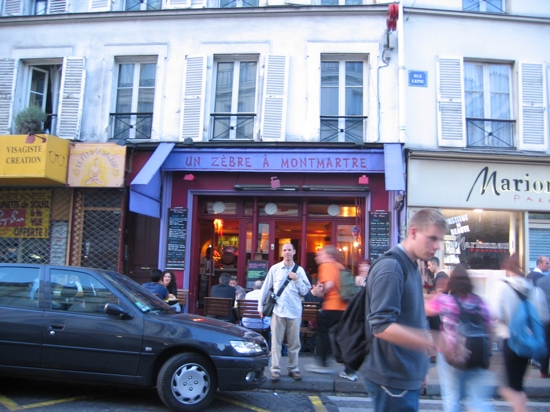
Our first night, we ate at Un Zebre a Montmartre, a hip little restaurant just down the street from our hotel. Reasonable prices (appetizers were 6 Euros, main courses 11 Euros), and good food.
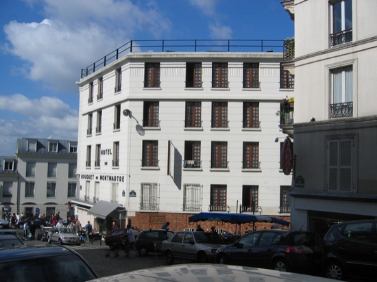
We stayed at Hotel Bouquet de Montmartre, in the 18th arrondisement, right at the foot of Montmartre. It's crazy inexpensive (60 Euros a night for a double), well-situated (one block from the Abbesses metro station, a short climb up the hill to Sacre Coeur), and really teeny. The only drawback was that the bars in the neighborhood stayed active until late in the night, which was shameful, since there are a lot of just normal folks trying to lead their lives here, too.
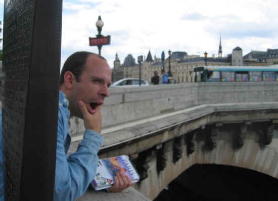
peterme, excited, on Pont Neuf.
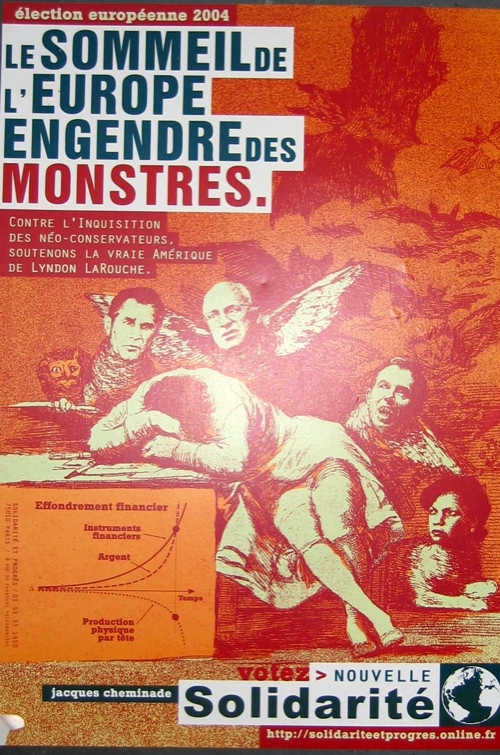
The European Parliament elections (which had the lowest turnout, and was overwhelmingly Euroskeptic) took place during our trip. This poster, on a wall in Paris, has a potent illustration. I really dug it, until I read the smaller type below "MONSTRES." Still, cool drawing.
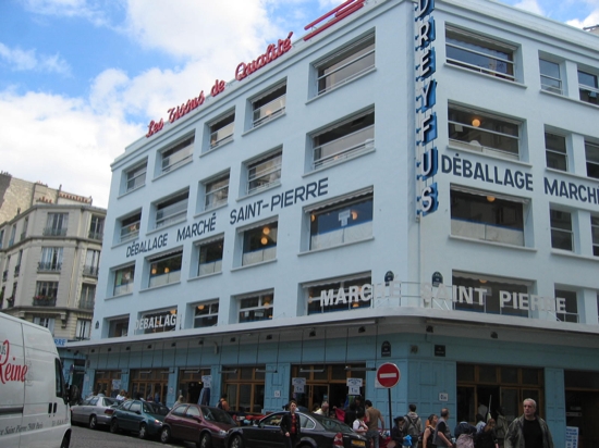
Of interest to maybe no one I know other than Courtney and Sharon, on a walk through the 18e, we stumbled through the textile district, which included this store offering 4 floors of product. And it was just one of like three right in this neighborhood, and that doesn't include the innumerable smaller sellers.
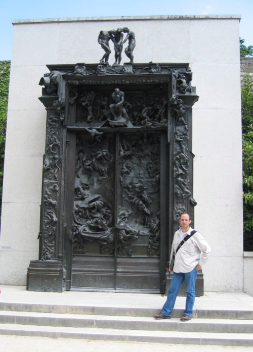
Seen here are THE GATES OF HELL. Like the Van Gogh Museum, the Musee Rodin allows visitors to witness the evolution of a great artist in a beautiful setting. It and the Musee d'Orsay are my only two "must-see" museums in Paris.
Only one other note (this time without photos) -- for dinner one night, my friend Frederic introduced us to Chez Janou, a delightful restaurant near his house. I can recommend the magret du (de?) canard without reservation. They also serve crazy big bowls of chocolate mousse.
This Napoleon Doesn't Have Much Of A Complex
Last night, had to choose between waiting in a long line for Fahrenheit 9/11 or walking right into and sitting down for Napoleon Dynamite. I chose the latter.
Describing the film's plot pretty much misses the point, but the setting is important -- barren Western town, and a lot of action taking place at the high school that the film's title character attends.
The movie is both resolutely normal -- dealing with the well-trodden miseries of small-town and high school life, and what it means to be a geek in those milieus -- and profoundly weird -- though set in contemporary times (as elements like mobile phones and online dating attest), the sets, clothing, and music all come from the late 70s and early 80s, as if Preston, Idaho was stuck in time. And the character's behaviors -- playing tetherball, rollerblading while towed by a bike, having hunks of steak thrown in your face, taking "glamor shots", etc. etc. -- are just so... odd.
This is not a great movie. I'm not sure that it's a good movie. But I enjoyed it, and laughed, and found myself surprised at some of the things I laughed at. The character of Napoleon Dynamite, as embodied by Jon Heder, is amazing -- eyes perpetually half-closed, mouth-breathing, shock of red curly hair, a combination of abusiveness ("You're a flippin' idiot!"), insecurity ("I went hunting for wolverines"), loyalty ("I'd vote for you, Pedro"), and a can-do spirit (pop-locking to Jamiroquai). All adding up to a surprislngly endearing persona.
The various subplots (the uncle's attempt at returning to his glory days, the tupperware sales, the chat room pay-off) weaken the film, but I suspect they're there because they simply didn't have a full movie's worth of Dynamite material.
Should you go see it? I don't know. If you're around my age (31), and a child of too much pop culture, with a taste for the absurd and ironic, it's definitely worth a look-see.
June 29, 2004
Amsterdam
I know this isn't a very original sentiment, but I adore Amsterdam.
I had the opportunity to turn work-related events (a plenary at SIGCHI.NL and Adaptive Path's 2-day workshop) into a delightful European adventure, with more time spent in Amsterdam than any other city.
I last visited Amsterdam in 1994, and was surprised at how little had seemed to have changed -- which is for the better, since I loved it back then, too.
Forthwith, a few notes on our travels in Amsterdam, with some suggestions for other folks visiting there.
The Canals
Of course. Particularly the Prinsengracht, Keizergracht, and Herengracht, and particularly on the west side. Peaceful, lovely, relaxing. And with good shopping, cafe-ing, etc. It was on our first walk of our first day that we settled into a delightful cafe at the corner of Prinsengracht and Leidsegracht, a cafe that became our "local." (Of course, I don't know the place's name). You can sit at tables overlooking the canal, while drinking screwdrivers made with fresh-squeezed orange juice. By the time we got here, we were quite hungry, and noticed the table next to us had a plate of meat snack appetizers. We asked our waiter for it, who at first discouraged it, "It's raw meat--a very Dutch food." But we insisted, and it was quite yummy.
Stacy enjoying the best screwdriver ever.
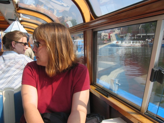
A key canal excursion are the ever-present boat tours.
Here we are, at the start of the tour.
Though unrepentantly touristy, the tours offer a great perspective on the city. We took the Holland International boat tour, the audio for which was pretty lame. We heard later that the Lovers tour is widely appreciated.
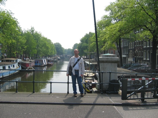
peterme with a canal behind him.
Eating and Drinking
While the Dutch aren't known for their cuisine, we actually ate very well, in large part due to helpful pointers from locals.
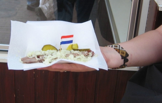
Perhaps the most "Dutch" food we ate was Nieuwe Hollandse - raw herring.
The Dutch love food that can be eaten with toothpicks. Even better if it's got a flag on it!
We had good contemporary meals at Cafe de Jaren and Cafe de Koe. De Jaren scores many points with me, as it's a great place for coffee and reading -- they even have library tables with the arced late placed over your reading material.
For drinking (whether it was coffee or booze), de Balie was great -- spacious, with free-wifi. Peter turned us on to de Zotte, a beer bar specializing in Belgian brews. Oh, and we had a delightful afternoon coffee-turning-into-beer at Cafe in de Waag, which has a prime spot on the Nieuwmarkt.

Cafe in de Waag, picture stolen from their site.
One of the nicest things about drinking in Amsterdam is that no matter where you went, you could simply order a "Beer", and trust that what would be brought (which would be whatever was the primary house tap), would be good. So easy!
Out and About
Amsterdam is not a museum town, not like a Paris or New York. While we were there, both the Rijksmuseum (art throughout the ages) and the Stedelijjk (contemporary) were closed or greatly reduced. The Van Gogh Museum, however, was open, and it's a treat unlike any other in the world. In my book, it's the only "must-see" museum in Amsterdam. Being able to trace this great artist's evolution is an enlightening treat.
A spot we enjoyed returning to was the Albert Cuyp Markt. It's a bustling open-air market, with bargains on everything from cheese and produce to ticky tacky souvenirs or cosmetics. It's also a good place to score fries. We were told that this is the best place to get fresh stroopwaffels, but we never figured out where.
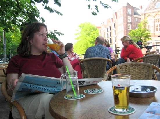
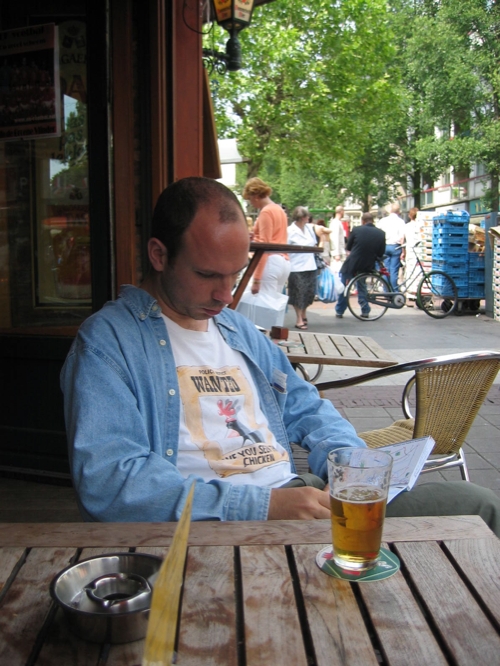
Drinking a beer near the Cuyp Markt
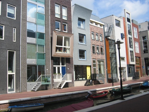
Amsterdam is an interesting architecture town. It's not uncommon to see startling modern boxes next to 18th century gabled houses. One morning, we headed out for the Java Island, which is the site of some remarkable contemporary urban residential architecture.
If we had been in town on a Saturday, I would have most definitely taken the canal tour that winds through these new developments. (I can't find reference to it online. You can get information from the Holland International dock near Centraal Station.)
Lodging
Since we were footing our own bill our first couple of days, we stayed at the Albay Homestay, a kind of bed-and-breakfast without the breakfast out near Oosterpark. It was reasonably priced (€85 a night for two people), and we stayed in the Marhay room, which was quite spacious, and had access to a large private garden. (Apologies -- we neglected to photograph the lodging).The Albay is definitely out of the way for most travelers, but it's only one block from two major tram lines that will take you to where you want to go (Central, Museumplein, etc.).
Our next two days were paid for by the good folks at SIGCHI.NL, so we were able to upgrade and get a little more central, and we ended up at the Crowne Plaza Amsterdam-American, formerly known as the "American Hotel," through a deal we found on Hotels.nl. This proved to be a perfectly serviceable business-class hotel, which meant that it was disappointing -- the American Hotel has a reputation of an art nouveau delight, and I was hoping for nifty classic design touches. While the exterior, and the Cafe Americain still provide the swoopy glory of nouveau, the interior of the accommodations was renovated a few years ago, and felt remarkably undistinctive.
Upon returning to Amsterdam, the company put us up at Dikker en Thijs, located very near Leidseplein, along then Prinsengracht (a canal). Our room was the same size as what we had at the Albay, only it cost more than twice as much. Also, "service" seemed to be a novel concept -- calling down for an iron and ironing board did no good, I had to go down there and schlep it up. We also find out that when the list "Internet connection" as a room facility, what that really means is that there's an available phone jack you can use for dial up. Huh.
We had wanted to stay at 't hotel, which looks very cool and got good notices from friends, but it's a small place that was all booked up by the time we called them.
Thanks
For our delightful time in Amsterdam, much thanks to Peter Boersma (and his lovely girlfriend), Peter Bogaards (as strapping as the photo suggests), and Tjeerd de Boer, for pointing us in all the right directions.
June 25, 2004
"Ah, Shit." Or, "Hell, Yeah!"
I don't quite know what to feel.
I just got back from my trip to Europe, and in my pile of mail is an announcement of the Nielsen/Norman Group User Experience World Tour.
And I see listed, on the main event, that Don Norman is giving a talk called "Expectation Design". And I think, "Huh, is this like what I've been going on and on about with Explicit Design? Where I write "Through my work, what I've observed is that the web is all about managing expectations. Setting expectations, and then fulfilling them. That's it. You do that right, and you're golden."
Well, the blurb for Don's talk suggests it might:
Expectation Design: The Next Frontier
Don Norman
Good designers already know how to make products attractive (visceral design) and how to appeal to self- and brand-image (reflective design). Good behavioral designers know how to make products usable and understandable--indeed, that's the focus of most of this conference. It's time now to turn our attention to pleasure and fun. Here, the challenge for designers is behavioral design, where expectations drive emotions. This is where hope and fear, and satisfaction and anger reside. Deliver on positive expectations and people experience pleasure. Deliver something different than expected, but equally satisfying, and people have fun. Fail to deliver, or leave people feeling out of control, and you get a wide range of negative emotions.Expectation-driven design marks a new dimension for our discipline and provides a new framework for design. It shifts the emphasis from pure function to an emphasis on designs that both function well and offer people pleasure, enjoyment, a sense of accomplishment, and yes, even fun.
So I can either feel good that I've hit upon something real, something that others are thinking about, including luminaries like Don, or I can mope that my meme will be carried away by the far more popular Donster.
Hmmm.
The Plight of Masculinity
So, there I was, in Europe for the last three weeks.
And pretty much from the moment we got there, the Euro 2004 football tournament was underway.

Now, in the states, I can't be bothered with soccer. It goes too slow, and I don't know anything about the teams, the players, the rivalries, the matchups.
But, because I have a surfeit of testosterone, or that pesky Y chromosome, or something, I couldn't help but follow the tournament. This was definitely influenced by the fact that *everywhere we went*, the populace was caught up in the excitement. So now I know what a rivalry the Dutch have with the Germans. How exciting it was for Portugal to beat Spain. The drama of the Scandinavian tie and the Italian's complaints. I'm actually enjoying that England was thwarted in the quarterfinals.
My best experience was watching the Netherlands - Latvia game at a bar in A'dam, with a crowd decked out in orange, and witnessing not just the Netherlands winning (which was relatively anti-climactic, since Latvia stunk up the place), but also Germany losing -- which meant Holland could move on to the quarterfinals. People went apeshit.
See? I'm all caught up in it. And now I can't watch it anymore, because it's only available on expensive pay channels, and I wouldn't know where to go to see it, and so I get my fix by reading the website. And tomorrow, Holland plays Sweden. Maybe I'll find a Scandinavian bar somewhere to watch it.
Pity the poor male.
June 24, 2004
Cultural Hegemony
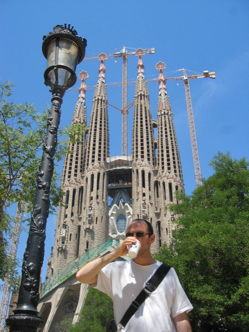
Peter Merholz, drinking Starbucks, in from of Sagrada Familia, Barcelona, Spain.
Jeff Veen in Amsterdam
So, my three week European sojourn is nearly over (I'm at the airport in Amsterdam), and I'll write about it in due time.
Until then there's this photo:
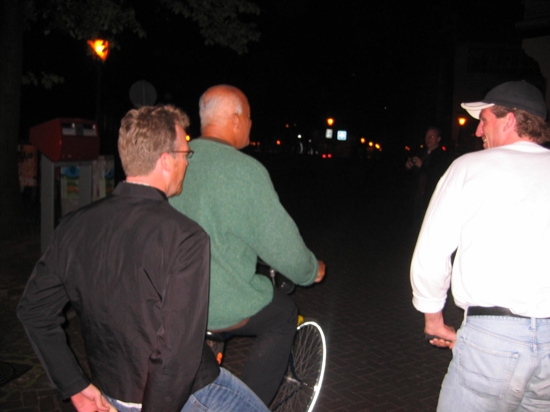
That's Jeff Veen, on the back of some Dutchman's bike. Jeff went racing after him (and I went racing after Jeff to snap this photo) as we were heading down the gracht, and then leapt onto the little rack in the back, and rode for a block or two.
June 05, 2004
Off to Europe...
So posts will be *even sparser* than normal. Apologies ahead of time if I let comment spam sit too long.
June 02, 2004
Thinking About Audience Segmentation
While this is not an explicit Explicit Design volley, it's definitely related.
A holy grail in Web site information architecture is the ability to cleanly segment content by audience type. Much of the content on a website is not applicable to every single person, but without good segmenting methods, we have to expose all that content to everyone.
Some sites have it easy. An Adaptive Path favorite is Hay Net.

However, few folks have such easily separated audiences. This is particularly true in high-tech marketing, an area I've been deeply involved in ever since working with PeopleSoft in 2001. Every high-tech marketer wants to target different messages at different levels within the potential customer's organization -- executives get a Business Value message, directors and managers get an Ease of Integration message; developers get technical specifications, etc.
One company actually went pretty hard to market with these distinctions: Siebel. Thanks to the Wayback machine, I was able to dredge up their "custom views" over the last few years.
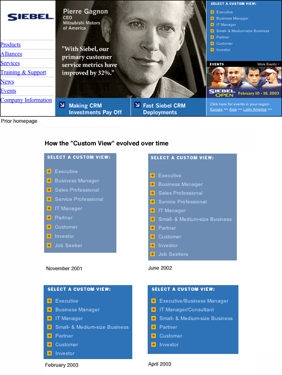
Well, I went to Siebel.com today, and noticed that they've dropped Custom Views. If you ever clicked around their Custom Views, you know that they never really did the concept service -- there'd be a single page for each audience, but beyond that, the distinction was lost.
But I don't think the real problem was execution. I think it was more fundamental. It's pretty much impossible making good clean distinctions that visitors can select themselves by. The changes in Siebel's options show this. In June 2002 they add "Small and Medium Business", in part reflecting the importance of the market, but also because an "executive" of a small business has a lot more in common with a "business manager" of a large corporation.
I find the combination, in April 2003, of "executive" and "business manager" telling. It's basically them throwing in the towel for this kind of audience segmentation. What's happening here is that Siebel is realizing that meaningful segmentation doesn't have as much to do with job titles and self-identification, as it does with the types of tasks the people are engaged in. When it comes to enterprise software, Executives and Business Managers start to blur -- you pretty much just want the best value for the money.
And this is why Siebel was wise to ditch the Custom Views altogether. It was an attempt on their part to be Explicit -- what could be more explicit than getting people to *exactly* the content best suited to their needs -- but it ran against the reality that, when it comes to marketing products, "audience type" is the wrong type of explicit. All that matters to the visitor is their task at hand, not what some company thinks of their job title, and they'll click immediately to whatever they believe will support that task -- which is likely one of the clearly labeled main navigation areas.
All this said, I don't advocate never segmenting by audiences. But you can only successfully do so when the audience accepts the labels as meaningfully applying to themselves. One realm where this works is higher education. UCLA's home page clearly distinguishes its audiences.

The reason this works is that the *tasks* -- what people want to do at UCLA's site -- cleanly break down by audience types. Future students have interests distinct from current students. Current students distinct from faculty. Etc. Not to say they're mutually exclusive -- but a visitor can look at those selections and click with assurance. You can't do that with a selection like "business manager."
Anyway, I feel this really resonates with the notions of Explicit Design. If you can be explicit and meaningful -- such as Hay Net, or UCLA -- then by all means you should. But if you can't be explicit, as in segmenting potential customer audience types for high tech, then attempts at being so will backfire, because this faux explicitness confuses the visitor when they don't see an option that inspires confident selection.
Paying attention to Mind Wide Open
I'm reading Steven Johnson's Mind Wide Open, and just completed Chapter 3, "Your Attention Please." In it, he discusses the many facets of attention, and I found myself having trouble keeping them all squared away. It made me wonder why there wasn't a diagram of some sort to help express the relation between these various elements.
So I drew a diagram, if only to help me keep it together.
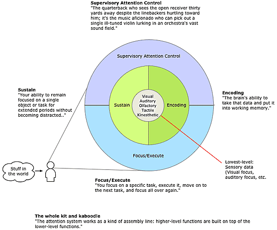
After drawing the diagram, I realized why there might not have been one in the book. Making a clear sketch wasn't easy. Oh well.
