July 31, 2004
Conventional Wisdom is Neither Conventional Nor Wise
I don't quite know what the title to this post means, but it came into my head when reading this column on a recent essay citing the 100 most influential papers in physics. It points out that for all the glamour that cosmology, quantum mechanics, black holes, and the like have been getting, what physicists are actually *doing*, and what they're actually *reading* is more prosaic.
July 30, 2004
My legacy.
I am the number one result for the the Google Search poontang. And that search term accounts for, far and away, the most visits on my site.
July 29, 2004
SHIT IS TOO HARD TO USE
I'm working on a project where I get to go into people's homes and watch them attempt to set up an internet-enabled device (excuse the vagueness). And, without fail, they cannot. What's interesting to me is how they fail -- each time it's different. Though often in the same part of the process, the detail that causes them to go astray varies -- mistyped email addresses, password confusion, network set up, clicking the wrong link and getting lost, etc. etc. And I'm sure that with each subsequent observation, we'll observe new hitches.

Over 15 years ago, The Donster wrote The Design of Everyday Things, where he wrote about the difficulties we have with fairly simple products -- door handles, stoves, etc. The most complicated single item was an office telephone, with it's various modes that you access through key presses.


the probability of being able to pass a unit of product or service through the entire process defect-free.Basically, this means that the more steps you take, the likelier failure is. Even each step has a high probability of success, when you add them up, the likelihood someone can get through all of it becomes startlingly low.
And that's the big problem I'm seeing. Too many steps. Too many opportunities for something to go wrong. For people to enter a typo. For people to not see and instruction. For people to click the wrong link. I'm not blaming people for this -- they're just doing what they do.
My client assumed they were doing the world a service, allowing you to connect this device directly to the internet -- without a computer. It will make everything easier to have it all in one place. It will allow you access to things you couldn't do before.
But connecting to the internet is not easy. It requires modems, routers, and setting up. To add devices requires cables, or wireless-savvy. People have already gone through a fair amount of hell just getting their current system up and running. Adding to this often just upsets them. People are happy to just have something that works. When you suggest to them ways they could optimize, they'll turn a deaf ear -- change brings uncertainty, change could mean that the thing just doesn't work any more.
In the case of our client, complexity has been bred by a marketing group that WANTS MORE FEATURES (because they sell!) and an engineering group that adds these features onto the existing product like rooms in the Winchester Mystery House -- without rhyme nor reason, with no overriding logic, with no real principles to guide them.
Anyway, the nub of this wee rant is, of course, simplify. It feels like we're reaching a breaking point with new technologies -- if we thought the blinking "12:00" on the VCR was sad, what terrors can we expect? Think about the lesson of rolled throughput yield -- how can we minimize the steps involved? How can we enable people to plug something in and *just have it work*? How can we do a little more work on the design and engineering, so the customer has to do none on their own?
July 21, 2004
A Revolutionary Take on ROI, Business Value, and User Experience
Today we posted Scott Hirsch's essay on ROI Is Not a Silver Bullet: Five Actionable Steps for Valuing User Experience Design.
This coincides with the release of Adaptive Path's first serious research report, Leveraging Business Value: How ROI Changes User Experience, written by Scott, Janice, and Sara Beckman from Haas School of Business. This report marks a significant turning point in how we user experience types recognize our value to the enterprises in which we work.
Up until now, the single best source for valuing user experience is the book Cost-Justifying Usability. Considering it was published over 10 years ago, that's either a testament to the book's brillance, or the remarkable paucity in thought and discourse on the subject in the intervening years. (I suspect a combination of both.) When we've discussed the book with others, particularly those in bigger companies, we realized that there's vast skepticism toward its daisy-chaining-numbers-approach, where benefits are figured out by saying that if you can reduce user's time on a screen by 5 seconds, and that screen is seen X times by Y people being paid Z dollars per year, then you multiply everything and voila, there's your expected benefit. Perhaps in certain highly controlled processes (like repetitive data entry) this kind of calculation is possible and meaningful, but typically this just leads to hypothetical results that aren't verifiable. And if you try to bring such reasoning to your finance folks, they'll roll their eyes.
What we've seen that works are more macro, bolder, simpler, and more realistic claims. Something direct like, "This will increase registration by 40%." In one of our client companies, they bought a CMS. In trying to get the money for it, they soon found out that a cost-justifying-usability argument about productivity (users will spend 10 fewer minutes every day finding information, saving $n!) meant nothing. But when they could say, "This CMS will eliminate the need for printing and distributing documentation," that resonated, because "printing and distributing documentation" was a clear line item on a budget, and the financial person could immediately realize the benefit of crossing that line out.
This report is different from other attempts at addressing the ROI of UX question in that it doesn't make specious industry-wide claims about UX investments, nor does it try to "value" UX methodologies. In fact, for the report, design methods are a "black box" - it's impossible to say that card sorting returns x%, or that iterative prototyping returns y%. The foundation of the report are 5 in-depth case studies (Bank of America, KQED, Cathay Pacific Airways, Belkin, and ESPN.com) of how companies are actually valuing user experience design. The results have less to do with specific returns on investments, and a lot more to do with organizational maturity, and processes that ensure that UX teams are appropriately valued. In the end, this report feels much richer, and much truer, than what I've seen that has gone before.
Here are some of my favorite quotes from the report:
Generalizations such as this [10% investment in usability leads to 168% ROI] fail to take into account the project, business model, industry, and other factors that are important to the financial accounting people who are used to making decisions based on ROI. Bottom line, ROI is an internal tool for comparing investments, not a proscriptive guideline — generalizations are meaningless and unconvincing.This, of course, rings of the critique Scott and I leveled at the Nielsen/Norman Group's Usability ROI report. Providing industry-wide "ROI" numbers is pernicious -- they're the Holy Grail of this research, but in reality are practically impossible to derive. One of the best aspects of this report is to set aside the search for this grail and focus on things that are addressable.
Based on our observation, establishing well understood selection criteria [in determining projects] and ensuring transparency in the final decision are vital. If project sponsors do not understand the rationale behind selection decisions, they are less likely to propose “fundable” project opportunities. Similarly, if project selection seems arbitrary, they are less likely to view user experience as a strategic resource available for their use.For me, perhaps the single most resonant finding of this report involves project ideation, prioritization, and selection. So often, with our clients, with our colleagues, with anyone we talk to, the projects they work on seem to have been chosen by dart-throwing. Or executive fiat (we had one project that started because a senior executive wanted "fewer links on the home page.") And nothing makes a project team feel like their twisting in the wind than arbitrary decision making processes that end up with them expending time and money for an unclear gain.
One subject firm in the report, Cathay Pacific Airways, has a remarkable project prioritization and selection process that's worth emulating. A boatload of explicit project attributes, each of which are assigned a value, leads to an obvious and transparent decision.
Control of pipeline. The Web team controls its own development pipeline by managing a transparent process for selecting projects that is well understood by internal clients.This is a bullet point from a larger list, dealing with what needs to happen to make Web teams effective. They need some measure of independence, so they're not subject to the whim of others. They need to control their pipeline. Such control should be okay, if they make it explicit to others why they've opted to work on some projects and not on others. If it's explicit, those others can't really complain if they're project isn't chosen, because the reasons should be clear. Without this control, the web team becomes pawns whose time can be wasted on thoughtless projects.
An additional layer of complexity is added when the analytic process itself has a significant cost. A few firms commented that in some cases they would like to apply more rigorous ROI methodology, but the data to determine business value is too difficult to analyze given their current technology and staffing constraints. However, these limitations do not negate the use of ROI methodology. In most cases, some linkage between user behavior and business value can still be made, even if the quality or granularity of the data is not ideal. Instead, teams can establish user experience metrics that are likely to indicate business impact. Such hypotheses regarding the quality of indicators can then be tested.Getting good metrics is so difficult that many companies just throw their hands up at the prospect. Or because they don't have the metrics now, they feel they can't start measuring value. These obstacles are more mental than real, though. The reality is you've got to start somewhere. If you're not collecting these metrics, that's okay. Just start doing it now. If you can't get all the metrics you think you need, that's okay -- find a few that seem relevant. Start small and take it from there. The point, though, is to *do it*. Don't let some idea that you can't do it "right" mean that you don't do it at all. It's a matter of degrees, not right and wrong.
Again, an ROI calculation is always going to be a guess. The value of the analytic process is not diminished by the difficulty in drawing statistically significant correlation between user experience and business impact — the greatest value comes over time, as the ability to make more-accurate estimates increases.This is kind of a corollary to the previous quote. But that first sentence is important. Folks like me assume that the business/finance people require certainty, and that puts us in a panic, since, well, it's hard to be certain about potential effects of user experience. The thing I've learned, though, is that the business/finance people are okay with some squishiness. They want an educated guess, but they don't need precision to 2 decimal places.
To get more of a taste, Adaptive Path has made the report's executive summary freely available. It captures just how the report is reframing the issues, away from specious statistical claims towards a richer, more interesting take on the reality of organization and how they evolve. If that first taste tantalizes you, use the coupon code BVDEAL and get 15% off the cost of the report.
July 19, 2004
The Old New Thing
I've been working in "new media" for 10 years now, beginning with The Voyager Company in 1994. Back then, it was all about CD-ROMs and multimedia, and bookstores were turning into 'media outlets,' and the press was eating up this "future." Buzz buzz buzz.
In 1995, I began working on the Web (for Voyager), helping manage one of the first e-commerce sites (what was it we called it then? oh yeah, a "catalog"). I remember when animated GIFs were all the rage, and I made a morphing "A" for the Voyager home page.
I couldn't stand New York, though, so I moved back to SF, and got work with Studio Archetype, a graphic design company that had drunk deeply of the interactive Kool-Aid. I morphed myself, from a middling Web developer (wrestling with JavaScript and layers when Netscape 4 launched) into an interaction designer. This was 1996, and over the next few years, this mildly freakish obsession of mine turned into the biggest thing since sliced bread. There were fabulous parties, fabulous conferences, travel, etc. etc. And everywhere a DJ spinning. I found myself in the center of a maelstrom, all the time just doing what I wanted to be doing.
I thought about this last Friday night, at the RX Gallery, where a most fabulous party took place following a conference on social media, mobile devices, art, and urban settings. I didn't attend the conference, so I felt like I was entering a play in the third act. And what a play! Hip artsy bar in an edgy part of town, filled with beautiful young people. It was very much like being a web worker in 1997. Except more gender equitable, and everyone was cuter. Naturally, a DJ spinning.
At some point, I found myself in the loft toward the back of the bar, looking out at all the beautiful people. And I really felt the metaphor, me on the outside looking in on this new wave. And me realizing that I was no longer at the heart of the new and cool thing. In the past, I had just naturally gravitated toward multimedia and the Web, and found myself caught up in The New New Thing. But in this present, I just can't get worked up about social networking systems, or mobile devices, or some combination thereof. I try, but my eyes glaze over. Instead, I've opted to doggedly pursue making things make sense for people, and promoting the business value of this decision. Which feels both responsible and perhaps stodgily corporate.
And I wondered, as I gazed out on the room, have I matured? Or become rigid? Or both?
July 18, 2004
What Jeopardy! Reveals About Cognition
Today's NY Times runs a pretty good article on whether Ken Jennings, the Jeopardy!-million-dollar-winner (and counting) is a genius. It basically gives them an excuse to explore some issues of cognitive science, particularly those related to intelligence. Good stuff.
Also, if you haven't been watching Ken wipe the floor clean with the brains of his opponents, it really is something to watch.
July 15, 2004
Goodies from Adaptive Path
 Just a little post, reminding you all of some things we got going on, and discounts we're offering for everything.
On July 22nd (that's next week), the J-J-Geegester does New York Tufte-style with a one-day presentation on The Elements of User Experience. Use the promotion code FOPM and get 15% off!
Next month, the entire Adaptive Path crew ransacks our nation's capital with User Experience Week, 4 days of tutorials, activities, parties, and field trips. We've got some great guest speakers -- Christina Wodtke, Doug Bowman, and 37 Signals. We've also structured the sessions so that each day has a strong theme, and if the whole week is too much of a commitment, you can sign up for individual days:
- Day 1: Organizational and Strategic Issues of User Experience
- Day 2: Interaction and Interface Design
- Day 3: CMS and Web Standards
- Day 4: Bringing it all together... and field trip!
Once again, use the promotion code FOPM for 15% off.
Lastly, we're offering a discount on my first report, How Labels Affect Usability and Branding. Use the coupon code LABELSDEAL and get 15% off all the reports you buy, as long as one of them is "Labels."
July 11, 2004
Photos from and Thoughts on Barcelona
I, seemingly like everyone else, adore Barcelona. This was my first visit, and it was too brief (only 3 days). It became very clear very quickly that the best way to see this city is to rent an apartment for a week or two (or four) and live the life.
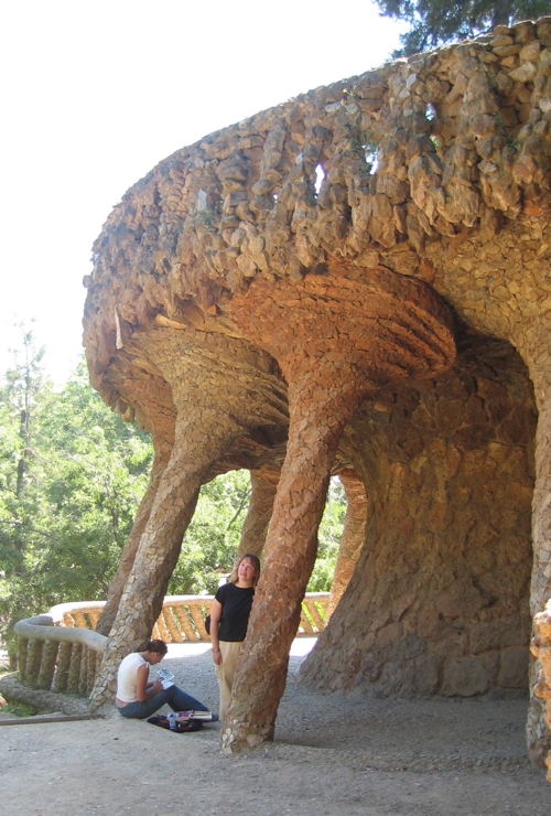
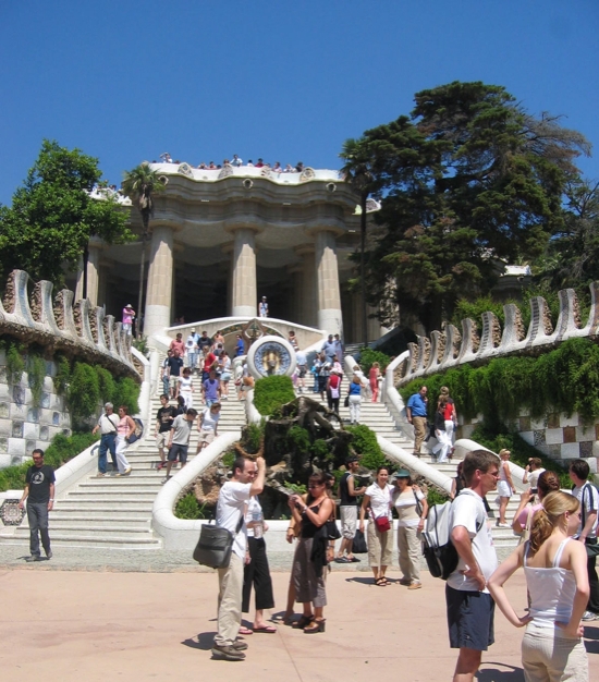
Being first time visitors to the city, we did our part to take in Gaudi and the other Modernist architects. Our first morning, we headed straight for Parc Guell, Gaudi's attempt at an upper-middle class garden city (which failed, and was turned into a public park).
Tourists visiting Parc Guell will be tempted to take the subway and then walk. Let me discourage this. We did it, and the walk is a) not brief, b) mostly up hill and c) has you enter at the least appealing part of the park. If I were to go back, I'd take a cab. Taxis are very affordable, and a trip up to the Parc probably would run you about 4 Euros.
Right angles? Bah!
Near the entrance to the park. I'm helping some other travelers get a photo taken.
One of the park's niftiest attractions is the Gaudi House, where he lived for the last 20 or so years of his life. It's set up as a kind of museum, and is a marvel of architecture and interior design in the modernist/art nouveau mold.
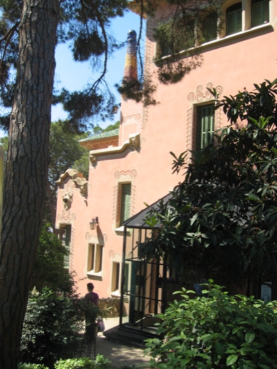
The exterior. Click to make bigger and see the detail.
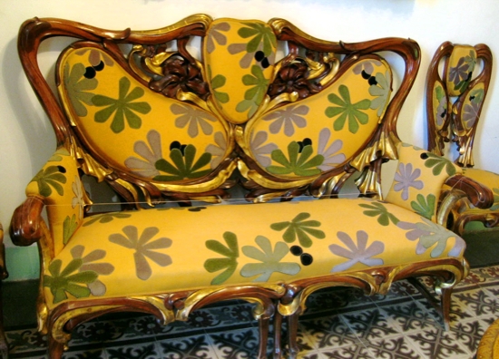
Inside, there's lots of nifty furniture.
Flowery couch
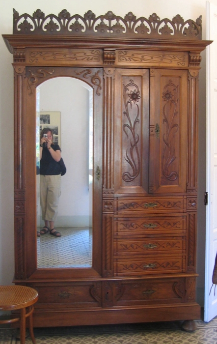
That would look very nice in my bedroom
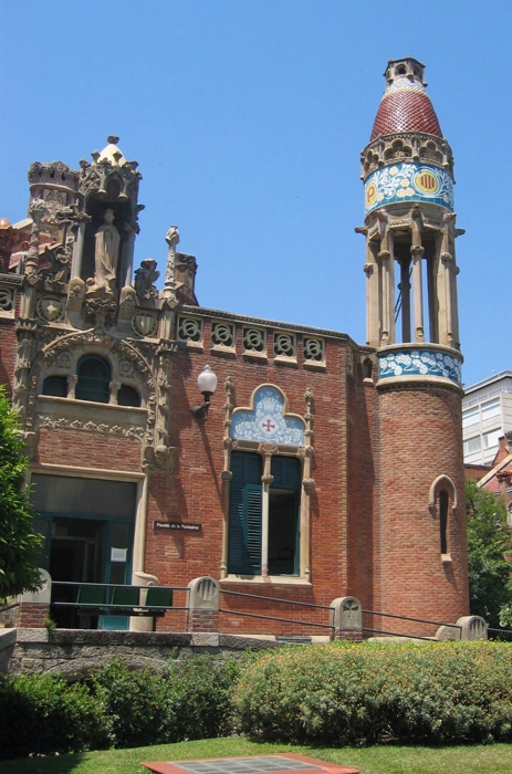
After Parc Guell, we made our way to the Hospital de Sant Pau, a remarkable Modernist architecture experience. The architect's idea was that patients would recover more quickly in a beautiful place -- a marked departure from typical hospital design. It's a stunning public work.
Hospital Building
Column thingy
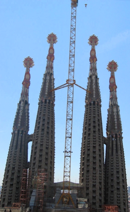
A short walk from the hospital is Sagrada Familia, what is considered Gaudi's monumental masterwork.
Spires atop the cathedral. "Excelsis" and "Hosanna" visible in the spires.

The temple is awesome. As our guidebook noted, If You're Going To See One Thing In Barcelona, this is it. A dizzying, delightful work. I was particularly taken with the Passion Facade - a set of sculptures depicting Christ's death and ascension. The work of Subirachs, these scultptures are so unexpected that they really drew me in. The blocky shape of the figures is at first shocking, and then their beauty and power become clear.
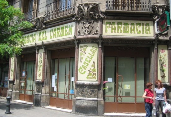
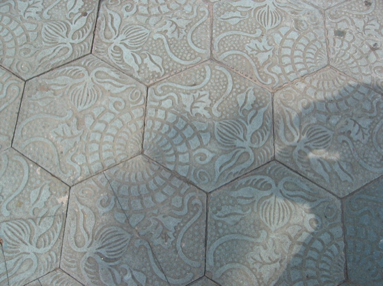
Just thought it was wild that Art Nouveau is everywhere
One of our favorite aspects of Barcelona was learning about its origins as the Roman City of Barcino. We visited the Museu d' Historia de la Ciutat, which is set atop an archaeological site that you get to wander through. The amount of 4th century roman stuff that's preserved is remarkably -- you wander around this city, through the wine and fish factories. You can't take photos of the site, but that's okay, because Roman ruins still stand in right in the city.
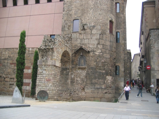
Barcino was a walled city, and some of those walls remain, 1800 years later. It's fascinating that they remain the center of the city, and that their presence affected the development around them.
Roman sandstone walls incorporated into later buildings. I think that arch had an aqueduct above it.
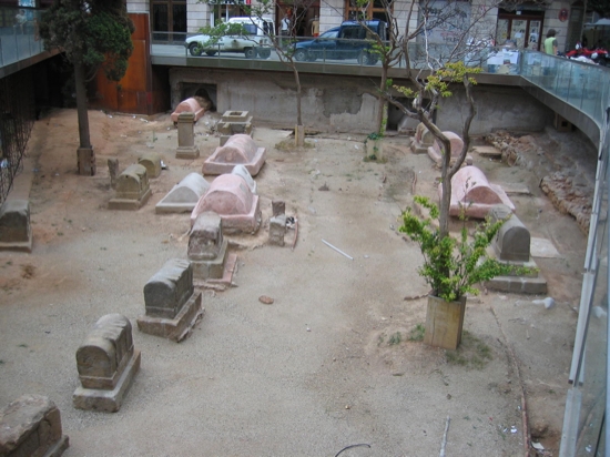
An old roman gravesite, with ...

And now, for some other stuff.
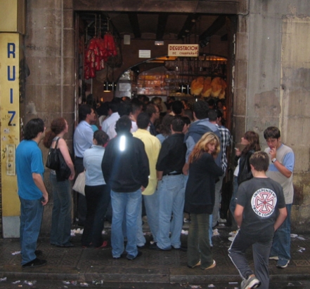
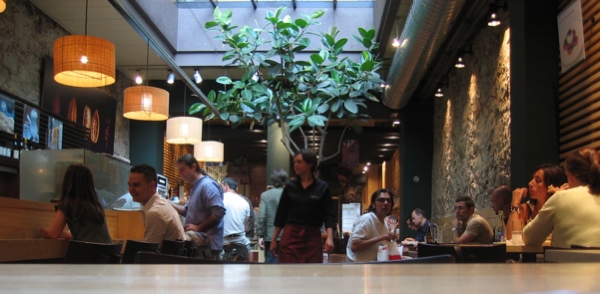
An exceedingly popular cava bar, where people are pressed together like sardines. I couldn't imagine why anyone would go in there.
 Click to Enlarge. This is George Orwell Square (as noted on the left), which makes the sign to the right all the more ironic.
That's it for photos.
July 03, 2004
A Few Days in the Pyrenees
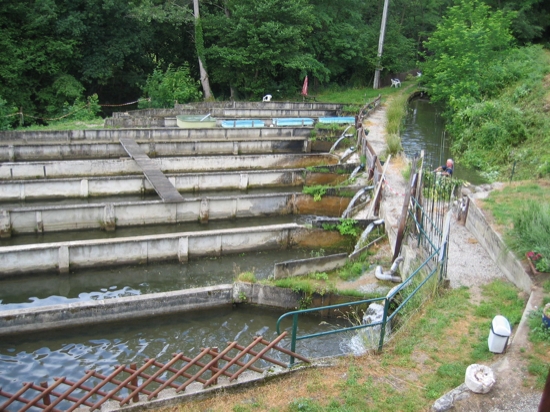
The mellowest, and possibly most delightful, part of our European tour were the few days we spent in Foix, a little town in the Midi-Pyrenees, about 50 km south of Toulouse. Our attraction to this region had two main causes: 1) paleolithic cave paintings (at Niaux), and 2) Cathar castles. We ended up specifically in Foix because, looking for lodging in the area, we stumbled upon the website for Pisciculture de l'Arget, a bed and breakfast that also happens to be a trout farm -- and she loves the fish.
Lodging
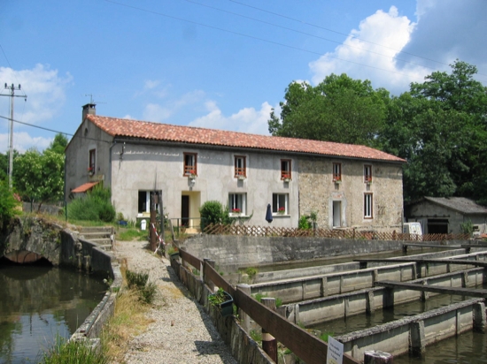
The chambres de l'Arget. Our room spanned pretty much the entire second floor facing this side.
The choice proved excellent. Corinne and Patrick run the place, and are excellent hosts. We were given "La tahitienne" (scroll down), a huge room with a huge bath. Among the first things we did was take deliriously lengthy soaks in the tub. This was what we saw when we looked out the window:
All this space and comfort, for only 45 Euros a night. The only cheaper lodging we had on this trip was in the hostel in Barcelona. It's one of the nicest things about the Ariege-Pyrenees region -- it's not overrun with tourists, so prices are reasonable!
For an additional 15 Euros for each of us, we ate at Pisciculture, where we had tasty dishes that utilized trout in ways you've never thought of. My favorite: the trout carpaccio appetizer (essentially trout sushi). Yum!
Prehistory
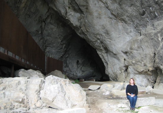
Okay, so we didn't spend all of our time at the lodging. (Not that that would have been a bad thing). Our first excursion was to la grotte de Niaux, the site of 15,000-year-old cave paintings, and one of the few that allows visitors inside. At 13h00 every day in the on-season they have an English-language tour. It cost about 10 Euros. We were the only North Americans -- the bulk of the people were German, and there were a few Brits. The entrance:
You then walk in about 800 meters, led only by your provided flashlights, until you reach Salon Noir, the Black Room, which has, well, 15,000-year-old drawings of bison and horses and ibexes. You can't photograph inside the cave, so you'll have to make due with the pictures on the site linked earlier. Though, that page doesn't include our favorite painting, the smiling horse:

Image stolen from here.
Making your way into the cave is a transformative experience. You wonder just what on earth lead these prehistoric peoples to explore so deeply into the rock, especially since their illumination technology was even more primitive. And why so deep? Were they hiding something? Protecting themselves? Or was it just not such a big deal?
And that link that you're given to the past, through these drawings... You so want to touch them, just so you can connect to these predecessors.
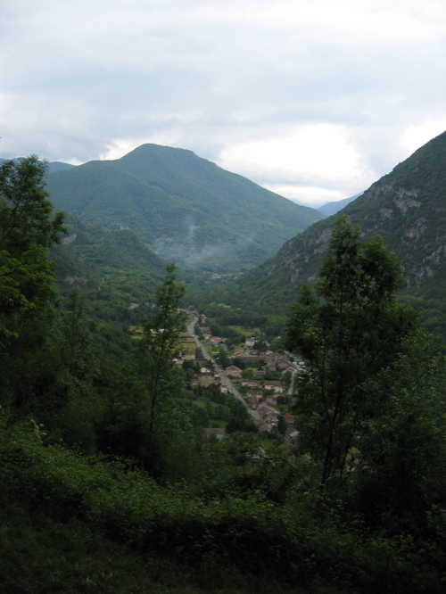
After you've traveled forward in time and emerged from the cave, this is the view you get:
What's most distressing about this image is that such views are pretty much dime a dozen around here. Cute little villages nestled in verdant hilly areas. (The red tiled roofs are the buildings in the little town of Niaux.)
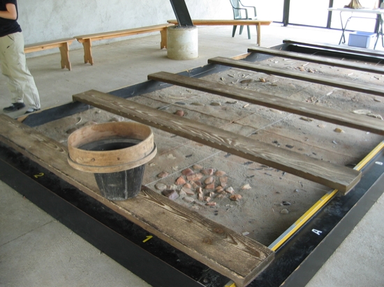
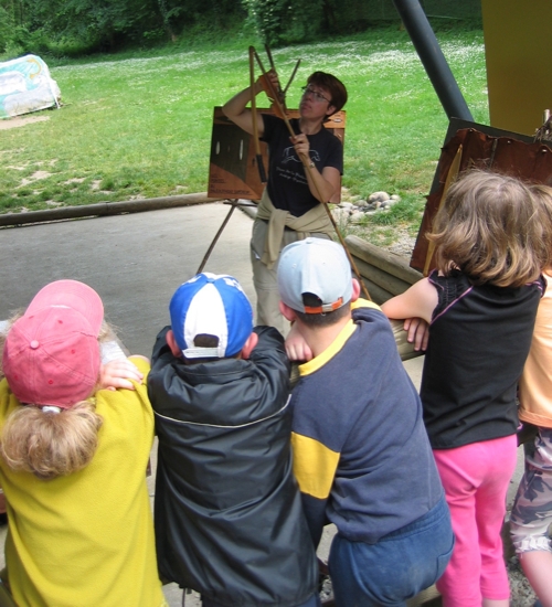
We remained firmly rooted in prehistory by following our cave excursion with a trip to Parc de l'Art Prehistorique. It's a remarkably well-planned museum/park thing focused on things like cave paintings. The park has a path that leads you through a variety of experiences:
how archaeologists work:
demonstrations of spear-throwing (a favorite with the kiddies!):
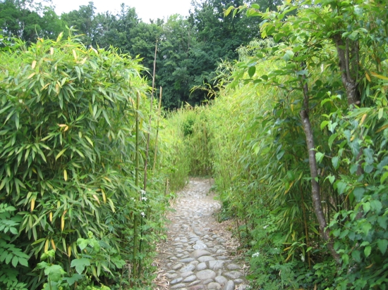
and my favorite, the Labyrinth of Sounds:
This is an entrance into the Labyrinth. You stroll these paths through this growth, accompanied by a variety of wildlife sounds meant to evoke life back in the day. A simple, but really effective, immersion.
Montsegur
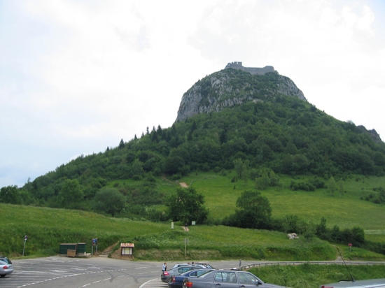
Our other big excursion (the following day) was to Montsegur, the last stronghold of the Cathars.
Arriving at Montsegur, you park in a lot at the foot of the mountain. You then hike up for about 20-30 minutes to reach the castle.
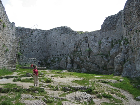
A view from inside the castle. It's seen better days.
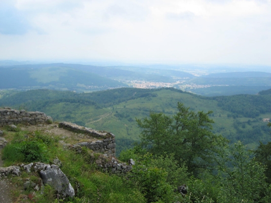
Looking down at Lavelanet, the nearest biggish town.
Frankly, and this might upset the Board of Tourisme of Ariege-Pyrenees, I found Montsegur disappointing. It's really just a set of ruins high up on a hill. Not much to see. There's no attempt to interpret or situate yourself within the historical context.
The Town of Foix
Surprisingly, we stayed in Foix, yet we didn't do the one thing everyone else does when you visit Foix - go to Chateau de Foix, the big castle in the middle of town. Frankly, it didn't even occur to us.
Foix is an adorable medieval town, which means lots of little twisty turny streets and really old buildings. Sadly, they allow automobiles down these sinewy paths, which means you're constantly dodging cars.
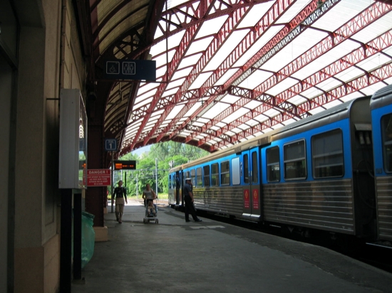
We arrived by train from Toulouse:
We then walked about a kilometer into town (we didn't realize that we could have taken the Navette, a little bus line.):
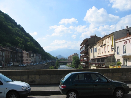
Crossing the river, entering the heart of the old town.
If, like us, you don't quite know what you're doing, head straight for the Office of Tourism ("cliquez ici"! ha!), which is very centrally located. We found them very helpful.
We rented a car from a Hertz on the Peysales. Our three days of rental totalled around 155 Euros, including hefty taxes and, I think, insurance. Not too bad. We did learn that you want to plan your car rental in advance -- it took us a long time to find a reasonable rate day of.
Our one meal in town was at "Le Mediéval", a moderately fancy restaurant. Upon seating, Stacy showed me her menu -- which, unlike mine, didn't show prices. We both ordered prix fixe, and were pleased (though not knocked out). It was one of those restaurants where you get little mini courses in between the normal courses. I also had a hockey-puck-sized entrée of foie gras, which proved to be too much -- I felt ill the next day, and I know that was the reason why.
Conclusion
I love the Ariege-Pyrenees region. A future trip of mine will be a road trip, starting at the eastern end of the Pyrenees, and heading west toward Basque country. Along the way, a variety of stops in little villages, at cave sites, and for day hikes in the mountains. A guide book at the B&B showed all these delightful "randonnées" that take you from village to village nestled in the mountains. This region isn't overrun with people, so it sounds most blissful.
