November 29, 2004
Examples of Interaction Design and What's Interesting About Them: #1 In a Series
A couple weeks ago, a friend and I were asked to present on the subject of interaction design. The audience needed primer material. We started out the presentation by walking through some examples of web-based interaction design and explanations as to why they were interesting.
I thought I'd share a few.
Booking Reservations at the Broadmoor. A Flash-based interface that lets you choose dates, pick rooms, and submit payment information all on one-screen.
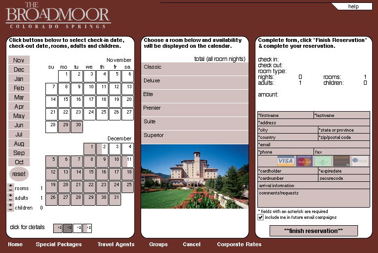
Why it's interesting:
1. Visitors determine order of importance -- date and then room, or room and then date?
2. You see the ramifications of your choices immediately -- if you want these dates, then you won't get these rooms.
3. You cannot "finish reservation" without having filled everything in -- it doesn't require a trip to the server to receive an error message. This pretty much prevents that error
Is it perfect? No. The color-coding of dates is non-intuitive, adding people or rooms is a bit of a kludge, and it features a dreaded "info-slit" below the picture of the room (only a few lines of text visible, requiring a lot of scrolling).
Still, this site is the best of its kind out there, at least that I know. It's also a couple years old, and as an example is getting hoary... Except that no one (apart from iHotelier's other clients) seems to have followed suit, if my experiences booking airfares and hotel reservations is at all typical. Why aren't we seeing more of this?
Oahspe -- The product of too much nitrous?
She pointed me to this image:

The title page to Oahspe, a sacred text written by a dentist, and credit for the first use of the word "star-ship."
