July 31, 2006
Remember this name: Aaron Koblin
This afternoon I attended the Yahoo Design Expo, a collection of projects from students engaged in new media/media arts/interaction design at various universities.
Most of the exhibits were interesting, but only one presenter really shone through as One to Watch: Aaron Koblin. A student at UCLA, he showed two works that demonstrated amazing promise:
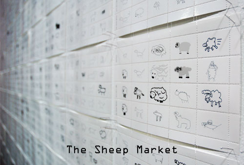
The Sheep Market - exploiting Amazon's Mechanical Turk, he collected 10,000 drawings of "sheep facing left." It's silly, weird, and brilliant.
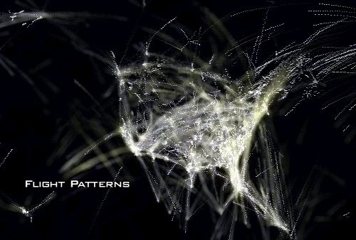
Flight Patterns - using FAA data about a single day's set of flights, Aaron generated a visualization of airplane movement that is reminiscent of Stamen's Cabspotting -- though on a much larger scale.
Make sure to download the large Quicktime movie, "Overview Documentation". So good.
July 30, 2006
Completed my conversation with Michael Bierut
You can read the third (and final) part of my conversation with Michael Bierut on the Adaptive Path site. It's a nice little capper of our discussion.
You'll also see a teaser from Michael on what he plans on discussing at User Experience Week. And, if you didn't know already, you can buy single-day passes to UX Week, so if you just want to see Michael (or you just want to see Steven Johnson, or Jeffrey Veen), you can do that. Just don't forget to use promotional code FOPM to get 15% off.
Tufte's Beautiful Evidence, Chapter 3: Links and Causal Arrows: Ambiguity in Action
Welcome to my thoughts on chapter 3 of Tufte's Beautiful Evidence. If you haven't yet, you can read what I thought of Chapters 1 and 2.
As an information architect and interaction designer, I've had my share of trafficking in boxes and arrows -- diagrams of schemes, systems, processes, and flows, commonly depicted as elements connected through lines. So it was with great anticipation that I approached the third chapter, which begins with this diagram:

The chapter gets off to a good start, with this informative diagram, and Tufte serves the reader well in his assessment of its strengths and weaknesses. The primary thrust of this chapter is that linking elements in diagrams, typically represented as lines or arrows, are too often ambiguous in meaning; or, even worse, different links in a diagram, which might appear identical, might have different meaning (i.e., one line might mean "influenced by" as you see in the diagram above, while another line might mean simply "related to", etc. etc.)
The chapter starts losing focus when showcasing Ad Reinhardt's brilliant cartoon "How to Look at Modern Art in America." In part because, though a fun illustration, the cartoon has very little to do with the thrust of Tufte's thesis. Also, because I think Tufte takes the drawing too seriously, seeing it as a weighty condemnation of certain art practices. I find it hard to discern Reinhardt's specific point of view, but in some ways that doesn't matter. It's a cartoon. Enjoy it as such.
The Mark Lombardi drawing brings Tufte back on focus, but sadly he spends only half a page on his work. Yet Lombardi, and the influence he draws from, the sociogram, showcase an essential expression of the link and causal arrow -- how people are connected to one another through various relationships. (Also think: family trees, or, if you want to get more involved, anthropological kinship diagrams.)
Such diagrams are pretty easy for people to appreciate, yet Tufte doesn't use these kinds of diagrams to dig into his analysis. Instead, he goes on about cladograms (which depict evolutionary development), Feynman diagrams, and Italian drawings from the 15th and 16th Century. It's as if he's purposefully obfuscatory -- perhaps with some desire to deonstrate his breadth? I mean, the horsey made all up of annotated lines is, frankly, a useless illustration. And yet it gets two full pages devoted to it.
The one exception to this is the diagram depicting the spread of SARS, which Tufte rightly displays as an exemplar, even though it's "design" is *extremely* basic.

I found this chapter to be perhaps the most disappointing so far, because it's a subject so close to my interests. Whether website architecture diagrams, social network diagrams, or conceptual models like mind maps, boxes and circles connected by various lines is a fundamental tool in the strategic designer's box.
Thinking of links and causal arrows brings me to a conceptual model Jesse and I developed for a client, a bank. Here is one small section of the model (which has links to other parts that you'll just have to ignore).
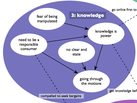
We called this the thematic model, because it addressed themes that emerged from our user research observations. What for me was interesting about this bubble was the story it told:
People, when acquiring financial products and services (like checking accounts, loans, etc.), have a fear of being manipulated. That leads them to seek knowledge, because knowledge is power. They also have a sense of what it means to be a responsible consumer, which means to compare options across providers. The thing is, these folks were unable to articulate an end state (the precise product and service, with its fees, percentages, etc.), and when you combined these three concepts, you ended up with someone who, when shopping for financial products, just goes through the motions.
Now, what Tufte would point out, and I think he'd be right, is that our arrows are woefully ambiguous. The drawing requires explanation -- it is in no way self-evident, and a legend wouldn't help, because all the lines look the same. BUT, and I think this is important, I can think of no more a compact way of presenting this finding of ours, and I think the visual does compel.
Anyway, Tufte really only scratches the surface of the discussion here, getting distracted by diagrams either too technical or too archaic to be of general use. Maybe Dan's book can help those us needing more applicable examples?
July 27, 2006
Why Joel Kotkin is Full of It
Joel Kotkin is an urban theorist who loves to flout urban conventional wisdom by supporting suburbs and the rise of new cities like Phoenix.
His primary argument seems to be, "If people want to move there, Why not let them?"
And a good reason to at least call into question this flight of people to places like Phoenix is because the growth of cities in the middle of nowhere is that it can have a deleterious effect on the environment, as this Chronicle article illustrates.
The article discusses a housing boom in California's Central Valley because land is cheap. However, developing in these hot inland regions means developing under the assumption that people will be living air-conditioned lives, which is an enormous contributor to energy consumption. And, thus, a contributor both or our rolling blackouts, and to the greenhouse gases that are causing global warming.
Joel doesn't seem to care about these second and third order effects, which has always upset me. Residents of these towns should be taxed in ways that reflect the true cost of their living there... Then we'll see just how quickly they flock there.
Those taxes wouldn't just address issues like energy consumption, but health as well -- residents of a hot inland city are bound to be more sedentary (who wants to go out in that heat?) and thus have all kinds of medical concerns.
It's not just a matter of giving people what they want. It never is. People living in the Central Valley, or places like Phoenix, are an enormous drain, requiring more energy, greater fossil fuel consumption to supply them with resources, water needing to be brought in from ever-farther distances, etc. etc. And the problems that arise from this drain are not located only in those cities, but shared with everyone. Shouldn't residents of those cities contribute more to offset the harm they're causing?
July 24, 2006
Fujita-san
Stacy, because this is the kind of thing she does, has been digging into the history of the house in which we live. Among the things we've found out is that it was built in 1905, and has the identical floor plan, albeit in mirror image, to the house right next door.
A couple days ago she came to me with a print out of this database record. It turns out the subject of that record, Santaro Fujita, lived in our house in 1942 (though we don't know if he rented or owned.)
What will sadly not surprise you, if you connect a Japanese name and the year 1942, is that the record is evidence of his relocation that year to the Central Utah Relocation Center, but not before being housed at the race track in Tanforan (San Bruno, California). As in, horse stalls converted to barracks. (You can download a Powerpoint presentation featuring photos of Tanforan.)
Look again at that record. That such a reductive, factual presentation of data can stir up such sadness is a bit shocking. Fujita-san was no recent emigre. At the time of his relocation, he was nearly 60 years old, having lived in the United States over 40 years. The idea that our government considered him in any way a threat is dismaying to a remarkable degree.
Fujita-san was married to Toyo. She was relocated along with him. She was ten years younger, and had been in America for under 30 years.
I'm having trouble uncovering much on the Japanese community in Berkeley before World War II, but there's some mention of the relocation situation in Chapter 7 of Berkeley, A City in History.
Though deeply saddening, I must say I'm looking forward to what else Stacy uncovers that allows me to connect my current situation with that of the past.
[[I forgot in my original posting to add this. The Social Security Death Index shows that Santaro Fujita lived to be 90 years old, dying in Los Gatos, CA.]]
July 20, 2006
JJG and SBJ - Interface Culture 9 Years Later
Wow. The discussion between my colleague Jesse and Steven Johnson is stunning. I was a little jealous that I didn't get to converse with Steven, but after reading this, I'm now thankful -- Jesse addressed things I wouldn't have considered, and uncovered interesting ideas that I wouldn't have found.
Steven, of course, is the day 1 keynoter for Adaptive Path's User Experience Week conference happening next month. We're now allowing single day pricing, so if you just want to go to Steven's day (or Michael Bierut's, of Jeffrey Veen's), you can do that. Use promotional code FOPM and get 15% off your registration!
Tufte's Beautiful Evidence, Chapter 2
Earlier this month, I wrote an at-times-savage review of the introduction and first chapter of Edward Tufte's new book, Beautiful Evidence. I write that critically because I hold Tufte to very high expectations -- if only because he considers himself a critic of the highest order.
Chapter 2 is markedly different from Chapter 1 in that it is actually and believably brilliant. Titled "Sparklines: Intense, Simple Word-Sized Graphics," it provides detailed presentation of a new form of information visualization that can be embedded in the flow of text.
Something fascinating about this chapter is how I knew everything to expect, because Tufte wrote this chapter very much in public. Over two years ago I wrote about an early discussion of sparklines. And Tufte's discussion boards are filled with commentary and examples dating back to mid-2004.
Sparklines are a brilliant and seemingly inevitable innovation in the display of data with text. The degree to which it can enhance understanding, particularly of anything statistical, is enormous.
I do find some of the illustrations needlessly obtuse (the human genome, 3D scatterplot). And the inclusion of another Durer drawing seems less about intense, simple word-sized graphics than about showing off his appreciation of fine art.
But my primary frustration is Tufte's continuing dismissal of computer screens in favor of high-quality printed paper. Sparklines, as I wrote back in 2004, seem ideal for computer displays -- with their ability for color, animation, and, most important, interaction, just as much, if not more, information can be presented on screen than on print. Unfortunately, when Tufte sees a computer, he seems to see a static medium, and so doesn't recognize the power. Hans Rosling's displays at TED demonstrate that animation over a single screen can provide a far more instructive experience than seeing the information displayed over small multiples.
July 18, 2006
Animation from the Great White North
A long long time ago, when a student at UC Berkeley, I volunteered for the organization that brought movies to campus. A perk of that role was the ability to get paid Real Cash Money to work the annual Spike and Mike Festival of Animation, which, in the early 90s, was still pretty obscure, and little known beyond college campuses.
I saw a bunch of groundbreaking shorts this way -- the original Beavis and Butthead short "Frog Baseball", Milton, Lupo the Butcher, Mutilator, Bambi meets Godzilla, and the like.
Among the favorites were two shorts that, even then, I noticed were funded by the National Film Board of Canada. Imagine! A federal government giving money to make cartoons!
Now, The National Film Board has just released 50 shorts for viewing online, including those two: The Big Snit (a husband-and-wife Scrabble game goes awry), and The Cat Came Back (a deliriously frustrating cartoon for cat haters).
These are both movies that, because I worked the shows, I saw literally dozens of times. And they're still funny.
What I've been up to - conferences edition
The blog has been quiet... Some stuff is brewing.

There's an official website for the IDEA 2006 conference I'm organizing.
Speaking of conferences, I've been invited to speak at SHIFT (Social and Human Ideas for Technology), taking place at the end of September in Lisbon, Portugal. I've never been to Portugal!
And, of course, I'm still working to make Adaptive Path's 2006 UX Week event the best ever. If you hadn't been told, we're now offering single-day pricing. Sign up, and use promotional code FOPM for a 15% discount!
And then come November, I'm headed to Chile to attend an IA Retreat and the first Latin American IA conference.
July 10, 2006
TED Talks; People Listen
I finally got around to listening to the posted talks from the 2006 TED Conference. They made their way to the internet in no small thanks to June Cohen, an old friend who is now involved with organizing the TED conference (is that a dream job or what?) and is trying to get the TED message out to the broader world. (TED has been somewhat famously cloistered, and I give June many many props for trying to open up that discussion.)
Now, I listened to the talks (instead of watching them). They struck me as perfect iPod fodder. My guess is that listening has lead me to have a different reaction than those who watched them, judging by my quick browse through Technorati's pointers to other blog posts.
For one thing, among the most lauded talks in the blogosphere is Sir Ken Robinson's discussion of education and creativity. Frankly, I found the talk insufferable (as in: I didn't finish it). Ken seems very enamored of his wit, which he displays at length, taking the longest time to get to any point. And the point he does have, that standard educational practices stifle creativity and innovation, is not particularly novel, and he doesn't really offer much by way of insight as to how to address it.
The speaker that most surprised me was Tony Robbins. I am familiar with him only from his infomercials. That chin. Those teeth. That hair. I've always thought the he looked like a genetic experiment gone awry--an assemblage of the perfect elements of a human face which, when brought together, look grotesque.

So, I figured he peddled soft-serve self-help for a Woe Is Me generation. His talk, though, was remarkably good. What wasn't surprising was his delivery -- he compels you to listen, and has a lot of charm and confidence. What was surprising was the content -- Tony Robbins is, essentially, an existentialist. He makes it clear that what he believes is important in life is simply this: making decisions. "Decision is the ultimately power." He also even dabbles into Zen - encouraging folks to let go of the past and focus on the now. And before he finishes he lays out some pretty clear concepts on a set of discrete needs that people have (though people have different weights behind those needs).
Oh, and he uses profanity. A few bullshits and a fuck. Which I found oddly refreshing, given the stuffy context of TED.
Anyway, his is well worth a listen.
Al Gore's talk is pretty good. It's very much about showing us 'human Al' -- he tells post-2000 stories of humility that we can all chuckle at. He also provides some "duh" advice as to how we can help address our climate crisis.
David Pogue's talk, while quite funny (it's filled with Broadway-esque musicals about technology and the woes of "tech support"), struck me as remarkably rudimentary for the TED crowd. I wouldn't be comfortable having him give such a talk at Adaptive Path's UX Week event -- I would fear it would be an insult to our attendees! So, listen for the humor, but don't expect to learn much beyond, "our products need to be simpler."
I don't have much to say about Majora Carter's talk other than I didn't get much out of it. She's clearly speaking from personal passion and experience, and Sustainable South Bronx is doubtless a worthwhile cause, but, again, I didn't take away anything meaningful.
Hans Rosling's one talk I didn't listen to, because they haven't released it on MP3. So I watched the video, which demonstrated very quickly why they haven't offered the audio - it's meaningless without the (stunning) visuals of demographic data moving across charts over time. Hans is passionate about merging design with data in order to help people better understand what is going on in their world.
July 09, 2006
Thoughts on reading Tufte's Beautiful Evidence: Intro and Chapter 1
"The principles of analytical design are universal--like mathematics, the laws of Nature, the deep structure of language--and are not tied to any particular language, culture, style, century, gender, or technology of information display." (Page 10)
Wow. that's an inauspicious beginning. I'm shocked that Tufte is so myopic not to realize this passage is full of shit. And, more importantly, that it's a claim he cannot back up. He tries to with what follows ("our examples come from 14 centuries, 16 countries...3 planets, and the innumerable stars." Not only does he conflate the provenance of the illustrations with the subject (I don't think any creatures from planets other than earth drew what is in the book), this "evidence" of universality is laughable, and seems like a desperate attempt at legitimacy. Tufte -- you're a smart guy, and you have interesting points to make, and those of us reading the book are likely to agree that appropriate information design is valuable. Why puff it up with this foolishness about "universality"?
Anyway, on to the show...
Page 18 features an geometric illustration by Durer and page 19 a drawing by Mersenne of stringed instruments annotated with numbers and letters. Tufte lauds both as remarkable examples of "mapping." I can't figure out the point, or the message, of either. The Durer drawing seems like a geometric abstraction almost for the sake of it. The Mersenne is the most frustrating -- a collection of numbers and letters that one assumes have some connection, but is not *evident* from the illustration itself.
Universal, my ass.
It's not until page 22 and 23 that we get the first excellent example of what Tufte is describing. Chillingly, it's an illustration of men and women packed shoulder to shoulder on a slave ship.
Tufte's talk of universality is once again challenged by the diagrammatic deconstructions of Cezanne's work on pages 24 and 25. After much staring, I finally got the perspective diagrams explained on page 24. Page 25's "picture boxes" are still a mystery to me.
I'm a fan of Hockney's attempts at capturing how great classic artists painted pictures of such precision and detail, so I'm a sucker for the reference on page 28.
I will have to take Tufte's word that the drawings of counter-dancing on pages 32 and 33 helpfully depict how to engage in this activity. After a few drawings in, I'm lost as to which dancer is where, and what they are supposed to be doing.
It actually ended up raising what for me became a significant question -- yes, these drawings compel with their aesthetics and diagrammatics, but are they really the best way to communicate this information?
Tufte, you see, presumes the printed page as the tool for explanation. My tendency to question assumptions leads me to wonder -- shouldn't people learn counter-dancing by counter-dancing? Viewing drawings is going to help how? *Maybe* after you've taken some lessons and need a referent... But then, these drawings are no longer "universal," because they require having engaged in the action, to have *embodied* the action, to understand this "evidence."
This became particularly acute when viewing the admittedly beautiful annotated photographs on 36-39, "How to Ski by the French Method." The photography and typography are stellar, and make for a fun read.
But did anyone ever learn "how to ski by the French Method" by reading this book?
In the introduction, Tufte asserts that it is difficult "to identify what place or time this book is from," lauding the timelessness and placeness of his examples. And then on page 43 he shows a picture of his doggies, overlaid with white Gill Sans, and this book very firmly is placed in the mid-2000s (by the typography and style of the image) in Tufte's backyard.
So, while Tufte makes some good points that images should be mapped in order to provide greater understanding (by, say, juxtaposing photos of planets with the earth to provide scale, or providing rulers in drawings), frankly, it feels like there's a lot of filler in this first chapter. I hope this isn't indicative of the book as a whole.
Check Your Irony at the Door
In San Francisco, I know of two totems of kitsch whose power is so great, it renders any attempt at ironic detachment or sarcasm moot. One is the Tonga Room in the Fairmont Hotel -- once you see the lightning and rain shower while a mediocre band warbles 80s-era classics, you have no choice but to succumb.
The other is Beach Blanket Babylon, which I saw last week as part of a blogger press corps event. (Which means that, yes, I got to see it free).
Beach Blanket Babylon is a comic musical revue that has been running in North Beach for the last 30 years. The show's material is continually updated with the times (so we get Dick Cheney shooting people in the face, Brokeback Mountain, and the like).
Most people I know have very little knowledge of the show, and if they do know anything about it, it's the totally overdone headdresses that performers wear as part of various costumes. Frankly, those headdresses are pretty much worth the price of admission, especially the San Francisco Skyline, which has been updated to include the new de Young.
By it's nature, the show is a mixed bag. Gag after gag is thrown at the audience. Some of it works, some doesn't. You have to applaud the show's producers for their their willingness to create rather involved 5-15 second gags that have nothing to do with anything. It's almost like a game of word association at times--someone remarks about how they want to find a younger man, the curtain goes up, we see "Demi Moore", and then "Ashton Kutcher" comes riding out on a tricycle, does a loop of the stage, returns to Demi, the curtain closes, and we move on. It's remarkably appropriate to the short-attention-span culture we live in, and must be quite costly to put on!
My favorite of these associations was when a performer says "darkness," the curtain opens up, and we see a PG&E worker, who begins to sing "Hello darkness my old friend..." as a blackout occurs. I only wish BBB had more Bay Area humor. When I last saw it (10 years ago) I remember a fairly involved bit with Da Mayor at the time, Willie Brown. Sadly, Gavin Newsom doesn't warrant a caricature, though he does get namechecked in a song referencing gay marriage.
Speaking of politics, what doesn't work is the increasingly dated political humor. Too much time is spent making fun of Theresa Heinz Kerry, which can only be explained by the show's producers wanting to get as much mileage as possible out of the ketchup bottle that she's in. Unfortunately, the set piece around that gag feels, well, lame.
It's also disappointing that they use no music made since, oh, 2000, and the bulk of the tunes are hoary chestnuts from the 60s. Perhaps that appeals to the decidedly boomer crowd that was in attendance (if you removed the blogger press corps from the audience, the average age was probably about 50), but it gives the production a tired feeling. I would think that contemporary pop songs like "Hey Ya" would fit perfectly and provide some freshness.
The fundamental question is, is it worth the price of admission? Well, you do get a *lot* of material, and quite a number of laughs, and even a few wide-eyed open-mouthed stares at the amazing hats, so it's definitely worth something. Personally, I'd say something in the $45 area (and you can pay up to nearly $80 for some seats some nights). It's could definitely be part of a fun evening out in North Beach, a perfectly good date, or perhaps something to do with friends in from out of town. You'll definitely walk out feeling good, and probably humming to yourself the song with which they close...
San Francisco, open your golden gate
You let no stranger wait outside your door.
San Francisco, here is your wandering one
Saying I'll wander no more.
Other places only make me love you best,
Tell me you're the heart of all the golden west.
San Francisco, welcome me home again;
I'm coming home to go roaming no more.
