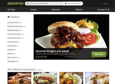
This morning, Groupon announced to the world it’s new site design. You might have seen it already (we ‘tested in’ to it over the past few weeks), but as of today, every visitor to Groupon.com will see what we internally have referred to as Prom Night (because it’s about growing up, but still having fun). Gone is the sea of “Groupon Green” and design with faux depth, gone is Arial (at least on modern browsers). In it’s place we’ve got a cleaner, more elegant and understated aesthetic, a little flatter (though not purposefully “flat” design”), and enhanced typography thanks to Open Sans.

Additionally, there’s a host of new features:
- A proper homepage, which we’ve never had before, to start you on your way
- A navigation-bar with sitewide search (with auto-suggest) and easy access to site subcategories
- A filter rail to empower browsers to find deals of specific interest to them (getting this to work right was probably our greatest interface design challenge, and I’m sure we haven’t fully solved it)
There’s more coming, and, as always with these kinds of launches, plenty to clean up.
I am immensely proud of the design team at Groupon — this is the culmination of 7-8 months of focused, day-in and day-out work. One thing I’ve learned is that delivering great design has very little to do with process, and very much to do with persistence — constantly pushing to ensure we launch something great, and never satisfied with a simply ‘workable’ solution. We now have a site design that we can point to with pride, and, more importantly, built a foundation upon which we can improve.