[There will be 3 highlights posts]
Last week I attended the inaugural HITS (Humans Interaction Technology Strategy) conference, sponsored by IIT’s Institute of Design. An attempt to bridge the worlds of Design and Business, it offered a lot of food for thought. There was no ability for real-time blogging (the conference took place in a remarkably unwired venue), so here are some notes after the fact.
On the first day, we were treated to a couple of cold water presentations, one by Tom MacTavish from Motorola, and another by Jim Euchner from Pitney Bowes. I call them “cold water” because their diehard business perspective was an awakening splash in the face. Also, both utilized the ugliest PowerPoint templates you’ll ever seen in a conference sponsored by a design school.
Tom’s talk was a no-nonsense look at understanding business and technology[244k PDF], with clues as to how to get the most out of your organization, and how to read financial statements.
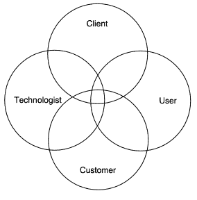
Jim’s talk was more about the reorganization of teams in order to better encourage product design that succeeds. Jim had two four-circle Venn diagrams that I liked.
The first diagram was of the human elements that go into product design. Ideally, you have them all converge to produce the best work:

(“Technologist” can be thought of as the engineer/designer, client is the internal business owner, customer is the person who buys the technology, and user is the person who will use it. Oftentimes in enterprises, the customer and the user are different people.)
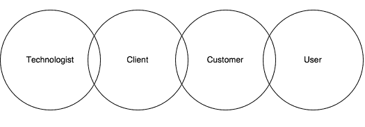
He pointed out, though, that the reality is that the rings don’t overlap, but get pulled to form a chain…

The client and customer serve as intermediaries in a chain between the technologist and the user. Such an arrangement hampers success, as it resembles the child’s game “Telephone,” where the fidelity of the message degrades as it passes from person to person.
I loved the idea of pulling the rings from that idealized Venn diagram to form a truer representation of how these things really work.
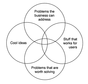
Another diagram of his also had four rings:

I liked this because it intelligently extends the more typical Venn diagram of feasibility/viability/desirability. It shows that feasibility has two aspects: 1) What we have the technology to build (“Cool ideas”) and 2) What the business is geared to address. It’s not enough to simply address a “problem worth solving” — you also must consider whether your organization has the resources to meaningfully address that problem.
One of the things not mentioned in these first two presentations is ROI. Metrics. Finances. So I raised my hands and asked Tom and Jim about how do we consider the ROI of the design component (as we’re increasingly asked to do these days) and both pointed out that the various parts of the process are so tightly integrated that awarding elements of the ROI to any particular contributor is nearly impossible. (I don’t know if I agree, but I was intrigued that this was the response.)
In all, I was happy to see elemental business questions being addressed so straightforwardly as a way to lead off the day.
Personally, I thought Sam Pitroda’s presentation overshadowed both MacTavish’s and Euchner’s in ugliness. But, I also found Pitroda’s much too generic and out of focus for my liking (perhaps it was the failure of Powerpoint as Tufte bemoans). I also enjoyed Euchner’s points regarding the last diagram you detail. Just my opinion.
hello.
good and interesting theme. imho, breaking the crosslink and turning to a chain drives to a poor product with small usability in the end… it shouldn’t be done.
The last chained ring is, as for me, the key to success.
Interesting topic…
This venn diagram can be a good framework, but it may be slightly simplistic with the term “technologist” and “customer” for some educational models. I find that technologist circle would have to include (SME, ID as well as the multimedia team)– a real challenge getting them all in that circle.
The “customer” and “client” are sometimes morphophed as one — still makes it a useful guide for design/development success.
mike