Being a student-run conference, it makes sense there would be student presentations.
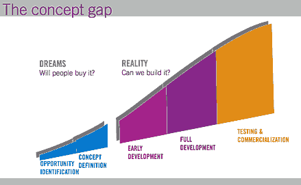
The first student presentation I heard was Michael Winnick’s “Crossing the Other Chasm: The perils of getting concepts into development”. He opened with Geoffrey Moore’s take on the technology adoption life cycle, where a chasm exists between early adopters and getting the product into the mainstream — it’s at this point that many products fail in the market. Michael turned the chasm focus inward…

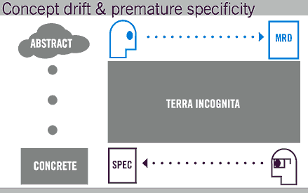
His basic thesis is that if we can successfully cross the product development chasm, we can be more confident that we will cross the technology adoption chasm. He identifies the crux of the problem as a gap between the marketers and the engineers, where the marketers develop a requirements document full of features and great ideas, but the engineers need to develop a specification that precisely labels how the thing will work, and the two are never well reconciled. Marketers need to get more concrete, and engineers more abstract, so they can meet up in the middle and ensure that ideas flow successfully.

Michael works at Gravity Tank, an impressive product research and design firm, and listed 7 steps that they’ve found helpful in navigating these murky waters:
1. Accept change
2. Reduce barriers to actual users
3. Get everybody together
4. Prototype in low fidelity
5. Embody research, don’t report it
6. Make decisions explicitly
7. Validate embodied concepts
The first two are obvious. The third is about getting all members of the team, be they engineers, marketers, business owners, designers, whoever, in the room together, collaborating. The fourth addresses how they can collaborate — give everyone simple tools for prototyping solutions — tap the latent creativity in folks whose lives are mired in Outlook and PowerPoint.
The fifth point resonates with the work we do at Adaptive Path. About the least useful deliverable is the Lengthy Report that Sits On A Shelf. To the degree possible, put your research in action — it will ensure adoption by the developers.
The second student presentation I saw was Dale Wunderlich’s “Teams At Work.” [2.3 MB PDF]. He and his team of students researched the dynamics of meetings, utilizing Edward De Bono’s “Six Thinking Hats” model to develop a color spectrum of participation.

(This graphic is here to tantalize you into downloading the presentation.)
It’s a really impressive piece of work. The team minutely analyzed meetings in order to understand how people “enter” and “exit” the stage, the nature of their contributions, and the effect of the environment. They did so for descriptive, not prescriptive, purposes, though it wouldn’t take much to imagine how this understanding could help guide meetings towards greater productivity.
I just want to add that not only in this presentation, but in all my interactions with ID students, I was very impressed by their skill, savvy, wherewithal, groundedness, rigor, and humility.
[Side note to ID students: Did you know about the Secret Lives of Michael and Dale? It turns out that Michael Winnick is also a CPA, and that Dale Wunderlich has run for office in Alaska.]
Why can’t engineers just be engineers and marketers be marketers? I say let boys be boys and girls be girls and vive le difference. Epicenity is not a creative environment.
And since you like paradigmatic graphs so much I suggest you draw a square around all of your recent representations and then consider what might lie outside the box.
That suggests the danger of diagrams and models: that one begins to believe they represent the only way to look at things. But, no one ever said a few diagrams encompassed the entirety of the universe in a simple four-by-four grid with pretty icons.
They’re a *way* of seeing, and as designers, IAs, or UX afficianados, it’s our job to always see things as many *ways* as possible. One way doesn’t preclude another. You just have to use a different set of eyes.
Your metaphor of the different set of eyes demonstrates my point. We do not see with our eyes, but with our brain. Your comment seems to suggest that we think with our eyes. How come none of these models are framed for our senses of smell, touch, taste, hearing, balance, ease, warmth, etc, etc, etc.?
I’ll tell you why. Because making diagrams is an easy way to depict a simple idea–whether it is relevant, accurate or not.
But I’ll cut to my bottom line on the subject: graphs are cute and cosy, but if you don’t see the flaws inherent in any two dimensional characterization of multi-dimensional problems then you haven’t seen much at all.
“Michael works at Gravity Tank, an impressive product research and design firm”
Pardon me for going on a tangent but my disagreement was so pronounced that I couldn’t help but point it out.
This is what users with screen readers get when they visit Gravity Tank’s website.
Homepage
[USEMAP]
[INLINE] [LINK] [INLINE]
[INLINE]
[LINK]
[LINK]
[LINK]
[LINK]
[LINK]
User Research
[INLINE] [LINK]
[LINK]
[INLINE]
[INLINE]
[LINK]
[INLINE]
[LINK]
[LINK]
[LINK]
So much for an impressive product research and design firm.
“Michael works at Gravity Tank, an impressive product research and design firm”
Yes, design is written all over their website. So much so that the site is entirely made up of images. This is what users with sreen readers get to hear on the site
Gravity Tank Homepage
[USEMAP]
[INLINE] [LINK] [INLINE]
[INLINE]
[LINK]
[LINK]
[LINK]
[LINK]
[LINK]
Gravity Tank User Research
[INLINE] [LINK]
[LINK]
[INLINE]
[INLINE]
[LINK]
[INLINE]
[LINK]
[LINK]
[LINK]
It’s really unfair to praise a firm that shows such blatant disregard for user needs.
yo, yo, yo, where’s the love? the empathy?
first, let us apologize for our web site. we will have a new one up in just a bit that takes your “helpful” comments into account.
having said that, we are not a web site design firm (obviously) and the site was put up two years ago (obviously) by a product designer (obvious enough, now). we don’t know html, what a screen reader is, and we don’t claim to design user friendly web sites. many colleagues have pointed out our site flaws and we seek to repent.
sorry to peter for the fall out, but he did say “product” research & design firm…
Maybe the screen reader sucks? Why aren’t we criticizing the screen readers? Just as browsers needed to get their act together to benefit the thousands of site developers, screen readers do as well.
Chris,
A “product” research & design firm has as much obligation to design an accessible website as anyone else. In case you didn’t know, it is a legal requirement.
Also, it’s rather easy to turn those pages accessible. All you have to do is to add alternative or ALT text to your image tags. On the user research page, where you have img src =”http://www.gravitytank.com/ur/urrt” add ALT=”Gravity Tank employs a… results of our research.” This is quick fix you can implement right away until your new site goes live. Another useful resource is the Bobby Accessibility test.
Helpful enough now, I suppose?
Dude, you’re being a sanctimonious prick.
And, clearly you’re not willing to hold this non-controversial view very strongly, or you wouldn’t hide behind anonymity.
Peter,
Your comments surprise me. My last post wasn’t meant to be condescending and I started off admitting this was a tangent.
I post anonymously because I otherwise admire your work and do not want to be associated with a clash with you. There’s no need to get personal. It leaves as much of a bad taste in my mouth as it does to you so why don’t we agree to delete the whole thing. I don’t mind that at all. Your post isn’t about this issue and I never wanted to hijack it.
But yes, I do feel strongly about making our work accessible to all.
well, i definitely thought peter’s comment was appropriate and succinct, but in an effort to clear up any confusion, and at the risk of fanning the flames, section 508 applies to federal agencies and companies that are vendors to federal agencies. i agree with the need to make web sites, especially my own, accessible to as many people as possible, but we are not yet breaking the law as was implied by an earlier post.
always open to thoughtful suggestions,
cc
In the new version of the Gravity Tank website, I suggest they stream the Judas Priest track “Breakin’ the Law.” It fits right in with their brand identity, right? When gravity tanks are outlawed, only outlaws will have them.
For the deaf users, the lyrics of the song could scroll along a tickertape display.
And this would probably involve the RIAA as well, just to be sure that the law does get broken.
And yeah, this post helps no one, but it’s Friday afternoon and we all need someone we can blow steam on…