February 20, 2004
The Oversimplification of Mark Hurst
In his latest "Good Experience" email, Mark offers a series of notes for successfully addressing what he refers to as "the page paradigm." Unfortunately, he's misguided as often as he's on target.Mark is basically correct when he states:
    - - - - - - - - - - The Page Paradigm - - - - - - - - - -
     |                                                       |
     |       On any given Web page, users will either...     |
     |                                                       |
     |   - click something that appears to take them closer  |
     |     to the fulfillment of their goal,                 |
     |                                                       |
     |   - or click the Back button on their Web browser.    |
     |                                                       |
- - - - - - - - - - - - - - - - - - - - - - - - - - - - -Throughout the piece, Mark talks up goals -- he even has a note devoted to capital-G "Goal." That capital demonstrates his key shortcoming -- Mark discourses as if you can design for a single user goal.,Yes, each user has a singular goal they are trying to achieve, however, each user's singular goal is likely different from one another.
Mark points to a case study for the earphones section of Shure.com as an exemplar of his approach.
I did a quick assessment of the site Mark points to, and I can say with no reservation that you should totally follow all of Mark's suggestions when you're designing a 26 page site. Which is how many pages comprise the Shure earphone site. (It gets a little over 50 if you include the Mobile Headset). For all of you out there designing sites with 50 pages, feel free to ignore consistency, breadcrumbs, and the notion of "where content should live." And focus on the Goal, because there won't be much more than one.
For those of you managing sites of more than 50 pages, heed Mark's suggestions at your own risk. It's been a while since I've worked on a site that had less than 1000 pages, and such sites require clear, coherent, and consistent navigation systems. Largely because this notion of "the Goal" doesn't apply -- many users have many different goals, and those goals will shift over time.
It's just this uncertainty and complexity that drives information architects (a group that Mark maligns in his piece) to provide navigation systems with wayfinding cues and breadcrumbing. I actually agree with Mark that users "don't care where they are" on a site -- they care about where to go to achieve their current goal. However, in order for a single system to enable thousands of different users to achieve their hundreds of different goals, it needs navigation system to support this unknown range of desires.
How do you address something like "the Goal" on a site like PeopleSoft.com? (At last count, with tens of thousands of pages). First off, PeopleSoft.com needs to support a wide range of users (prospective customers, current customers, partners, job-seekers, investors, analysts, press, etc.) Let's say we're going to focus just on prospective customers. Well, there are many different types of prospects -- executives, directors, managers, developers. And because this is a big ticket item, sales cycles run for months, with a visitors' goal evolving each time they return to the site. (And believe me -- if someone is returning to your site, they value a consistent navigation scheme, and maybe even breadcrumbs, to help them return to where they had been.)
I won't belabor the point any further. If you're a small e-commerce site, yes, do what Mark tells you. If you're not, then you might want to think twice. And I do agree Mark that, if you haven't seen The Producers (by which I mean the original film), watch it.
February 15, 2004
Research and Development in Interaction Design
In the February 16 & 23 issue of The New Yorker, James Surowiecki devotes his The Financial Page column to the unproductive R&D departments in big pharma. My first thought was, "That sounds just like Microsoft Research." Now, I don't know about Microsoft Research in detail, but I've occasionally run across their work since 1998, when I saw a couple folks present at CHI on whether web sites perform better as broad and shallow, or narrow and deep.
As this list of projects suggests, Microsoft devotes tons of money to research and development. But to what end? I admit I can't say much about many aspects of the computing world, but with respect to interaction design, all that I know that's actually emerged from Microsoft research is the office assistant, AKA Clippy, and we know how well that's done. There are numerous other projects that have produced academic papers and little else. Marc Smith has recently gotten a lot of attention for research he's been conducting over the last 5 years on social software, though what people outside of the industry don't seem to realize is that no one cares about methods of conversation on USENET.
I think about this as I sit in front of my 12" PowerBook G4, which is riddled with interaction design innovation. Perhaps my favorite is LaunchBar, an app that lets me launch pretty much any program or file with just a few intuitable keystrokes. Or OmniGraffle, whose smart alignment and distance guides make positioning graphics a snap. Or SubEthaEdit, enabling easy-as-pie collaborative document editing.
And, on the web, we've seen things like Google (started by two guys from Stanford), blogging tools like Blogger (started by Pyra when it was three people), MovableType (Ben and Mena, so, two people), Slashdot (CmdrTaco and Hemos), Netomat (mostly Maciej),
Perhaps Steve Jobs was right to kill Apple's vaunted Advanced Technology Group. It seems that product teams are responsible for their own innovation, and, what do you know, it's working (Rendezvous, iTunes, Expose, etc. etc.)! Contrast this with Remail, from IBM's research labs, which garnered some buzz when the site launched, but which I doubt we'll ever see in any piece of shipping software. I mean, I love Babble as much as the next geek, but where is it getting us? And where is it getting IBM?
February 13, 2004
On the Unintended Uses of Information Technologies
Danah writes up her Etech talk on "Revenge of the User", and she notes:
When technologies are built, the creators often have a very limited scope of desired and acceptable behavior. They build the systems aimed at the people who will abide by their desires. Often, their users don't have the same views about how the technology should be used. They use it differently. Creators get aggravated. They don't understand why users won't behave. The demand behavior. First, the creator messages the user, telling them that this isn't what is expected of them. Then, the creator starts carrying a heavier and heavier stick. This is called configuring the user. And y'know what... it doesn't work.
It brought to mind a panel I spoke on at South by Southwest 1999 called "Interface Design as Social Architecture." I wish *I* had written up my notes, but instead I have to plumb the cobwebby depths of my memory. For my part of the panel, I talked about how people adapt technologies to their own needs, which often run orthogonally, if not in direct oppostion, to the creators' intents. Essentially what happens is that creators put functionality Out There -- what happens after that can be somewhat up for grabs.
My primary example at the time was Amazon.com's customer reviews. The designer's intent was to allow customers to provide feedback about products (in order to alleviate concerns with the uncertainty of buying online.) Somebooks, such as The Fountainhead, though, end up encouraging discussion between users. Probably not intended, but also not really problematic. But then there's the case of the infamous Family Circus book reviews. For the longest time, Amazon tried to squash the obviously parodic comments, but over time just gave up in the face of the unremitting onslaught.
I then stepped back to consider the Web and hypertext itself. Originally, TBL just wanted to help physicists publish and share their works. Even more ambitiously, Douglas Engelbart developed the Online System (NLS) to augment intellect.
Now we use these technologies to accumulate pornography.
(Yes, that's flip, maybe even facile, but still addresses my point about unintended uses.)
The point in all of this, is that, as William Gibson said, "The street finds its own uses for things." Cory had a remarkable riff on this at ETech two years ago.
February 12, 2004
What User Experience Can Learn from the Oakland A's
The comments of Paul DePodesta, titled, "The Genesis, Implementation, and Management of New Systems," provide much good food for thought for those of us trying to "make the case" for user experience work.
While general manager Billy Beane gets all the glory for the Oakland A's remarkable success while having one of the lowest team payrolls, it's Paul DePodesta who did the math (and math and math) to figure out what actually makes a team successful, and found that it wasn't what the conventional wisdom esteemed.
As DePodesta points out, he had an advantage over people immersed in baseball because he knew "absolutely nothing" about it. He could approach baseball with a fresh pair of eyes, and see that the way it was valued didn't really make sense. (This actually ties with the reading I've been doing in an Information in Society course, where we discussed "paradigm shifts", a la Thomas Kuhn, where it's often an outsider who provides the perspective that the people within the culture can't attain on their own. Think about a patent clerk upending physics with some notions on relativity.)
What I found most valuable about this talk was DePodesta's revealing that at his first major league job, with the Cleveland Indians, he wasn't able to make change because the team was successful. Such an environment made innovation impossible, because people don't want to tinker with success. Even though a change could lead to remarkably more success, and stagnancy would likely lead to the competition surpassing you (which it did, a few years later, when Cleveland's far greater payroll performed worse than the A's.)
I think about this in the face of introducing thoughtful, robust, user experience processes and methods into organizations. One of the most annoying realities of a user experience professional's life is eBay, because it seems to flout everything we stand for. The Web's most popular 'pure play' sports a remarkably unwieldy and unattractive design. eBay is wary of changing it because, hey, we're making money, right? Yet I wonder about the untold billions more eBay could reap if it tightened up its experience. Yes, initially there would be a lot of grousing, and probably loss of revenue, as people adjusted to the status quo. But overtime, the site's ability for higher productivity on the part of its users would lead to greater activity, and more sales.
I don't think I'm just eating sour grapes. I actually work with a client that suffers this syndrome, and whom I'm convinced could reap an additional 50% in revenue through making their current site more usable. In the current set-up, people are spending so long maintaining their accounts as they are, that they don't have time to expand their accounts and their activity, which would in turn reap greater revenue for the company. (Sorry for the vagueness). But the company is profitable, so, "Hands off!" -- though, unlike eBay, they're starting to see their lunch get eaten by an innovative competitor.
Another interesting parallel to work I do is DePodesta's discussion of information overkill. Baseball is renowned as a sport for stat-heads. Trading cards are covered with numbers. The problem is, there are too many stats, and many of the lauded ones just didn't matter. Anyone who has seen a company grapple with their website's log files knows what DePodesta is talking about. Early on in the Web, it became a joke how companies were obsessed with "hits" -- because hits, really, are meaningless. Something with pageviews, time on page, and a whole slew of other metrics. It took a long time for companies to realize that the only numbers that matter are those that reflect results -- leads, sales, forms submitted.
And in much the same way that baseball folks are still grappling with the stat problem, the website analysis problem is far from solved.
Anyway, lots of good food for thought in that piece, as well as the other "Thought Leader" essays.
February 10, 2004
Again With That Word, "Design"
I subscribe to two magazines, The New Yorker, and BusinessWeek. I enjoy BusinessWeek for its clarity of reporting and its breadth of coverage.
This week, however, I find myself seething at BusinessWeek. From an article titled "Designer Cars":
Now, a decade-long drive to close the engineering and quality gap among the world's carmakers has left the companies competing increasingly on, well, looks. "Design is the No. 1 selling point these days..."
Later we're told to "get the proportions and styling right -- an elegantly curved shoulder line or an innovative grille--and you can add up to !% to the sticker price and outsell rivals.
I don't dispute the facts, I dispute the use of the word "design." In part spurred by my recent reading of Henry Dreyfuss, I just wrote this letter to the editor:
Subject: Design Is Not Just StylingFor decades, designers have fought being branded as mere decorators, so it's a shame that BusinessWeek, which sponsors the annual IDSA awards, would equate design with styling ("Designer Cars", February 16, 2004). Design is a complex process that must work from the inside out. Coordinating relationships with marketers, engineers, and customers, while paying attention to external trends, designers strive to create products that are useful, usable, and desirable. To reduce this effort to "looks" does a great disservice to the design profession.
Peter Merholz
Partner
Adaptive Path
BusinessWeek's article only bolsters my concerns from a prior post of mine, "That Tricky Word, 'Design'". Generally, BusinessWeek is pretty clued in, and pretty clued in about design. If *they* use the word in this way, what should we expect from the less clueful?
February 01, 2004
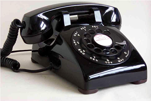
Designing for People - Chapter 7: The Telephone
Henry Dreyfuss' widest-spread and most lasting design contribution was his work with Bell Telephone, and particularly his work on the 500 Series.
(Taken from here)
There are a few lessons from this chapter. The first is: don't enter beauty contests. When Dreyfuss is first approached by Bell Laboratories about redesigning the telephone, it was as part of a program for artists to conceive the future of the telephone. Dreyfuss declined, insisting that the "appearance should developed from the inside out." Bell at first disagreed, only to return months later with the news that while the other artists offered original designs, they were all impractical.
Such began a remarkably fruitful partnership. Bell Telephone, while perhaps an evil regulated monopoly, deserves some props for their appreciation of good design. They had the insight to hire Saul Bass to redesign their logo in 1969, and to work with Dreyfuss.
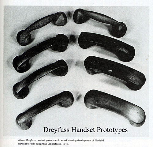
Anyway, Dreyfuss presents all the factors that went into the phone design: ergonomics, maintenance, aesthetics. You can read more about it at the National Design Museum's site on "Documenting the Process". And it's worth viewing the evolution of the shape of the handset.
(Taken from here)
The ubiquity of the telephone means that we tend to forget what an amazing design artifact it is. What Dreyfuss could have never guessed was just how wildly popular this design would be -- I can't find the page now, but I came across a statistic of something on the order of 90,000,000 such phones produced. And, as a sign of the design's brilliance, when Ma Bell released a touch-tone phone, the basic shape of the 500 series remained intact.
It's worth going a step back, and thinking about the design of telephone calls. Using a telephone is so simple, we forget how remarkably complicated the process actually is. The genius of Alexander Graham Bell, and the phone system in general, is that they placed all the complexity on the other end of the phone -- at phone switches and the like. The user interface to the phone was made intentionally basic... From party lines (pick up the phone and just talk) to operator assisted calls (pick up the phone and tell the nice lady what you want) to telephone dialing that allowed instant access to pretty much anywhere in the world.
I still use a Bell touch-tone phone. It's got meaningful heft, is easy to handle, and easy to use. The handset evolution photo demonstrates the care that went into the planning. And because it was in Ma Bell's interest that customers never need to replace the phone (since the phone was 'free' with your service), they were designed to pretty much last forever. Compare that to the shoddiness of contemporary phone design -- I've got a Toshiba cordless that pretty much became gummed up in its keypad within just a couple of years.
After the stagnation and then worsening of the landline phone experience, for a brief period, mobile phones served as exemplars of evolving utility -- screens that allowed you to see the number you punched in (helping avoid misdials), address books, microphones that didn't need to be directly in front of your mouth, etc. But, sadly, phone manufacturers have decided that people don't want to make a call on their phone any more, and the resulting interface designs have grown remarkably unwieldy.
For God, Country, and... Starbucks?
Long-time peterme.com readers know of my love for the book For God, Country, and Coca-Cola: The Definitive History of The Great American Soft Drink and The Company That Makes It. The title of the book comes from a letter written by a former G.I., who, in his distress over the release of "New Coke", claims that he fought WWII "For God, country, and Coca-Cola." The book also points out how Coca-Cola followed the G.I.s in WWII to Europe, and how that was the beginning of their international distribution.
This comes up because this morning the paper had an article on how "California Troops Bring Starbucks to Afghanistan." A couple of G.I.s have set up a faux Starbucks in Afghanistan, largely as a morale booster. I guess Coke Isn't It any more.
