October 23, 2004
I Have Seen The Future of Annotating Space, and My, Is It Del.icio.us!
Anne links to a piece from the Institute for the Future's blog on annotating space. The core paragraph is is:
Everyone one of these personal geo-annotations boils down to "I was here" or "You are here". People will take the time to compose a message and tag that message to a place because they want you to know that they were there, or because they have information that will be relevant to you later when you're in the same location, or some combination of both. As I look back at the annotations I composed, the "I was here" motivation will be largely emotionally driven. Examples: 'This is the place where he proposed'; 'I needed to mark the spot where occurred'; 'I'm a tourist and really having a great time'; even 'I lost a bet, as part of my payoff I have to mark the spot where..'. Ultimately, these types of annotations are still meant for other people -- what is the sound of an unread geo-annotation? -- but the value for the viewer will largely be to participate in someone else's experience and get a sense of the unrecorded history of a place.
...and that strikes me as exactly wrong. Shockingly, fundamentally wrong. What's bizarre is how this poster's interpretation directly contradicts the evidence they cite.
The evidence suggests a strong "I was here" orientation. Which, to me, is not about annotating space for others -- but annotating space for yourself.
Why would you want to annotate space for yourself? For whatever reasons you would use del.icio.us. While del.icio.us thrives as a "social bookmark" site, it depends on the me-ness of the activity -- by and large, I'm saving items to del.icio.us that interest me, that I might want to return to later, and the posting-for-others aspect is largely secondary. It's an added benefit, but not the raison d'etre.
One of the key emerging trends we're seeing with things like del.icio.us and Flickr is the merging of personal information architecture and public/shared/group/emergent information architecture. And one of the things we're seeing in the *use* of these systems is self-centeredness -- how else do you explain the prevalence of "me" on Flickr?
To get back to the notion of annotating space -- I would argue that people will annotate space much like they annotate the web, or annotate their photos... More in a notebook sense, a journaling sense. The annotations are explicitly *not* "meant for other people" -- they're meant for yourself, they only have to make sense for yourself, and if others stumble across them, great, fine.
In fact, I would argue that if people are annotating space only to serve others, it will never, or only rarely, happen. What do I care what some stranger 8 months from now thinks about what I wrote at the corner of New Montgomery and Market in San Francisco? What on earth could I possibly say that's meaningful to them? What benefit do I derive by acting as a tour guide to a stranger?
But I will note things that are important to me, much the same way I do in del.icio.us, so that it helps me remember.
People interested in this topic would be well advised to visit Annotate Space, produced by smart person Andrea Moed.
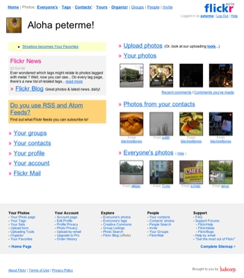
Living Design Case Study - Flickr.com
With all the hullaballoo around web applications, there's one site that is continuing to delight -- Flickr.com. They're doing great design work in providing what is by far the best photo-sharing site on the Web.
I'm posting today because of a recent, simple, change. They've added a task-oriented sitemap to the bottom of every screen.

Click for the making it bigger
I've discussed placing navigation at the bottom before. On February 12, 2000 (scroll down), I posted an email from Peter van Dijck, who had been experimenting with this practice, and found it remarkably successful. (Sadly, many of the links in that post are now dead.)
What surprises me is how few sites take advantage of that space "at the bottom." It's prime space for a few reasons: it doesn't clutter up the top, where the focus should be on stuff, not movement; it suits a reading flow... read to the bottom, and then see what it is you can do; when scrolling to scan a page, people often head all the way to the bottom of a page, and then make their way back up. Amazon.com has long used the bottom as a smart place for cross-selling.
