November 27, 2005
Don't Forget: User Interfaces for Physical Spaces
MAYA Design, in preparation for the User Interfaces for Physical Spaces event, has just published a fabulously detailed case study, annotated with copious illustrations.
It makes even clearer just how cool the workshop will be. The case study outlines their process, which we'll get to walkthrough in detail -- literally, as we make trips to the libraries before and after renovation.
I mean, where else have you seen people create information blueprints as companions to architectural blueprints?

The workshop takes place December 12, in Pittsburgh, PA. And, let's face it -- you're not getting any work done that close to the holidays! So use up that training budget before the end of the year and come join us!
November 26, 2005
Thoughts on walking
I am reading Rebecca Solnit's Wanderlust: A History of Walking. Since I was little, I've been a walker. I walked to school from grades 3 through 12 (I lived within a mile of both schools I attended, a rarity in Los Angeles). I would walk weekends to the mall, and then I'd walk all around the mall. I'd walk along the beach, the boardwalk. When I moved to Berkeley, I'd walk up into the Berkeley hills. In San Francisco, I'd traverse high and low. In New York, well, it's foolish not to walk.
And when I travel: walking. Heel toe. Heel toe. When I was younger, and I would travel with parents, I'd get a shitty hotel map, and just start wandering, meeting up with them at some appointed time and place. I walked San Francisco, Seattle, Vancouver, and London in such a fashion.
Anyway, as I read this book, it will spur various thoughts. Some of them I will write down.
A few so far:
For my money, perhaps the most haunting depiction of walking in literature is Yossarian's ramble through the "Eternal City" in Catch-22. In an otherwise satirical and absurdist work, the bleakness of this chapter is deeply chilling.
Walking, or rather, bipedalism, is considered by some to be the original human trait. When I think about australopithecines walking around, the image that comes to mind is of the footprints found in the volcanic ash, left 3.7 millions years ago by a couple of ancestors, scurrying with some intent, quite possibly safety.

And something I just learned. The adjective "pedestrian," meaning dull or prosaic, predates the noun "pedestrian," meaning one who goes on foot.
Technorati Tags: walking
I think this is major.
Chris Anderson, Editor-in-Chief of the once-again relevant Wired magazine, writes on his blog that he very rarely engages in mainstream media directly, instead utilizing RSS and the blogosphere as a set of editors to point him to what is relevant.
Obviously, Chris is an early adopter, but he's also the lead guy at a major mainstream publication. That he relies on the collective intelligence of the blogosphere to keep him appropriately informed I think suggests a crucial trend.
Chris also notes that he has 150 feeds that he follows. I'm at 149, after having been as high as 170. He and I both use Bloglines, which, frankly, isn't equipped for such numbers. But with all the RSS readers out there, none of them have successfully addressed Feed Overload. I think this is a potentially huge opportunity.
I've stuck with Bloglines because it's dumb-simple interface doesn't get in the way of reading, unlike all the other web-based tools I've tried.
37Signals on Fast Company on Simple
Jason nearly dislocates his shoulder patting himself on the back writing about Fast Company's "The Beauty of Simplicity" cover story.
One of the things that Jason writes is, "The big guys have to force simple. The small guys are simple by default." Which, of course, is not true. *Everyone* has to force simple. At Adaptive Path, we've worked with many less-than-10-person startups who could NOT be convinced to embrace simplicity.
And some big companies get simple by default. Apple, with the iPod and iTunes, is the obvious example. Google and their home page is another. (Though, Don Norman pointed out Google's nudity in his insightful, The truth about Google's so-called "simplicity".)
If you want a truly valuable, and subtle, take on the Fast Company article, read John Maeda's "The Subtlety of Simplicity." He recognizes that less isn't more... That what we're striving is not simply the elimination of details and complexity, but the addition of meaning and elegance.
November 25, 2005
Innovation through accretion?
A long time ago, after attending a design and business conference, I wrote a post lamenting innovation fetishization.
Such an obsession with "innovation" worries me. It worries me because I live in a world where the things that already exist typically don't work as well as they should. More time should be spent bringing existing products and services up to snuff, and not focusing on The Next Big Thing. This innovation fetishization becomes a shiny bauble distracting people from paying attention to the here and now.
In a recent post, Gene distinguishes between optimization and innovation, and claims that the new Xbox 360 is an example of the former. In short, the Xbox 360 is like the Xbox, only moreso -- it doesn't innovate, it just does what the Xbox has done, an does it better.
I read his post on the same day that I read a surprisingly glowing review of the new machine in the New York Times. And that review suggests that Microsoft has focused on what I thought appropriate -- making the basic experience *just work*, instead of chasing after something "revolutionary."
And it made me wonder if you can innovate through accretion -- that you reach some threshold for each of your improvements, and the experience improves in some quantum way.
November 20, 2005
Zen is not for value judgments
A blog called "Presentation Zen" has generated a lot of buzz for a couple of posts that smugly satisfy what an audience wants to believe: Bill Gates and Visual Complexity and Gates, Jobs, and the Zen Aesthetic. Readers feel righteous in the easy digs at Microsoft's busy PowerPoint slides, particularly when compared to Jobs' spare presentations.
And when I first saw those posts, I thought, "Yeah! Spareness! Simplicity! Whoo!" Bet then I wondered, "Um, isn't Bill Gates worth a gajillion dollars? Isn't Microsoft an exceedingly successful company? Should we maybe look at this a little differently?"
And I wonder: Maybe Microsoft is giving people what they want. Obviously, it's all about context. And Microsoft's contexts are very different from Apple's. Steve Jobs never really explains anything. He simply shows products. He pretty much just gives demos. Bill Gates, in the presentations critiqued by those posts, is trying to explain something... And explain something that contains a fair bit of complexity. And Bill's audience is likely quite different... Bill is trying to communicate to developers, who are wondering about the ramifications of Microsoft's decisions on their livelihood.
Steve Jobs pretty much just preaches to the choir (and press).
I would argue that Jobs' approach, while perhaps more aesthetically appealing, actually demonstrates a fair amount of condescension. "Don't worry your pretty little heads... Uncle Apple has it all figured out for you." Gates' approach, while clumsier, is also more revealing... It provides opportunities for the audience to understand the machinations, and how those might affect them.
I mean, Bill Gates didn't get to where he is for doing this kind of stuff poorly.
I've given many presentations where the feedback was, "more bullet points." Depending on what you're talking about, people want those details spelled out... They don't want shiny imagery. They want something that they can take home with them and recall what was discussed. They wants something they can *use*.
So, I think the challenge is to dig beneath the superficial qualities of these presentations and try to understand what is going on here. I'm not trying to defend Microsoft, but I don't know if we should be so quick to laud Apple. Apple does everything they can to tightly control The Message, to feed you exactly what they want you to know. Kind of like, I don't know, the Bush Administration (and I make that comparison knowingly. I'm very frustrated by how Apple communicates (or mostly, doesn't) to the outside world.)
Though, yeah, I honestly don't understand how any designers thought the clouds was good imagery..
Technorati Tags: apple, billgates, microsoft, powerpoint, presentation, stevejobs, zen
Lodging in Minneapolis: The Wales House
I just spent a few days in Minnesota for work, and on Friday, I lodged at the Wales House. I found the Wales House through Trip Advisor, and, I must say, I was very pleased.
I'm not a fan of Big Hotel lodging. I don't usually need concierges, and lobby bars, and exorbitant fees for internet access. When I do stay in chain hotels, I prefer Residence Inns, because I'll take room comfort over squads of service staff to appease my every whim.
The Wales House is essentially a boarding house, and a very nice one at that. It's run by a very friendly couple who live there, with their daughter and their very pretty dog Sky.

Sky
The room rates are cheap cheap cheap, and with it you get a very clean room, free wi-fi, and a light breakfast. There are no teevees in the rooms, but there are two teevees in the House's spacious common areas.
It's also almost ideally located. It's very close to the main drag in Dinkytown (the neighborhood of the U), which means it's a short walk to Al's Breakfast, my favorite restaurant in Minneapolis, as well as bookstores, coffeehouses, and the like. It's also a very pleasant walk from downtown, which you can make across the Stone Arch Bridge.

Heading towards downtown, across the bridge
So, if you're plans are taking you to Minneapolis, even if on business, consider the Wales House!
Technorati Tags: minneapolis, stealthmode
November 15, 2005
What about business informing design?
There's been a lot of talk in "design thinking" circles about how the practice of design needs to do more to inform business. You won't get any disagreement from me.
But I haven't seen a lot of talk of this being a two-way street. We seem to think business folks should appreciate the value that design brings, but we don't expect designers to appreciate the value that business brings.
Something we're trying at Adaptive Path is to use explicit business value metrics to brainstorm design ideas. It starts with what we call the linking elephants. The elephants first appeared in our report Leveraging Business Value: How ROI Changes User Experience. Diagrammatically, the elephants look like this:

And an example of our work from PeopleSoft shows that they would be applied like this:

Businesses typically know what their problems/challenges/opportunities are (the box on the far left) and what kinds of things have value (the fourth box). What the linking elephants demonstrate is that businesses can achieve that value by encouraging desired behaviors.
And it is those desired behaviors where designers step in. Designers can build systems that encourage behaviors. In doing so, we can lead to business results. This is how we make clear that we are not simply a cost, but an investment.
Typically when we think of ROI and design, we think of how we can validate design decisions with an ROI case. What we're talking about here is *informing* design decisions with an ROI case. It's a subtle difference, but a powerful one.
What it means to me is that we're not just proving, after the fact, the value of what we designed. What this approach means to me is that we're doing better design work in the first place. It helps us prioritize just what design endeavors are most worth pursuing, and it gives us a clear path for understanding the success of our design work.
We're starting to use the linking elephants as a brainstorming methods, coming up desired behaviors that tie together business problems and value metrics.
We're already seeing that it's not only shaping the direction of our work, it's getting us tremendous buy-in from stakeholders in the organization (particularly finance people) who might not understand what design does beyond make some thing pretty. A process like this lets the strategists and financial types into the design discussion in a way that a) makes sense to them, while b) enlightening them about design's role.
I'd be curious to hear if others are working on tying design work so explicitly to a financial outcome, and what has and has not worked.
November 06, 2005
Workshop - User Interfaces for Physical Spaces
I'm very excited to announce a workshop that I'm helping put together in my role with the Information Architecture Institute.
It's called User Interfaces for Physical Spaces, and it's a one-day case study of some fascinating work that MAYA Design did to improve the visitor's experience of the Carnegie Libraries in Pittsburgh.
It takes place Monday, December 12.
By bridging information architecture across the physical and virtual worlds, MAYA got to work on something of a Holy Grail type project.
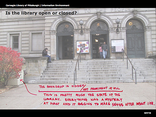
Aradhana Goel spoke about this project at Adaptive Path's User Experience Week last August, and while the PowerPoint was pretty neat, I knew I had to make this a field trip. Because the only thing better than seeing the annotated photographs explaining the problems of the library experience is going to those libraries and experiencing it for ourselves.

Annotated photograph from presentation
So we're going to start the day by seeing an unrenovated library (which demonstrates the "before" state). And then we're going to MAYA's offices to see how they analyzed and synthesized their research, and then drafted solutions.
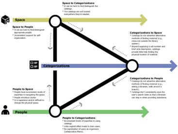
This illustration demonstrates MAYA's understanding of the three primary factors of the library experience -- the physical space, the information space (categorizations), and the people who work there. They identified breakpoints when interacting with each of these spaces, and this diagram depicts how to manage those breakpoints by hopping tracks from one factor to another.
At the end of the day, we're going back out to see some of the renovated libraries (demonstrating the "after"). This is stuff you simply cannot get from reading it.
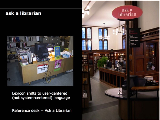
The above image illustrates the old way on the left -- messy "reference desk." The new way on the right is much more approachable, both in terms of signage and language - "ask a librarian". And a small example of something really nifty is that "ask a librarian" is used on the Carnegie web site to mean exactly the same thing.
Registration is only $250 ($200 if your an IA Institute member).
Read more about and register for "User Interfaces for Physical Spaces".
November 05, 2005
Yahoo creates the first decent road trip mapping program
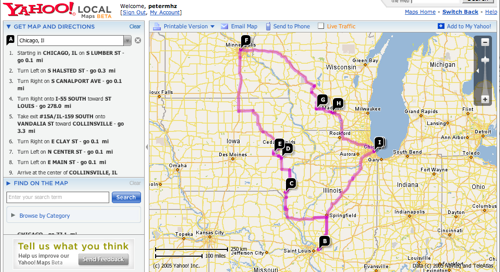
Yahoo has released a beta of their new super swanky mapping program, clearly a salvo fired in the direction of Google Maps. It uses Flash (instead of Ajax), and it by-and-large feels like Google Maps, except for one key exception: the ease of creating road trip itineraries.
I love road trips. I love the web. I've long hated that I can't create a decent road trip itinerary on the Web. None of the standard mapping sites (Mapquest, Google, old Yahoo) offered the ability to connect more than two points. The travel sites that offered road trip maps (Rand McNally, AAA), typically had shitty shitty interfaces, and bizarre restrictions (Rand McNally allowed for only 10 destinations on your itinerary).
Playing around with the beta Yahoo Maps, I saw that you can just keep adding destinations, and they keep stringing them together. In no time, I was able to recreate the road trip I took this past spring.
Some drawbacks:
It's not clear that you can save an itinerary. I think you might be able to through "email this," but that's a bit of a hack.
The rendering of the map information is still ugly. Anti-aliasing, people! Love it!


