May 21, 2004
Explicit Design's Relationship to Simplicity
"A Design Epiphany: Keep It Simple" is a New York Times article getting some play on the blogs. Given my new drum to beat, it won't surprise you that I think this notion of "simplicity" plays right into what I said about "managing expectations" and making your designs explicit. A simple design will meet a user's expectations, because they'll be able to grasp what it does.
There's a spin on this, though, that's kind of alluded to, but not really addressed in the article. It's the paraphrased Einstein quote, ""Make everything as simple as possible, but not simpler." What is not acknowledged in this article is what to do when something is, well, complex. A common error is to try to "simplify" it by reducing the elements for interaction -- saying having a single button serve more than one function, depending on modes. So while the interface might look simple, actually using the damn thing can be a pain (I'm thinking of radio alarm clocks right now).
This came up at the 2003 IA Summit, when Mark Bernstein reminded us all that "Multivalence is Not A Vice." This is a challenge that information architects have that interaction designers and product designers don't really have to grapple with. Information, in the form of words and messages, have an inherent complexity, because they have an inherent ambiguity -- they can mean different things in different contexts to different people. There's rarely, if ever, a one-to-one mapping. We have to deal with the fact that a variety of people will approach and use a single piece of content in a multitude of ways, and that that content will, in turn, spur a multitude of responses on the part of the reader. (Off the top of my head, think of a recipe. Typically it's "used" as a set of instructions for cooking, but it can also be used as a guide for making a grocery list, or a communication tool to suggest a meal to someone else. Right there, that one recipe affords a wider variety of uses, of interactions, then, say, the Rabbit Corkscrew.)

I don't know where this tangent has taken me. But I'm going to stop now.
May 19, 2004
Explicit Design Volley #1: Explicit Labels
The first thing I've ever written to be sold directly to people (as opposed to writing for a magazine or website) is now available:
How Labels Affect Usability and Branding
This is my first Adaptive Path report. It's a "Best Practices Brief" on the importance of clear labeling and terminology in site design. (Though, of course, it can be expanded to pretty much any design realm.)
Here's my little illustration which introduces the report:
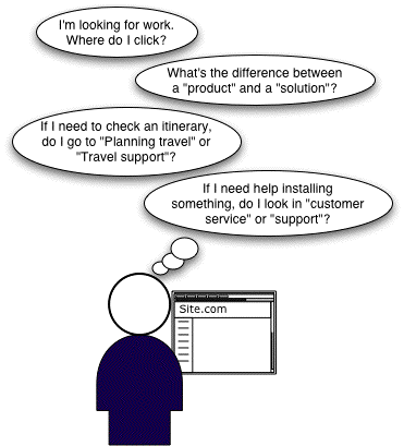
It was in the process of writing this report that I started to become obsessed with this notion of managing expectations. Words on websites are *all about* appropriately setting expectations, since they are pretty much all that a user has to go on to know what to click to find stuff that will satisfy their needs.
The thing is, as any one who has tried to write thoughtfully and carefully knows, words are hard. They're often ambiguous. Or dull. Or they make sense on their own, but not when grouped with other ones. This report addresses the common nomenclature pitfalls we've seen again and again at Adaptive Path (typically in our client work, but also just being active Web users).
This report is likely not of direct interest to readers of peterme -- statements like "Make your labels explicit" and "Clever labels can obscure destinations" are just preaching to the choir here. In my experience, bad labels come not from the web design team, but from their "clients" throughout the organization. Clients who are very attached to certain words, usually for some perceived branding goodness. I'm hoping that his report can be passed around to a web teams' colleagues in an effort to make clear why you shouldn't, for example, label training as "Education Services."
Go to the main report page
View the full introduction and table of contents
View page 5 of the report
May 17, 2004
Explicit Design: The Set Up
Though I've been blogging since 1998, it turns out I'm a "guru" and not a blogger. One of the things gurus must have is a drum to beat. A meme to promote. A conceptual hammer for the world's nail.
Mark's got "customer experience."
37Signals guys have "contingency design" (or "defensive design.")
BJ Fogg says "the web is about persuasion."
Jakob, of course, has usability.
None of these are wrong or right. They all provide a lens through which to perceive the situation, and perhaps better understand it.
Well, I've got a Hurstian oversimplification. Through my work, what I've observed is that the web is all about managing expectations. Setting expectations, and then fulfilling them. That's it. You do that right, and you're golden.
The term I have right now for dealing with this is Explicit Design. This does not mean that it's only for people over 18. It refers specifically to the primary definition:
fully revealed or expressed without vagueness, implication, or ambiguity : leaving no question as to meaning or intent.
Pretty much any digital design, be it web, software, mobile device, etc., must be *explicit*. Objects have an advantage, because their physical form makes explicit what it does, what to expect. Digital design, which tends to be screen-based, requires the development of explicit cues of use, since the physical form suggests little about what you can do with it.
This isn't new. Don may have moved on, but I'm definitely re-treading on issues raised in The Design of Everyday Things. Affordances. Mapping. Mental models. etc.
Where things do shift a bit, when considering the web, is that the emphasis shifts from the physical to the semantic. The web is still mostly about meaning, information, yes, even persuasion. All of which, by nature, are abstractions. And which makes explicitness all the more important, because it must be performed consciously -- it can't be the by-product of a concrete design.
Anyway, that's what I've been thinking about. We'll see where it takes us.
May 16, 2004
In the future, you will be on camera even more
Attended Wired's Nextfest yesterday. It harkens back to the General Motors Futurama exhibits from the 1939 and 1964 World's Fairs.
Of interest to me:
- It was a total mob scene. I think its appeal far exceeded Wired's expectations. I wonder what it is about this that taps into something zeitgeist-y.
- Cameras everywhere. Resistance is useless; you will be recorded.
- Robots. It's funny. "Robots" seems such an antiquated notion of The Future, but they were in full force at the show.
- Cities. Were totally ignored. And I wonder why. Usually discussions of the future revolves around how it effects cities. I mean, both of the Futurama exhibits envisioned cities of the future. Maybe because Nextfest was so object-fetishist. It definitely missed out on an opportunity of putting all the things on display in any real context.
