The Seduction of the Superficial in Digital Product Design

Digital product design discourse over the last few years has become literally superficial. Much (most?) of the attention has been on issues like ‘flat’ vs ‘skeuomorphic,’ the color scheme of iOS7, parallax scrolling, or underlining links. And not that these things aren’t important or worth discussing, but as someone who came up in design by way of usability and information architecture, I’ve been disappointed how the community has willfully neglected the deeper concerns of systems and structure in favor of the surface. I mean, how many pixels need to be spilled on iOS 7.1’s redesigned shift key?

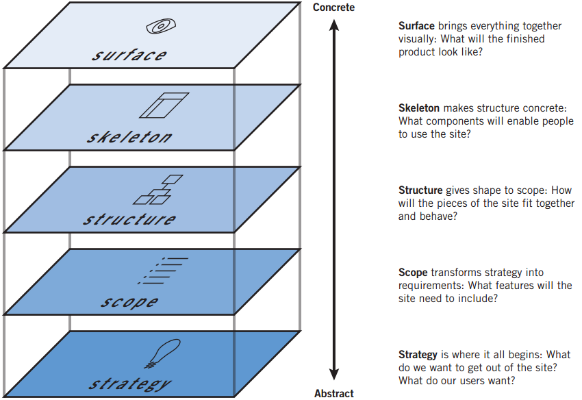
I was talking with Jesse about this over lunch a bit back, specifically how his 5 planes are more important now than ever.

simpleplanes


There was a golden moment, in late 90s and early 2000s, where the deeper matters of strategy, scope, and structure seemed to get more play, with multiple books on information architecture, and online journals like Boxes and Arrows leading the design discussion.

Jesse, ever the wiser one, coached me to watch for my “Get off my lawn!” mindset, and through our discussion I realized something.

When digital design discourse emerged in the late 90s, our ability to interestingly design for “surface” was heavily compromised. We designed for 640 x 480 displays. Maybe 800 x 600. We worried about the Netscape Color Cube. We had laughable control over typography and layout.

Graphic designers often got frustrated with the Web, and did what they could to control the presentation, overly relying on images, and exploiting hacks with tables and invisible .GIFs. And schmucks like me, who had no real graphic design skill, would smugly tell them to “embrace the medium” and focus on the interesting hard problems of information architecture and interaction design.

We now live in a world where I have an 1136×640 display with 16 million colors in my pocket. And processor speeds that allow for startlingly smooth animations. The Surface now warrants critical examination and exploration. But the Surface isn’t merely superficial. The decades of insightful dialogue on matters of graphic and motion design can now be applied to digital products. The increased sophistication of the digital canvas has lead to limitless possibilities on the Surface, and a capable digital interface designer must understand not only color, composition, typography, and layout, but now must also be facile with motion and animation. That’s enough to keep anyone busy for their career.

It’s understandable that non-designers talking about design (as increasingly happens) focus on the superficial–it’s the easiest to discuss. However, we in the digital design community must not get so caught up in the seductive Surface that we neglect those lower layers. There are a number of reasons:

  • It is a disservice to younger designers, particularly the self-taught, as it encourages emphasis on style over substance
  • It plays into the still-prevailing attitude among business and technical types that designers don’t grok the deeper concerns in these complicated systems, and are best to bring in when it’s time to make something look good
  • As the services we design cross more devices and have more online and offline touch points, managing those deeper layers is increasingly important for success

I’ve realized I’m grateful for the passionate conversation around Surface–it means that people care and are engaged. Still, we must be vigilant in maintaining similar attention to those deeper layers, precisely because their abstraction makes them more challenging to discuss.
Don’t “design for mobile”, design for your customer relationship

Last night I saw Luke W give his excellent “Mobile to the Future” presentation. In it, he questions many of the interface paradigms and assumptions that underlay our desktop web experience, and demonstrates the power of thinking “mobile first.” He shares great ideas for improving mobile interfaces, many of which are applicable to desktop web as well. It got me fired up to overhaul our designs.

Relatedly, there’s been enormous buzz about mobile in the past week. Mary Meeker’s internet trend report seems mostly about mobile (Groupon is featured in slide 35!). Sheryl Sandberg recently claimed that every team at Facebook is now mobile first.

All this talk about mobile is necessary. However, it’s also misleading. In that it sets up a false distinction. The idea of “mobile first” or “design for mobile” is in order to contrast it with “design for desktop”. But, as the ascent of mobile demonstrates, “design for desktop” was also always flawed. The problem is to focus on the specifics of a platform or technology. These things will continue to change. In five years, will we be saying “wearables first!”?

It’s never been about the technology. It’s about where your customers are. If you design for your customer relationship, then the rest falls into place. If your customers are moving from web to smartphone, you’ll just move with them. If your customers are moving from smartphone to tablet, head there. (Though, as we’re seeing, it’s less about moving from one to another than it is about customers using a variety of devices throughout a day.) USAA was the first to offer mobile check deposit not because they’d embraced a “mobile first” mindset, but because they have a remarkably attuned sense of customer care and service, and realized they could address a real need, one that happened to use that platform in the solution.

My concern with “mobile first” is that we’ll mistake that for “mobile only” (the way that the Web was seen as the end-all be-all for quite a while) and not appreciate just what our customers are actually doing, nor prepare ourselves for what’s next.


Supply and demand of digital product designers

12 years and 1 day ago, a group of 7 founded Adaptive Path. If you look at the NASDAQ 100 around that time, you’ll see just how far things had fallen, and they actually got worse over the course of the following year.

But, no matter how bad the internet economy was, there was always work for digital product designers. Even with layoffs or companies dissolving, I never knew any designer who went long without work. It might not have been the most desirable work, designers might have felt continually compelled to prove our ROI, but there were always jobs.

What I realized then was that, even at its lowest point, there were still more jobs than there were designers to fill them. Up until 1995, design for software meant working on packaged goods, and there simply wasn’t as much need. Beginning in 1995, the web created a sea change in the job market, and then the launch of iPhone in 2007, and iPad in 2010, has lead to successive waves of need for digital product design.

So now, supply and demand in the market of designers is frighteningly out of whack. The competition for designers is fierce. I remember getting paid $60,000 in 1997, roughly 4-5 years into my career. That is the equivalent of $87,000 today, and I can tell you that capable designers with 4-5 years experience are earning much more than that.

There is a paradoxical risk when designers are in such demand. The demand reflects the value that is seen in design work. But, with such demand, most organizations have too few designers given what they’re trying to deliver. That means those designers are spread too thin, and are focused on execution that keeps the light on. Which means design isn’t being used to its fullest extent, driving not just execution, but product strategy and definition.

Because designers are seen as so valuable, they are not able to deliver their ultimate value.

Stop with the bullshit school projects (What I would tell interaction design students, #3 in a series)

I’ve got a little series of advice/guidance/wisdom/hubris for interaction design students

I’m very much involved with Adaptive Path’s hiring processes, and as such I see a ton of resumes, peruse a scad of portfolios, and discuss futures with hordes of students soon to be graduating from a range of undergrad and graduate programs. As a “hiring manager,” what interests me most is your work. Do you have the skills to pay the bills, and how comfortable and confident are you when talking about your approach to solving problems?

Among my biggest frustrations is having students walk me through bullshit school projects. Bullshit school projects are those which are solipsistic (solving a problem that a limited set of college students face), and/or uninteresting, and/or overly formal, and/or simply lack meaning. If I’m going to be hiring you to work with clients to help address their challenges, I need to be comfortable that you have an ability to engage in real-world problems.

I think much of the blame for these projects lays at the feet of the teachers, who have ensconced themselves in the academy in order to avoid the real world. But students have a responsibility to demonstrate what they can do in a way that someone who doesn’t know them can understand their thought process, their approach, and their talents.

Perhaps the single best way a student can ensure she is doing relevant work is to take internships at companies. I met one undergrad who has worked with IDEO, Frog, and Nokia, and the work she showed me was largely drawn from these experiences, and gave me the confidence that she could deliver real-world design.

I’m not saying students need to think corporatist. One of my favorite student projects is the redesigned BART kiosk by Ljuba Miljkovic and Ben Cohen. BART didn’t ask them to do this (in fact, it demonstrates that BART unwisely spent money on a user interface so poor it could be vastly improved by two smart college students in a semester), but for a class project they realized it offered a remarkable opportunity. It hit on a real-world pain point (as anyone who has purchased a BART ticket knows), and demonstrated a thoughtful and practical approach.

And it doesn’t need to be a project that appeals to a big audience. As part of his MFA work at CCA, Matthew Baranauskas has done a set of tangible computing projects to create new tools to help mentally challenged folks express themselves in a variety of creative ways. While the number of people who could use these tools is quite limited, by addressing a space very different from his normal context, Matthew demonstrates his skills and vision in such a way that it’s clear how he would approach professional work.

So, if you’re an interaction design student, please don’t do yet another mobile app that helps you and your friends coordinate getting beers (or yet another web app that monitors a building’s energy consumption), or some context-free formal exploration of gestural interfaces, or something that simply demonstrates that you’ve learned a set of methods. Identify an interesting problem *in the world*, and attempt to solve it.

Nexus One: I’ve had one for a couple weeks

I can finally announce it publicly: I’ve had a Nexus One for the past couple weeks. While I played with it a bit, I never used it extensively, as I didn’t want to put my iPhone’s SIM card in it, and I didn’t have any other SIM cards lying around.

The Nexus One is a perfectly solid offering in this touchscreen-smartphone space. Its interaction and interface design are quite good. I love the Maps app, which essentially can operate just like an in-car turn-by-turn GPS navigation device, with the added benefit of Google Street View, so you can be quite positive your turning at the right spot.

I’m very interested in leaving Apple and AT&T, and the Nexus One could very much be that new phone for me. I am not really reliant on any non-standard iPhone apps, so the transition shouldn’t be too hard. But, at this point, I’m not ready to make the change, for two primary reasons:

  1. Podcasts. The thing I do most with my iPhone is listen to podcasts. And I’ve become quite reliant on the “2x” playback feature of podcasts. Google’s Listen app does not offer double-speed playback. I suppose I could turn my iPhone into an iPod touch and use the Nexus One for other things, but having two glass bricks on me at all times seems unnecessary.
  2. Desktop software configuration. Or rather, the lack of it. With Nexus One, you have to do all your configuration on the phone, or within various Google Apps. There is no iTunes equivalent for the Nexus One. I believe this is a huge mistake. Anyone owning a Nexus One is likely to own a computer with a USB port. Why not let me use my computer, with it’s bigger screen, easier text entry, etc, etc, to configure my Nexus One? I’ve said it many times – iTunes was the secret of iPod’s success, and is quite significant in iPhone’s success. Having to do everything on the Nexus One’s screen is a pain and it kind of angers me that Google hasn’t seen fit to release software to make the configuration easier. (If you’re not beholden to Apple/iTunes the way I am, this might not be an issue. Or, if you’re an extensive Google tool user (Gmail. Google Calendar, etc.), it might not end up mattering to you, as you can get all that information onto the Nexus One pretty easily.)

All that said, if I could get a $60/mo plan on T-Mobile for the NexusOne (which is what I currently play AT&T, as I’m grandfathered in with my first-gen iPhone), I would have to seriously consider the switch. However, it looks like the minimum price of the necessary T-Mobile plan is $80/mo, which is kind of a non-starter for me. I would even consider $70/mo with unlimited SMS and data.

I am happy that there is now a legitimate competitor to iPhone/AT&T, and one that is not beholden to a particular carrier. I hope this finally leads to some competition in the pricing of service plans.

Rettig, Steady, Go!

“Interaction Design” is one of those terms that we ‘user experience’ types use that refers to something that *everyone* is familiar with. Marc Rettig makes that clear in his presentation, “interaction design history in a teeny little nutshell” (PDF, 3.2 MB).

Even if you think you know everything about interaction design, you should check out the slides because

  • Marc puts together concepts in a way I hadn’t seen before
  • He presents some new-ish models for thinking about interaction
  • Marc gives great presentation — clean design, excellent illustrations