Home
Archives
Archives before June 13, 2001
RSS Feed
Adaptive
Path (my company!)
About
peterme
Coordinates
Most of the Time
Oakland, CA
Interests
Current
American history around the time of the Revolution, figuring out how to marry top-down task-based information architecture processes with bottom-up document-based ones, finding a good dentist in San Francisco Oakland
Perennial
Designing
the user experience (interaction design, information architecture, user
research, etc.), cognitive science, ice cream, films and film theory,
girls, commuter bicycling, coffee, travel, theoretical physics for laypeople,
single malt scotch, fresh salmon nigiri, hanging out, comics formalism,
applied complexity theory, Krispy Kreme donuts.
surf
Click
to see where I wander.
Wish
list
Show
me you love me by
buying
me things.
Spyonme
Track updates of
this page with Spyonit. Clickee
here.
Essays
[Editor's note: peterme.com
began as a site of self-published essays, a la Stating
The Obvious. This evolved (or devolved) towards link lists and shorter
thoughtpieces. These essays are getting a tad old, but have some good
ideas.]
Reader Favorites
Interface
Design Recommended Reading List
Whose
"My" Is It Anyway?
Frames:
Information Vs. Application
Subjects
Interface Design
Web Development
Movie Reviews
Travel
| Marti Hearst on Information Visualization Posted on 06/25/2002. |
|
In researching an essay on information visualization, I interviewed Marti Hearst. A professor in the School of Information Management Systems at UC Berkeley, Marti's background includes working at Xerox PARC. Learn more about her here: While I'll try to quote as directly as possible, much of what follows is paraphrased (I can only type so quickly!) But I'm confident I'm getting the basic gist across. So, What I Learned About Information Visualization from Marti Hearst My first question to Marti was about the success of information visualization as a field. Because, well, you don't see many visualizations out there. Marti agreed, and commented that in her latest class on visualization, she encouraged students to emphasize any usability studies if any had been conducted. Unfortunately, for the most part, there has been little or no validation of information visualization applications. 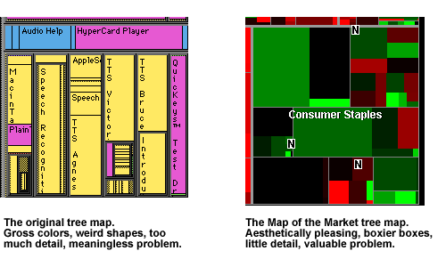 There are some success stories, most notably Smart Money's Map of the Market. The original idea of tree maps, developed by Ben Shneiderman, had a number of problems -- poor aspect ratios, no interactivity, it was ugly, and it solved a problem no cared about. The people at SmartMoney were able to take the fundamental core of this 2-d space-filling idea, and improve it by: correcting the aspect ratios (the elements are more squarelike, not long thin sticks); made fixed locations for the boxes, so that industries are always in the same area on the screen; not try to provide too much detail in the overview--just the green or red to show, generally, whether the market was up or down; relating the size of the box to a meaningful piece of data, a company's market share (the original tree map related the size of a box to the size of a file on a hard drive... who cares?); applying it to a very targeted task; choosing appealing colors; and making the interacting with it quite intuitive, through mouse-over and drilling down. Marti forecasts a significant change in how visualizations are approached. In the past, they've been treated as standalone applications, "Look at this thing! And how beautiful it is!" Where as the key for the future will be incorporating it as a small part in a larger system, integrating it with the rest of the interface. In doing so, this will require visualizations to seriously take the problem that users want to solve into account, a motivation currently lacking from many visualizations.  A visualization that particularly impressed Marti, and which hasn't received much notice, is the spiral visualization used to represent serial and periodic data. The essay which describes it(PDF) explains how it's been used to track food consumption by chimpanzees, for which there is a remarkably complex data set. Though perhaps quite obtuse to the layperson, Marti believes that for the scientists studying this phenomenon it's an innovative solution, using data tailored to the domain. An intriguing application of a spiral visualization can be played with at Rhizome, the net.art community, where you an use a spiral to navigate their article database. One of the most common applications of information visualization is searching and browsing textual data (as I discussed yesterday). Marti, who has focused a lot of energy on this specific problem, is coming to the conclusion that very little works. She has a class lecture devoted to the topic (PowerPoint), a section of which is called "Why Text is Tough", and which points out that "abstract concepts are difficult to visualize," that "language only hints at meaning," and that categorization is insufficient in understand the meaning of documents. She pointed out you could use visualizations for data mining applications on text, but that's a very different task. You're not trying to understand relationships so much as analyze a concordance. When discussing how visualizations might be used by the intelligence community (particularly in light of the Current Situation), she commented that in her initial conversations with folks in the IC, it's clear that have a lot of other issues (mostly organizational) to tackle before visualizations become at all useful. As an aside, she mentioned that the IC folks are researching software used by casinos to track individuals. It seems that casinos have some of the best intelligence software out there. Biotechnology is considered a prime market for visualizations, and while Marti believes it is likely to be so, she spoke of a discussion she had with someone at Genentech, who have "the fanciest tool ever," but no one uses it because it's too complicated. In no uncertain terms, Marti believes that the future of visualizations does NOT lie with 3-D. (An interesting counterpoint to another researcher, Mary Czerwinski, who states in an interview on InfoVis, "I am predicting--I would even bet money on it--that you'll see more 3D environments.") Instead, Marti believes that we'll see animation used more, taking advantage of humans' natural understanding and reaction to motion. I'm sure there's a lot more Marti could have said, but we had to stop at some point, and this was it. 11 comments so far. Add a comment. Previous entry: "Communication, not Content." COMMENT #1 COMMENT #2 COMMENT #3 COMMENT #4 Another assumption you can make is that ONE system or visual metaphor will probably NOT solve ALL issues, problems, navigational challenges, etc. So that means: - that it's gonna be some combination of visualization, visual metaphors, charts, what-have-you - with good old fashioned directories, categories, lists, headlines, etc. - with some new combinations of user experiences, interface controls, sequences of animations and/or video and (heaven forbid) something else that's just not clear yet! - :-) There's only one thing that completely clear - it ain't gonna be in HTML! :-)
COMMENT #5 also found this!
COMMENT #6 PS: From a self-promotional point of view, I've had some good fun lately visualizing networks of open-source cooperation and inheritance resulting from a programming contest. See COMMENT #7 COMMENT #8 COMMENT #9 COMMENT #10 COMMENT #11
|