peterme: What is the *purpose* of Social Network Analysis? Valdis: To write papers. To discover nifty new equations. (Laughing)
It's basically to see how complex human systems really work. It can be a project team in an organization, or a terrorist team, or it could be a community where a virus is spreading, and figuring out how and why it's spreading a particular way. It allows us to look at and map what are normally invisible dynamics inside a community. Once you know about it and start thinking about it, you start to realize there's a lot of relational data out there. If you start putting it together piece by piece, you put together an interesting picture, more than any of the pieces by itself.
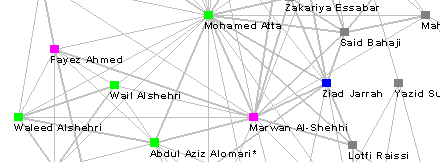
That's what I did with that terrorist network map. Everyone was talking about terrorist networks, but no one was putting it together. So I slowly started gathering data from various sources, and with a couple hundred data points, it started looking like something.
Sometimes its people or groups that want to look at their own networks, look at their own community, so they start gathering data, and start to see what's going on in the community.
Once you draw one of these maps, you can measure that map... You can measure the picture. It allows you to find whose the key player. Who's in a position of power. Who's in a position to bridge one community or one group together. Who has the most connections. Who has too many? Where are there gaps? In a corporation, you might look at a map and ask yourself, "Why aren't there connections between marketing and sales?" In an urban community, it might be, "Why aren't there connections between this street and that in the neighborhood?"
Once you get some measures, you have a baseline, and you can act on that to improve the community. And then track it over time with these metrics. The relations are improving, because we have metrics showing this, etc.
peterme: It seems that SNA is very focused on visualizations, the need to see the network. Is that true? How has that developed?
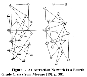
valdis: Initially there was a thing called a socio-gram, which Jacob Levi Moreno developed in the early 30s. These were drawn out by hand. You would observe a group, and draw a diagram, where the circles are the people, the lines are who talked to who. Other researchers started to follow.
(ed.: For a good history on the development of social group visualization, read "Visualizing Social Groups," (.PDF) by leading social network theorist Linton C. Freeman. And dig his hair and shirt!)
Of course, there was a limitation to how complex these diagrams could get. With paper and pencil, you can only do so much.
Visualization was crude until, probably, the mid 80s, with Unix programs, that could crunch significant numbers of data.
As technologies progressed, the ability to visualize has progressed.
At first, all you could do is count nodes. Then, someone said you can calculate them in a matrix. Multiply them together, raise them to a power. If you raise them to a second power, you can see how many two-step paths there are. Matrices are a pain in the ass to do by hand.
As spreadsheets came in, the networks got larger and larger.
What I do with InFlow is, instead of using the matrix approach, InFlow is written in Prolog, which is good for modelling relationships. Rather than crunch matrices, you just put data in as linked lists, and search for patterns and paths in the data. The networks we can visualize and measure have gotten larger and larger and more complex.
peterme: How does one *use* your visualizations? What are the goals sought?
valdis: You can show these network layouts, with as many nodes you have, as high as N goes, all those different layouts, maybe more. How a network is laid out can convince people that something is or isn't going on. Just like you can lie with statistics, you can lie with visualizations, too.
It's important to come up with some standard way of laying things out, also a simple way. I've seen 3D layouts, and all sorts of other things. And I've found that managers, those folks born in the middle of the last century, well, they just don't get 3D. Maybe the younger generation will get it, but most of today's managers have a hard time.
peterme: That's what I heard in my interview with Marti Hearst. She mentioned that 3D is not the way to go, but animation is.
valdis: I *am* getting more and more people asking for, "Don't just show me a graph, but show me a time sequence. Show how a network changes over time." We can do that today.
Simple is real important. People have to understand how the network is being visualized. If something is important, or key, it's going to be somehow in the center of the picture. If it's less important, it will be in the periphery of the picture.
As long as you keep things as simple as possible, then people can start to understand what's going on. If you just show a network map to someone, the first time they think, "Huh?" But with a little explanation, people pick up quickly.
To understand it well, I will sit down and interpret it with my client. I may be an expert in organizations and network analysis, but I don't know how to run Ford or IBM. Together, we'll come up with what's happening here. What we frequently find is that it's nice to bring the laptop in and show people what's going on.
So, I'll come in, and say, "When we do New Product Development, here is what happens. Hrm. What's happening with Marketing and Sales. What's happening there? Let's remove the other nodes and focus on them." The ability to interact with the visualization is very important, the ability to move things around and play with it. Get a feel for what's going on.
One of the things that people like about the Java applet on my website the most. You know, I pulled this node, and whole bunch of other nodes came with it. I knew it was an important node. If they pull something and it resists, then it's really well-grounded or something. They use what they know about the real world in this visualization.
Another thing that's really interesting, and that I run into all the time, is isolation. Some nodes aren't well connected or not connected at all. And some assume, if they're not connected, they're not necessary. I was making a presentation at TRW, showing how our department was connected in various activities. The first slide showed the boss very disconnected. This is good that he is not connected, because this is a network map of how our department does computer support.
peterme: How do you know when to stop? What is a robust data set?
valdis: Often, you don't know where to stop or where the network stops. You draw an arbitrary boundary, and say, this is what we're going to look at. For product development, we'll map the product development team. We may not map individuals outside the organization, but vendors of various sorts. Making the edges more generic and inclusive.
That's part of the inexactness of this science. You don't know where this network stops.
peterme: What is the value? Does it actually solve problems?
valdis: I play the role of the X-ray or CAT-scan technician in a hospital. You go to a hospital, get a CAT scan, say "see right here, there's a funny shadow here," and I give information to the doctor who will help the patient get better. To my clients, I'll give more information so they can see what's happening in their processes. I may not have the solution, but I can expose them to what's going on.
peterme: Here's a rather crass question: How can we use InFlow to stop terrorism? Can we?
valdis: I thought through that very question when I wrote an essay called "Can Large-Scale Terrorist Attacks be Prevented?"
What it takes is searching for data, working with investigators, and get them to provide their data and develop a map of what is going on. It's the type of thing that could have been done. The data they would have gathered is simple data gathered through their surveillance. In the article, I show how, from the two suspects known as far back as January 2000, a network could have been drawn, which, we now know, shows links to the hijackers.
From an organizational analysis perspective, the guys at RAND are screaming at the government -- They're saying we need to have as good or better of a network than they have. What we're fighting is a network. And if we just keep building hierarchies, it's not going to work. We need to be able to swarm and self-organize and all those things that networks do, and do it better than they do.
Rather than a massive top-down effort, analyzing all the emails and phone conversations in the world, turn it around, look at known suspects, use their planning and communication process, and unearth the network around that person. By having certain people under surveillance, it would have been easier to figure out what was happening. Look at known suspects. Monitor those who have a higher probability of being guilty. You reduce your data requirement significantly.
peterme: What is it about SNA visualizations that allow them to work?
valdis: They don't always work. You can have a very dense network. Where most people are connected to most others. No matter the visualization, you're going to get a hairball. It tells you something -- that you have a solid core of social space. It's just not very pretty.
Some of the layout algorithms give you a nice picture, but I always have to go in afterward and go in and clean it up.
I always look at the metrics. If someone stands out, and has a high centrality score, and clustered with 3 or 4 other nodes, I'll move those nodes out, to make the distinctions clear.
A friend at IBM did a network analysis of a department. The person who hired him was totally isolated in almost all of the networks. Connected with very weak links. The guy who hired him is on the outside, and here has to break it to this guy. This guy is going to have to go through this embarrassing
situation, showing what everyone already knows, which is that he's out of touch with his department. Instead of leaving him out on the periphery, he moved the node closer to the center, to make it appear less obvious. To remove some of the embarrassment.
And that was that.
So I clicked on Feedback to ask what the heck was going on, which popped up a window. Halfway through filling it out, it closed itself.
Did he mean to do that? Did anyone get anything get their own data working? It's a cool concept, but the expectation frustrated me.
(BTW, I used square brackets avoid Greymatter deletion, and wrapped the comment.)
Posted by Chad Lundgren @ 06/28/2002 03:17 PM PST [link to this comment]