Home
Archives
Archives before June 13, 2001
RSS Feed
Adaptive
Path (my company!)
About
peterme
Coordinates
Most of the Time
Oakland, CA
Interests
Current
American history around the time of the Revolution, figuring out how to marry top-down task-based information architecture processes with bottom-up document-based ones, finding a good dentist in San Francisco Oakland
Perennial
Designing
the user experience (interaction design, information architecture, user
research, etc.), cognitive science, ice cream, films and film theory,
girls, commuter bicycling, coffee, travel, theoretical physics for laypeople,
single malt scotch, fresh salmon nigiri, hanging out, comics formalism,
applied complexity theory, Krispy Kreme donuts.
surf
Click
to see where I wander.
Wish
list
Show
me you love me by
buying
me things.
Spyonme
Track updates of
this page with Spyonit. Clickee
here.
Essays
[Editor's note: peterme.com
began as a site of self-published essays, a la Stating
The Obvious. This evolved (or devolved) towards link lists and shorter
thoughtpieces. These essays are getting a tad old, but have some good
ideas.]
Reader Favorites
Interface
Design Recommended Reading List
Whose
"My" Is It Anyway?
Frames:
Information Vs. Application
Subjects
Interface Design
Web Development
Movie Reviews
Travel
| June 27, 2002 |
|
Have a nice weekend. See y'all on Tuesday afternoon. I'm travelling to Canada, inadvertently celebrating Canada Day. Think of it! The country grants itself A WHOLE DAY! That's esteem!  Posted at 11:06 PM PST [2 comments] |
|
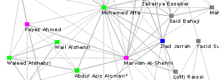
Interview with social network researcher Valdis Krebs. Valdis Krebs is the proprietor of Orgnet.com, a site devoted to issues of social networks and organizational dynamics, and the creator of InFlow, a software tool designed to depict social networks. I first became aware of Valdis through his depiction of the knotted hairball of internet industry partnerships, and have checked into his work on occasion ever since. As part of my visualization research, I poked around the world of Social Network Analysis, and chatted with Valdis. He was kind enough to let me post the interview. |
| June 25, 2002 |
|
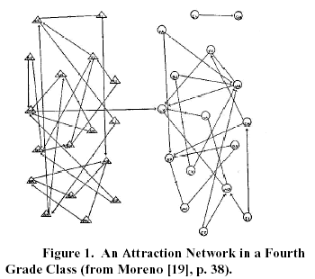
Marti Hearst on Information Visualization In researching an essay on information visualization, I interviewed Marti Hearst. A professor in the School of Information Management Systems at UC Berkeley, Marti's background includes working at Xerox PARC. Learn more about her here: 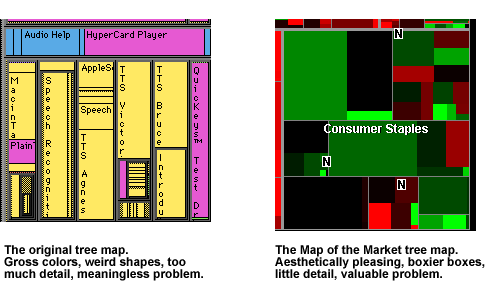  A visualization that particularly impressed Marti, and which hasn't received much notice, is the spiral visualization used to represent serial and periodic data. The essay which describes it(PDF) explains how it's been used to track food consumption by chimpanzees, for which there is a remarkably complex data set. Though perhaps quite obtuse to the layperson, Marti believes that for the scientists studying this phenomenon it's an innovative solution, using data tailored to the domain. An intriguing application of a spiral visualization can be played with at Rhizome, the net.art community, where you an use a spiral to navigate their article database. One of the most common applications of information visualization is searching and browsing textual data (as I discussed yesterday). Marti, who has focused a lot of energy on this specific problem, is coming to the conclusion that very little works. She has a class lecture devoted to the topic (PowerPoint), a section of which is called "Why Text is Tough", and which points out that "abstract concepts are difficult to visualize," that "language only hints at meaning," and that categorization is insufficient in understand the meaning of documents. She pointed out you could use visualizations for data mining applications on text, but that's a very different task. You're not trying to understand relationships so much as analyze a concordance. When discussing how visualizations might be used by the intelligence community (particularly in light of the Current Situation), she commented that in her initial conversations with folks in the IC, it's clear that have a lot of other issues (mostly organizational) to tackle before visualizations become at all useful. As an aside, she mentioned that the IC folks are researching software used by casinos to track individuals. It seems that casinos have some of the best intelligence software out there. Biotechnology is considered a prime market for visualizations, and while Marti believes it is likely to be so, she spoke of a discussion she had with someone at Genentech, who have "the fanciest tool ever," but no one uses it because it's too complicated. In no uncertain terms, Marti believes that the future of visualizations does NOT lie with 3-D. (An interesting counterpoint to another researcher, Mary Czerwinski, who states in an interview on InfoVis, "I am predicting--I would even bet money on it--that you'll see more 3D environments.") Instead, Marti believes that we'll see animation used more, taking advantage of humans' natural understanding and reaction to motion.I'm sure there's a lot more Marti could have said, but we had to stop at some point, and this was it. Posted at 06:15 PM PST [11 comments] |
| June 24, 2002 |
|
Communication, not Content. I think we can all agree that finding information on the Web is hard. I mean, sure, Google can turn up a few high-quality links, but any rigorous and deep use of the Web remains difficult -- particularly finding information of which we're not aware. One of the joys of researching at a library is to look up a particular book, find its place in the stacks, and then develop a crick in your neck as you drink in all the topically-related books gathered around the one you originally sought.Many have sought to replicate this experience online through visualizations of Web spaces. The Atlas of Cyberspaces is littered with attempts at overlaying some meaningful spatial framework in order to highlight semantic relationships and strengthen recall. Yet none of these have really caught on. Systems like WebMap only make the process of finding information more difficult, because they require a user to understand yet another layer of abstraction, and a highly arbitrary one at that. The main problem here is that visualizing semantic relationships is nearly impossible. There are far too many dimensions of meaning, and the dimensions that are particularly meaningful to me might have little relevance to others. In an essay I just finished on information visualization, I wrote this passage: |
| June 23, 2002 |
|
The Secret To Meeting Women Is To Not Bathe. (from an AIM conversation with a friend; her responses removed, my comments edited for readability) |
|
Lane pre-cognated, "When you review this on your site, you're going to call it 'Mediocre Report', aren't you?" The answer to which is, "Yes."Yesterday I saw Minority Report. Reviewers have been falling all over themselves in praising this film, and the clips looked like it had promise.Well, it's not a bad movie, but it's not very good, either. The movie is chock-full of interesting ideas about the future (beware: it's marketing hell), has some fun set pieces involving chases and eye surgery, and has a slew of perfectly good performances.It just doesn't add up to anything. From what I can tell, reviewers are dazzled by the look and paranoia and the film's "edge," without bothering to check to see if they had any emotional engagement... And I challenge a viewer to have an emotional engagement--I don't think it's there. This isn't helped by the paint-by-numbers plot--once the movie starts, you feel inexorably pulled to the utterly predictable end, like a ride-on-rails at an amusement park. Not that I'm against formula (I just watched for the umpteenth time, and loved, DIE HARD... side note: great DVD commentary). But the plot and characterization never do more than simply follow the rules, and leaves you very little to care about.See it as a matinee.Poking around, I found one review that shared my weariness with the flick. You've got to like a critic who hasn't given an "A" grade to any flick currently in theaters.Oh, and someone must stop John Williams from ever putting pen to staff paper again. |
| June 22, 2002 |
|
Chicago, IL. 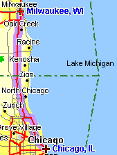  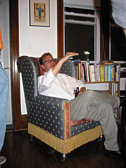 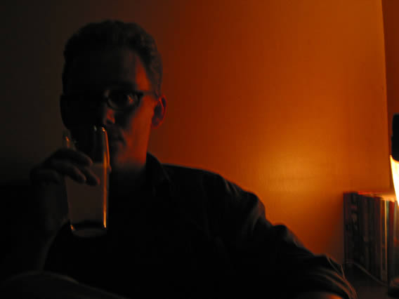 What is it, always with the beer, Bryan? Posted at 10:28 AM PST [3 comments] |
| June 21, 2002 |
|
Milwaukee, WI. 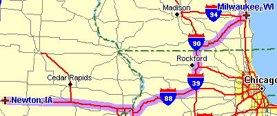 We were making good time on our sojourn, and it looked as if we could arrive in Chicago a day early. (I had to get there by Tuesday to prepare for teaching workshops on Wednesday and Thursday.) Instead, I suggested to dad that we choose an alternate route, one that would have us staying in Milwaukee for the night. Why Milwaukee? Because I'd both read in the media and heard from friends that the city was having something of a rebirth, and I'd never been there before, and this trip was all about new experiences, so hell, why not?Our first activity was to find a bookstore, wherein we could find a guidebook that might suggest some options for the day. We ended up at a downtown mall that was pretty much deserted, and a brief conversation with some sales clerks inside the mall's Eddie Bauer informed us that the lack of a crowd is pretty standard. Not a good sign for a city on the rebound. Flipping through a city guide in the Waldenbooks (yes! they still exist!), we read that "Historic Brady Street" was where the "hipsters" were, which in my mind translated to, "that's where the good coffee will be!" We found pretty good coffee at "Brewed Awakenings." Even better, we found a very friendly local, an unemployed graphic designer ("you have them here, too?"), who filled up an entire napkin with suggestions for where to eat and drink. After driving and wandering around for a couple of hours, we returned to Brady Street for a drink at the Hi Hat, where our very friendly bartender (originally from Orange County, clearly missed California a bit), served my dad the largest martini ever, and offered us the use of the house phone and phone book to find lodging and dining--even though the Hi Hat served food itself! For dinner we settled on what we learned was a true Milwaukee Experience--Kopp's Frozen Custard. It's a massive operation, serving burgers, fries, and various forms of frozen custard (a supposedly thicker/richer kind of ice cream). A huge crowd of people were ordering and eating, the energy in the place nearly palpable. Unfortunately, the food itself was remarkably bland--I prefer In-n-Out burgers and fries. Still, I suspect we got a sense of "real Milwaukee", which is definitely part of the point of such travels.Heading out of town the following morning, we did find some very good coffee at the Hi-Fi Cafe (which dad and I kept calling the "Hi-Lo", in honor of our favorite diner in Weed, CA.... and what is it with Milwaukeeans and the diminutive "Hi"?), which is in the Bayview neighborhood, which had the most interesting vibe (funky, ethnic variety, creative) we'd seen in the city. While I in no way regret the time we spent in Milwaukee, I don't think I'd ever go again. The people were very pleasant, but, frankly, it's a kinda-depressing post-industrial city without a whole lot going on. If you're thinking like I was thinking, "Hey, I have a day to kill, I'll go to Milwaukee," well, I'd now suggest to not bother. Posted at 01:06 PM PST [5 comments] |
| June 19, 2002 |
|
Visualize Articles Worth Reading In researching the topic of information visualization for an essay I'm writing, I came across InfoVis.net, a general resource site on the topic. Most intriguing is Inf@Vis, the "digital magazine", all articles written by the site's proprietor, Juan Carlos Dürsteler. Scrolling through the archives showcases Juan's solid publishing track record, and an impressive range of subject matter. |
|
Where's The Beef... Coming From? |
| June 18, 2002 |
|
Newton, IA. 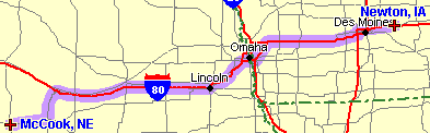 This will be the shortest entry yet, as, well, there's just not much to say about Newton. I was interested in stopping here as it's the home of Maytag, the appliance people, and I thought there might be some kind of interesting "company town" feel. Also, this is where Maytag dairy products, including the world famous Maytag blue cheese, comes from (a further note... a scion of the Maytag family is the man who restarted the Anchor Brewing Company in the mid-60s.) But, we didn't arrive until close to 8p, and it was a Sunday, so pretty much everything was closed, including restaurants. We made do with that which could be deep-fried at "Elmo Fudd's", an "eatery and drinkery." And we stayed at the extremely reasonable Mid-Iowa Motel--less than $25/room. The following morning, we *did* get quite a good cup of coffee at the Saints Rest Coffee House in nearby Grinnell. Posted at 11:06 AM PST [1 comment] |
| June 16, 2002 |
|
Networking sometimes is not working. A few weeks ago, I wrote up notes and thoughts on JC Herz' presentation on the "networked experience." She argued that anyone designing a networked system could benefit by understanding the sociological patterns in the world of online gaming.Among the elements discussed was making sure to include markers of "social status" for each participant. Such status is awarded for the amount and quality of participation in the networked system. In games, this often comes in the form of "levels"--those who have achieved higher levels have a higher status, more power, more influence. In a community publication like evolt.org, status is noted through "cubes", which reflect the number of essays written on the site.As JC was talking, I found myself mulling on some of the more pernicious qualities of "status" in any group activity. With status comes stratification, condescension, and other forms of inequality.JC's talk had the luxury of being concerned wholly with virtual worlds--these gamers don't really know each other in "real life", and the development of status is based solely on the playing, and rewards are given solely on merit. However, the reality is that many, if not most, networked experiences involve extending pre-existing social structures. Also, JC's talk suffered from what seemed to be a lack of real ethnography. JC did discuss personal observations (such as what she saw in South Korean networked gaming parlors), but it was clear there had been no structured approach to the research. I was thinking of inequality and structured research because JC's talk triggered thoughts of the ethnography of a hospital operating room presented in Bonnie Nardi and Vicki O'Day's _Information Ecologies_, and the difficulties of placing an interactive system within this environment that didn't take into account the highly stratified, and often times stultifying, relationship between the surgeons and nurses.Additionally, there's something to be said for anonymity, for a total lack of identifying marker or status. A BusinessWeek article, published around the same time as JC's talk, explores how the racial and gender unfairnesses of automobile buying (blacks, hispanics, and women all pay more, on average, than white men) are being smoothed out in the faceless world of the Web--now, minorities and women are getting sales quotes on par with white men.I have no answers here. I think there are some extremely intriguing facets to explore in the world of networked ecologies at various levels (familial, vocational, educational, recreational, mercantile). And while some aspects transcend these divisions, and knowledge of one group's interactions can inform how we approach others, it's imperative we also recognize the fundamental inherent differences.As I was poking around on the Web researching this post, I came across the page of Steve Whittaker, an AT&T Labs researcher who has worked extensively with Bonnie Nardi, who offers up dozens of publications grounded in ethnography and cognitive psychology. |
| June 14, 2002 |
|
You can judge a person by her covers. To help explain the essence of Molly... 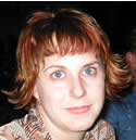 ...I shot this photo of her shelf... 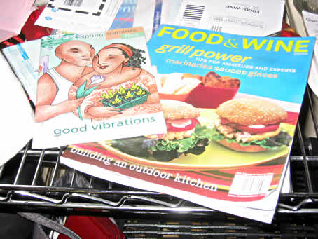 Posted at 09:38 AM PST [0 comments] |
|
"Blog" entering the OED. As this news item states, "blog" is being considered for entry in the Oxford English Dictionary. I have been corresponding with Jesse Sheidlower, the Principal Editor for the North American Editorial Unit, about this. I pointed him to the piece I wrote on the coinage of the word, and he's informed me that the OED can only cite a print source. Of course, I don't have a print source. I live in a world of electrons. So, the question is: does anyone know of any printed references to "blog" in 1999 that discuss its coinage? I know there was some early newspaper coverage back then, and articles found in newspapers online are likely also findable in their printed versions. |
| June 12, 2002 |
|
McCook, NE. 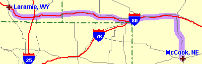 Not the exact route taken, but close enough. 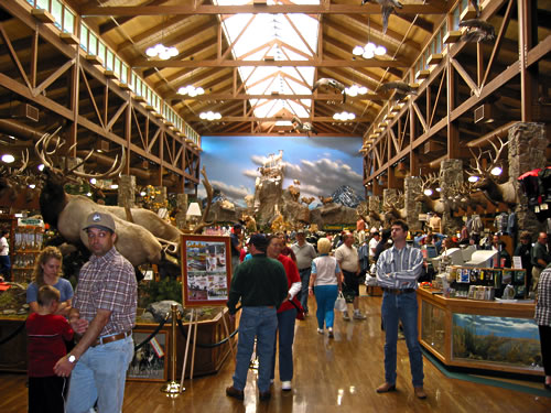 I've never seen so many mounted animal heads in my life. I purchased some great chamois shirts, the kind that Eddie Bauer no longer carries (ever since they ditched their Cabela-like roots in favor of pursuing an 'urban' dollar).I also had to take a picture of the snack truck outside: 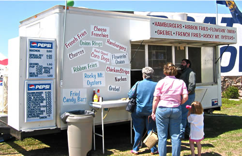 One of my few trip regrets is not eating a fried candy bar. And I still don't know what grebel is. 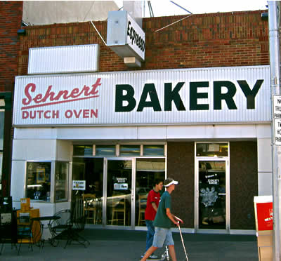 The closest thing to a donut shop in McCook Posted at 09:27 AM PST [7 comments] |
| June 10, 2002 |
|
Do Not Read If You Want To Trust Your Government. Over the weekend, the SF Chronicle published a commendable work of investigative journalism, "The Campus Files: Reagan, Hoover, and the UC Red Scare." Based on documents recently made public through the Freedom of Information Act, the series of stories details how the FBI targeted UC Berkeley as a hotbed of communism, unlawfully exceeded it's jurisdiction in the quelling of student protests and the firing of Chancellor Clark Kerr, and how gubernatorial candidate Ronald Reagan cosied up to the G-Men, happily playing the rat in return for help in defeating incumbent Pat Brown.What's most frustrating about "The Campus Files" is that, well, it's history. No justice will come of these findings. One hopes that we can at least utilize this history so as not to repeat it, but recent actions by folks such as AG John Ashcroft suggest otherwise. One of the ripest ironies of the piece is that Hoover's attacks on UC Berkeley went into high gear following the use of this question on a 1959 scholastic aptitude test: |
| June 8, 2002 |
|
For a weekend's web musings. At the bookstore I impulsively purchased The Ganzfeld No. 2, a beautifully designed book, with a collection of... well... stuff that's visually interesting. Among my favorite pieces is the section devoted to Peter Blegvad, who, among other things, is the proprietor of Amateur. That site is well-worth clicking around. I'm a particular fan of "Imagined, Observed, Remembered", and "The Spirit in the Thing," an essay on milk. |
| June 7, 2002 |
|
Candy Branding. The inestimable Jen Robbins has discovered that new M&M colors makes branding yummy!Here's my contribution: |
| June 2, 2002 |
|
Boldly Going Where No Town Has Gone Before. Vulcan, Alberta is a small, agricultural town that, at some point a few years ago, decided to forsake its history and identity by, well, you'll just have to view the town's official website. But I guess it's working.Is this one of those things where you laugh or cry? Or both? |
|
Laramie, WY. 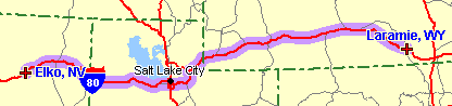 As always, image from Mapblast 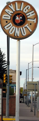 There really ain't much to say about this part of the trip. Driving through Utah and Wyoming is awesome. I-80 affords views of mountain ranges, salt deserts, mirages, and lots and lots of big sky. There really ain't much to say about this part of the trip. Driving through Utah and Wyoming is awesome. I-80 affords views of mountain ranges, salt deserts, mirages, and lots and lots of big sky.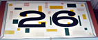 Laramie, WY proved a good place to stop. We stayed at the Ranger Motel, in room 26. We were even able to get one of those suite-like rooms, with two separate bedrooms sharing a common bathroom--just the thing if one (or both) of you snores.Dinner was at "the best restaurant in town," (according to the girl who checked us in at the Ranger) The Cavalryman, where dad hoped to get a good steak. The steak was fine, the meal came with unlimited serve-yourself-soup-and-salad AND a dessert, and Kelsey, our waitress, was delightfully dippy (she forgot orders, acknowledged that the cook of 17 years wasn't very good, and at one point made us a drink herself, even though she's under age). Dinner was capped off by coffee at Muddy Waters, seemingly quite the young local hangout (and pretty much the only place open that wasn't a bar). I flipped through local papers in an attempt to defuse the painfully embarrassing (for me) attempts of my dad in flirting with the girls behind the counter. These are the things you have to accept when traveling with others. I wish I had more to share, but this was really more of just a driving day. That Daylight Donut sign on the left was a couple blocks down from the motel. I hope I've been able to add just a little bit of information to the Global Brain about Laramie... Laramie, WY proved a good place to stop. We stayed at the Ranger Motel, in room 26. We were even able to get one of those suite-like rooms, with two separate bedrooms sharing a common bathroom--just the thing if one (or both) of you snores.Dinner was at "the best restaurant in town," (according to the girl who checked us in at the Ranger) The Cavalryman, where dad hoped to get a good steak. The steak was fine, the meal came with unlimited serve-yourself-soup-and-salad AND a dessert, and Kelsey, our waitress, was delightfully dippy (she forgot orders, acknowledged that the cook of 17 years wasn't very good, and at one point made us a drink herself, even though she's under age). Dinner was capped off by coffee at Muddy Waters, seemingly quite the young local hangout (and pretty much the only place open that wasn't a bar). I flipped through local papers in an attempt to defuse the painfully embarrassing (for me) attempts of my dad in flirting with the girls behind the counter. These are the things you have to accept when traveling with others. I wish I had more to share, but this was really more of just a driving day. That Daylight Donut sign on the left was a couple blocks down from the motel. I hope I've been able to add just a little bit of information to the Global Brain about Laramie...Posted at 09:16 PM PST [5 comments] |
 In their continuing attempts to become a newspaper with reporting worth reading, the SF Chronicle presents a